Skip to content

Tag: exhibitions

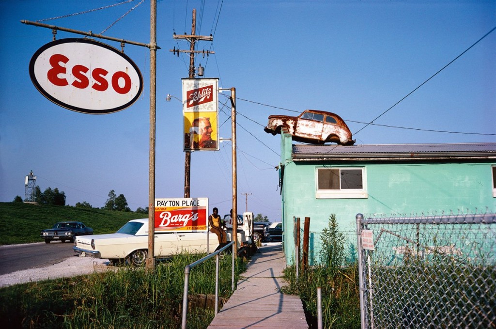
Tate Shots: William Eggleston

eggleston-tate

“William Eggleston never takes multiple shots of the same image, just the right picture at just the right moment.”

Curator Simon Baker discusses the work of photographer William Eggleston, currently on display at the Tate Modern in London:

Comments closed

In Thrall to Machines: Italian Futurism, 1909–1944

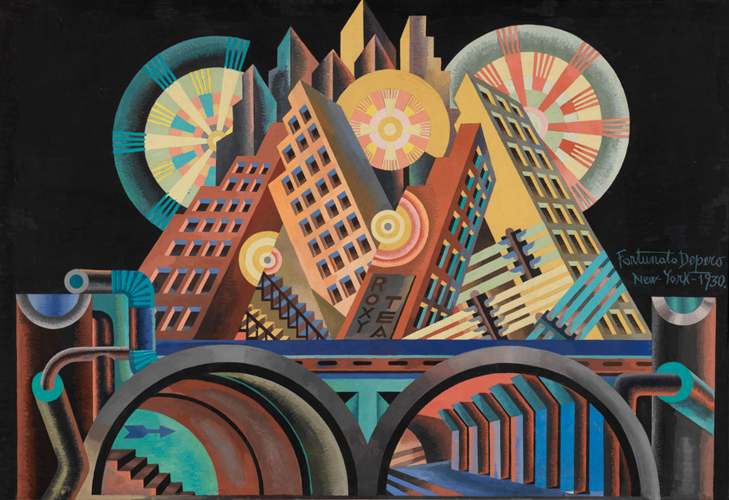
ex_depero_Skyscrapers-and-Tunnels

The New York Times reviews Italian Futurism, 1909–1944: Reconstructing the Universe, a new exhibition at the Guggenheim:

Was any avowedly modern art movement as obnoxious and noisily contradictory as Italian Futurism? By turn aesthetically revolutionary and politically reactionary, farsighted and visually challenged, not to mention officially misogynist, it is both a stain on the Modernist brand and a point of pride. It needs all the help it can get and it receives a large dose from “Italian Futurism, 1909-1944: Reconstructing the Universe,” an epic exhibition at the Guggenheim Museum.

Cool Hunting talks to curator Vivien Greene about the exhibition:

The show has a lot of didactics. Some of the artwork addresses that directly, so it’s easy enough to see their ideas, but we walk people through it as well. They celebrated war as this kind of cleansing medium, and a part of it was because Italy was seen as being so staid and so bourgeois, and after Italian unification in 1860, all those ideals of the Risorgimento really never come to fruition. So this idea of burn down the past and start fresh, be super modern—there were a lot of ideas of regeneration. But they also were very pro war because they wanted to enter World War One to get back the lands that were still under the rule of the Austro-Hungarian empire that were part of the Italian peninsula. So that’s a really practical historical reason that goes beyond you know, Sorelian ideas of the mob and violence—although Georges Sorel does inform them too, but sort of at different levels… [They] also were very aggressive: they start off as a left-wing revolutionary movement and then—how it often happens when you’re at one extreme of something totalitarian—you shift to the other and end up being on the right. They disagreed with the anarchists because the anarchists, although they were running around throwing bombs, had a more pacifist goal in mind.

Italian Futurism, 1909–1944: Reconstructing the Universe opens 21 February 2014 and runs through 1 September 2014.

(pictured above: Fortunato Depero, Skyscrapers and Tunnels (Gratticieli e tunnel), 1930.)

Comments closed

Richard Hamilton, Pop Art and Braun

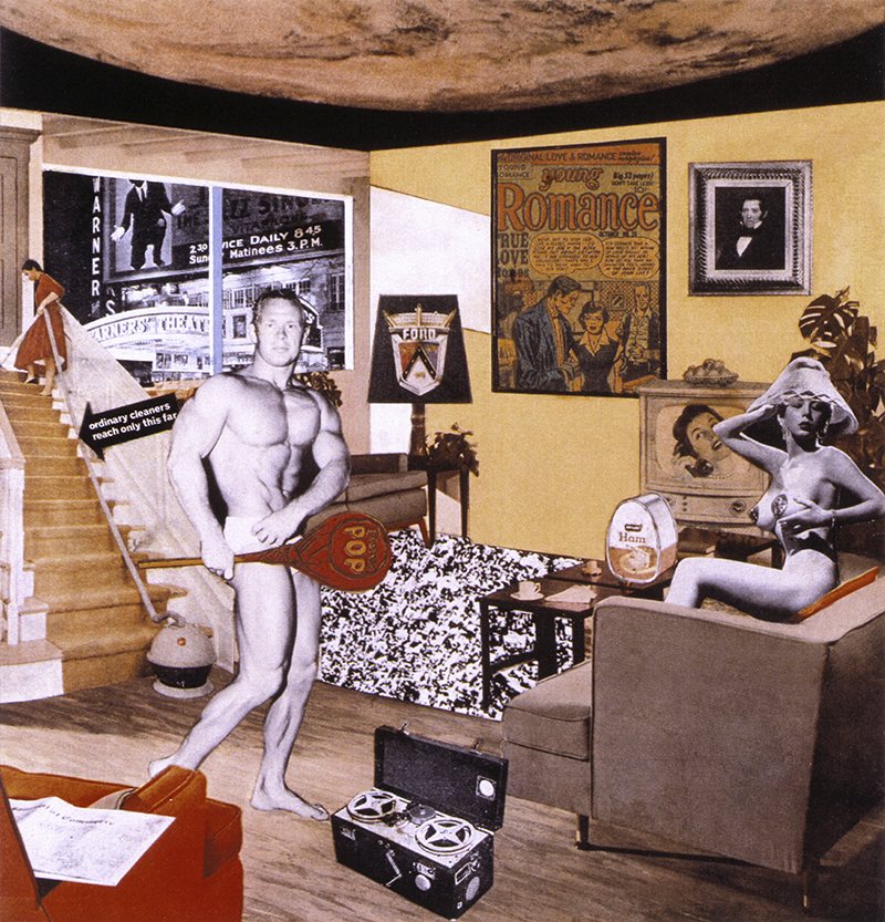
Also writing at The Guardian, Fiona MacCarthy on British pop artist Richard Hamilton:

Among the design cognoscenti of the period, Braun products were the creme de la creme, the must-have objects. I remember a time when no trendy living room would seem complete without its Braun stereo player. All image-conscious offices had Braun electric desk fans… The elegance and rigour of Braun products were drawn on by Hamilton in several of his most peculiarly disconcerting works. The Braun catalogues were plundered not only for the pop-up toaster but also the portable combination grill and even the immaculate typography.

His own admiration for Dieter Rams, Braun’s chief designer, verged on the ecstatic. Hamilton said: “I have for many years been uniquely attracted towards his design sensibility; so much so that his consumer products have come to occupy a place in my heart and consciousness that Mont Sainte-Victoire did in Cézanne’s.” All the same – and typically – this attitude of reverence did not prevent him from affixing to the top of his own Braun electric toothbrush the giant set of sugar-pink confectionery teeth his young son had bought him as a present from Brighton. The assemblage was later made into a multiple, The Critic Laughs(1968), complete with its own Braun-style packaging.

A retrospective of Hamilton’s work opens at the Tate Modern in London later this week.

Comments closed

Art Spiegelman: The Horror of the Blank Page

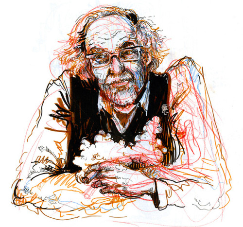
Artist Molly Crabapple interviews (and draws!) Art Spiegelman for Vice magazine:

Because of Photoshop we all know that photographs lie every second that they open up their mouths. You can’t really trust a photograph. It could have just as easily been a photoshopped collage. So, it’s probably more plausible to trust an artist. You get to feel whether you trust them or not… Artists tend to have to reveal more of themselves even when they try to be as scrupulous as Joe Sacco. It has a place insofar as concentrating on something has a place. We’re living in an ADD universe. The computer encourages that second-to-second dopamine rush as you go from click to click. What’s valuable about comics and print is they actually are a venue where you end up spending time.

Art Spiegelman’s Co-Mix: A Retrospective runs November 8th – March 23rd at the Jewish Museum in New York City.

1 Comment

Art Spiegelman: The Antibodies of Satire

Art Spiegelman talks to Tablet Magazine’s literary editor David Samuels about the retrospective currently at the Jewish Museum in New York, Mad magazine, and, inevitably, Maus.

While not exactly critical of Spiegelman, it’s one of the feistier interviews I’ve read with him recently:

Now, if you’re talking about nationalism, then you have to get to Duck Soup within a couple of seconds. And that impulse predates WWII, and it’s an outsider’s perspective on a culture, and there are still plenty of outsiders to this culture, and things will come from that still, I believe. That’s one point.

The other point, which is more to the point perhaps, is the impulse—I see it through Mad, because it’s the one that’s imprinted on me. Mad made the resistance to the Vietnam War even possible. And that seems really, deeply true, not just some kind of wise-crack true. Because the ’50s felt incredibly monolithic. The early ’50s was an incredibly oppressive place in America, very iconically represented by a decent-enough liberal chap named Norman Rockwell. It’s when we got this ‘In God We Trust’ on our money, it’s when we had our crazy McCarthy moments, we had all of these things happening, and yet there was room for a very effective antibody, which was this kind of self-reflexive, self-deprecating, angry response to the homogeneity from people who weren’t thoroughly homogenized in our culture, i.e., Jews. It led to something very fruitful, and we still have the aftermath of it, both positively and negatively.

Comments closed

Close Not Touching: Penguin Designer Gerald Cinamon

Close Not Touching is a beautiful short film by DILLONROSE.COM about the work of designer and typographer Gerald Cinamon.

Born in Boston in 1930, Cinamon moved to England in 1960, eventually becoming chief designer at Penguin Books. Strongly influenced by Swiss design, Cinamon utilized a combination of bold colour, clean lines and sans serif typography that was unique in British book design at the time. Now an influence on a new generation of type-inspired designers, the film includes a conversation between Cinamon and David Pearson:


An exhibition of Cinamon’s work, Gerald Cinamon: Collected Work Since 1958, opened at the ICA in London this week, and new book Graphic Design Gerald Cinamon, designed by Danny McNeil at SEA design, is available here.

Although a live appearance by Cinamon has had to be cancelled, Pearson will be discussing text design at Penguin at the institute on September 13.

A full-length feature documentary about Cinamon by DILLONROSE.COM will be available to download from iTunes in February 2014.

Comments closed

Ersnt Reichl: Wide Awake Typographer


Elizabeth Hawes, Fashion is Spinach (Random House, 1938; AIGA 50 Books 1939)

At Design Observer, design historian Martha Scotford discusses the work of German-American book designer Ernst Reichl:

Midway in his career, Reichl began to reflect on many of the books he designed in written comments; he spent more time on this during the period 1977-1978, shortly before his death in 1980. In the end, there were approximately 550 3 x 5 inch index cards on which he hand-wrote his thoughts about selected books he designed. In lively prose Reichl comments on myriad elements of book design and details of book production, several for each book. He covers typography, binding design and jackets, illustration, publishers, the publishing industry in New York, design colleagues (revered and annoying), production triumphs and problems, how well the book sold, his opinion of the book and his philosophy of book design as applied to that title. He also critiques his own work, sometimes in the moment, sometimes from the perspective of more time and experience. These comments, often sharp and humorous, are highly entertaining and informative. I know of no other book designer who has done this so extensively.

Reichl’s comments about book design have now been transcribed from the cards and accompany a selection of over 100 examples of his work in an exhibition curated by Scotford, ‘Ernst Reichl: Wide Awake Typographer,’ currently on display at Columbia University’s Rare Book and Manuscript Library in New York until September 13, 2013.

On a related note, Scotford has previously written about the US publication of James Joyce’s Ulysses and the role of Ernst Reichl, who designed the typographic cover for Random House.

Comments closed

Midweek Miscellany

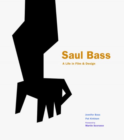
Lyra Kilston reviews Saul Bass: A Life in Film and Design for the LA Review of Books.

The Well-Made Book — An interesting article by Michael Agresta on how printed books, and their design, are changing in the digital age:

Now, as we move into the digital age, the well-made copy has come to occupy a familiar, almost nostalgic middle ground between the aura of an original and the ghostly quality of a computer file. A mass-produced paper book, though bulkier and more expensive, may continue to be more desirable because it carries with it this material presence. And presence means something—or it can, at least, in the hands of a good book designer.

Innards and Interiors — The Bauhaus: Art as Life exhibition at the Barbican reviewed at The Financial Times:

Paul Klee favoured risotto with steamed calf’s heart, sour liver and lung ragout: in the kitchen, as in his paintings, he was obsessed with innards, interiors, reconfiguring essential forms. Wassily Kandinsky lived in a streamlined white apartment but, incongruously, cooked on a “kamin” – a Russian wood-burning stove made from heavily ornamented black iron. Josef Albers claimed “I paint the way I spread butter on pumpernickel” – robustly and straightforwardly; he called the colour mixes in his “Homage to the Square” series his “recipes”. And Swiss painter and vegetarian zealot Johannes Itten was driven out of Weimar because he hijacked the Bauhaus kitchen and alienated director Walter Gropius by producing only “uncooked mush smothered in garlic”. The Barbican’s new exhibition… gives a whole new flavour to the story of the art school long seen to embody sober, purist German modernism.

Weird Comics — Local small press publisher Annie Koyama profiled in the Quill & Quire:

Koyama says her strategy for the year ahead is “to throw everything against the wall and see what sticks,” but she acknowledges her biggest business challenge is twofold: increasing print runs to improve margins and lining up reliable distribution for the fledgling firm. After working around the clock for nearly four years… she says her goal now is to create a sustainable enterprise that can continue to fulfill its artist-centric mandate… She’s also considering expanding into children’s books. But not in the way you’d expect. “While there are a million good kids’ books out there, there aren’t a million good kids’ comics I can see – especially not weird ones,” she says.

And finally…

Maurice Sendak, “author of splendid nightmares” has passed away aged 83. The New Yorker has made a short Art Spiegelman comic about meeting Sendak available online. And here is a wonderful interview with author from December last year:

Comments closed

Something for the Weekend

Adrift in the World — Tim Parks on fiction and place for the NYRB Blog:

If there is a problem with the novel, and I’m agreed with [David] Shields that there is, it is not because it doesn’t participate in modern technology, can’t talk about it or isn’t involved with it; I can download in seconds on my Kindle a novel made up entirely of emails or text messages. Perhaps the problem is rather a slow weakening of our sense of being inside a society with related and competing visions of the world to which we make our own urgent narrative contributions; this being replaced by the author who takes courses to learn how to create a product with universal appeal, something that can float in the world mix, rather than feed into the immediate experience of people in his own culture.

The Degree-Zero of Typeage — The “un-Google-able” Jenny Hendrix on Tintin for LA Review of Books:

Hergé himself described Tintin as the “degree-zero of typeage — a typographic vanishing point.” The formulation suggests Samuel Beckett, and there is indeed something Beckettian about Tintin. In French, appropriately, the phrase “faire tintin” means something approximating “to go without” or “to be frustrated.” Tintin may be a reporter, motivated, like any good journalist, by the hint of a good story, but only in his very first of his 24 adventures does he actually file copy. He was born 15, and supposedly stays that way, though it is hard to imagine he’s any age at all. He has no last name, no parentage and no past, no desires and no sexual identity. Even his appearance has little to say about him: his face is just a circle, with two black dots for eyes and a black, semi-circular wedge of mouth. He could be anyone, and frequently is…

Super-Punch — The New York Times reviews ‘Printing for Kingdom, Empire & Republic: Treasures From the Archives of the Imprimerie Nationale’, an exhibition of historical steel punches, copper matrices, and typefonts at the Grolier Club in New York:

[T]hese exquisite artifacts… offer a reminder, in the ethereal era of bitmapping, that type was once the tangible province of engravers and metal casters who labored in unforgiving but enduring media. To make a C with a cedilla, for example, involved a lot more effort and thought than holding down the Option key on your Mac. A comma-shaped steel appendage had to be lashed with string to the bottom of the C punch to produce a new matrix.

“People are practically printing books with their smartphones,” Mr. Fletcher said, in a tone suggesting that he did not think this was such a good idea. “It’s much more gratifying to be able to touch something and find out it’s real, rather than a matter of bits and bytes.”

Comments closed

Gerhard Richter at Tate Modern

With a major retrospective currently in London, artist Gerhard Richter talks about his life and work with Nicholas Serota, Director of Tate, on the eve of the show opening:

Comments closed