Skip to content

Tag: ephemera

The Collection

The Collection is a short documentary about two friends and their discovery of a unique collection of movie memorabilia, comprised of over 40,000 printer blocks and 20,000 printer plates used to create the original newspaper advertisements for movies released in the US from the silent era through to the 1980s:

(via Coudal)

Comments closed

Aaron Draplin and the Art of the Side Hustle

draplin-hustle

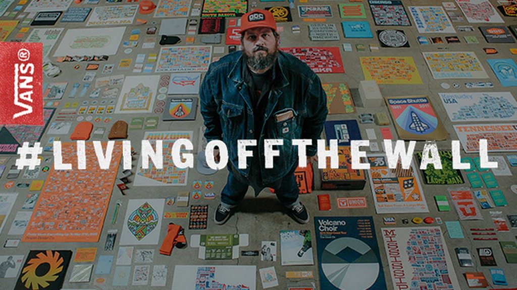
I could listen to designer Aaron Draplin get all excited about stuff for hours. In these short films by Jared Eberhardt for Vans, Draplin talks about design, ephemera, Field Notes, and more:

Comments closed

Inside Steven Heller’s Cave

Since I was an infant, I have feared my father’s den. Based on its ancient relics and mass clutter, I have since referred to the location as “Steven Heller’s Cave.”

Steven Heller’s son Nicolas (A.K.A. Ricky Shabazz) has made short video about the apartment where his father stores some of his more controversial design artifacts and ephemera:

Bonkers.

Comments closed

Something for the Weekend

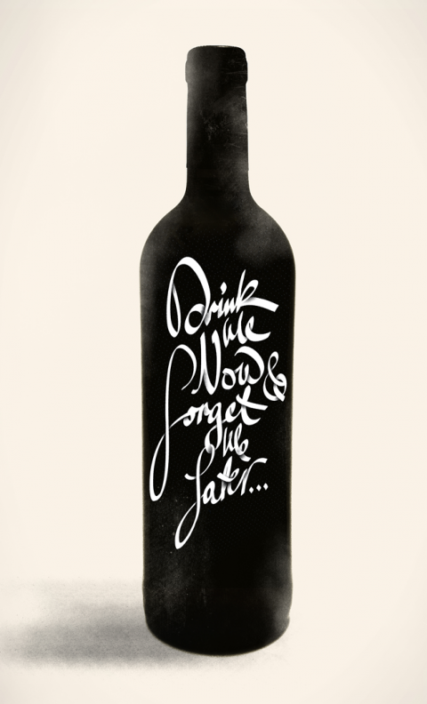
Letter Cult’s epic selection of the best custom lettering of 2011 (don’t click on the link if you have things to do today — and this is only part one!). Pictured above ‘Drink Me Now, Forget Me Later…’ by Michael Spitz.

Rank Amateurs — Design critic Justin McGuirk reviews Home-Made Europe: Contemporary Folk Artifacts for The Guardian:

The makers’ motives are not always need or thrift; sometimes it’s pleasure or obstinacy, or serendipity – a road sign that happens to make a perfect tabletop. This kind of uncelebrated creativity brings to mind artist Jeremy Deller’s Folk Archive, which catalogues everything from protest banners to pizza kiosks. Deller has written a short foreword here, in which he makes a distinction between these objects and DIY, “a hobby that seems so pleased with itself”. The difference is that the DIYer seeks to emulate the professional, whereas these objects all share the nonchalance of the amateur.

Also in The Guardian, Anthony Quinn on cricket and the novel:

Sport in novels is seldom just sport. It’s a way of talking about something else – fellowship, ambition, jealousy, honour. With cricket it’s clearly a way of writing about failure. Lately we’ve been hearing a lot about players who, at the end of their careers, succumb to insecurity and depression; some cannot handle the post-career blues and choose to end it all. As David Frith’s excellent book Silence of the Heart (2001) made clear, cricket has the highest proportion of suicides in any sport. Why? It might be because it is, of all sports, the loneliest.

Repressed Energy — An interview with Daniel Clowes about The Art of Daniel Clowes: Modern Cartoonist at the A.V. Club:

I can look at my early work and see what a pained struggle it was to draw what I was drawing. I was trying so hard to get this specific look that was in my head, and always falling short. I could see the frustration in the lines, and I remember my hand being tensed and redrawing things a thousand times until I finally inked it, and just having this general tense anxiety about every drawing. I think that comes through in the artwork, and gives it this certain kind of manic energy, this kind of repressed energy, so you feel like it’s sort of bursting at the seams or something.

And finally…

Sara Goldsmith on the history of the paper clip at Slate magazine:

The paper clip we think of most readily is an elegant loop within a loop of springy steel wire. In 1899, a patent was issued to William Middlebrook for the design, not of the clip, but of the machinery that made it. He sold the patent to the American office-supply manufacturer Cushman & Denison, who trademarked it as the Gem clip, in 1904. Middlebrook’s rather beautiful patent drawing shows the clip not as an invention but as the outcome of an invention: the best solution to an old problem, using a new material and new manufacturing processes. Coiled in this form, the steel wire was pliant enough to open, allowing papers to nestle between its loops, but springy enough to press those papers back together. When the loops part too far from each other and the steel reaches its elastic limit, the clip breaks.


Comments closed

Midweek Miscellany

Book designer and all-round good chap David Pearson on phillumeny at We Made This:

It’s no coincidence that a book designer should be drawn to matchbox labels. Their shape is intrinsically book-like, their method of communication instantaneous and spare, and they provide a dizzying range of illustrative styles. Their uncluttered compositions ensure communication across language barriers, and designs appear cohesive as a result of type and image being rendered by the same hand. But perhaps most alluring of all is their uncompromised clarity of purpose, an attribute that most modern designers can only dream about.

You can see more of David’s ephemera collection on Flickr, there’s another amazing collection of match-box covers here.

An Invisible Rightness — Six graphic designers, including Derek Birdsall and Peter Saville, discuss designers they admire in The Guardian.

A Repurposeful Life — Author William Gibson on cities and fiction in The Scientific American:

Necessity being one of invention’s many mothers, I have a certain faith in our ability to repurpose almost anything, provided it becomes sufficiently necessary. Then again, I suspect we’ve abandoned cities in the past because they were too thoroughly built to do some specific something that’s no longer required.

Let Us Tweet! — An epic-length rant by Jared Lanier, author of You Are Not a Gadget, at Edge:

I’m astonished at how readily a great many people I know, young people, have accepted a reduced economic prospect and limited freedoms in any substantial sense, and basically traded them for being able to screw around online… What that leads to is the world that Wells and Kurt Vonnegut and many others wrote about, where there just is enough virtual bread and circuses, just barely enough to keep the poor in check, and perhaps somehow not breeding, and they just kind of either wither away through attrition or something.

The A.V. Club offer a nice primer on newspaper comics.

Meanwhile… Robot 6 lists six great superhero comics from unlikely sources.

And finally…

An Act of Vengeance Against Former PleasuresThe Comics Journal reviews The League of Extraordinary Gentlemen: Century 1969, neatly summing up my own reservations about the direction of the series:

What’s disconcerting about 1969 is how joyless the exercise has become, and how wan and stretched the story feels. Like its predecessor, 1969 comes off as glum and a bit rancid. It feels like the story of characters who have outlived their time, which may indeed be the point… I don’t need to itemize the various bits of cleverness in 1969, or to point out the screamingly obvious, that 1969 is more intelligent and insinuating than most comic books. It is, after all, a book by Alan Moore and Kevin O’Neill. But the taste of it sits like battery acid on the tongue, and, like 1910 before it, it reads like an act of vengeance against former pleasures.

Comments closed

50 Watts

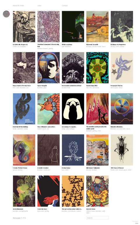
Will Schofield’s wonderful blog A Journal Round My Skull has been relaunched as 50 Watts using the Cargo platform:

The new name has something to do with Charlie Watts, Beckett’s Watt, Charles Wright & the Watts 103rd Street Rhythm Band, dim light bulbs, riots, cheap amps, chaos theory, and the friend who threatened violence if I didn’t drop my old moniker.

I didn’t threaten violence, but I certainly got the name wrong more times than I care to mention. 50 Watts looks great and I should be able to remember the name this time.

Make sure you update your bookmarks and RSS reader.

Comments closed

Midweek Miscellany

How To Live Safely in a Science Fictional Universe

A new cover from John Gall, seen at Peter Mendelsund’s JACKET MECHANICAL. Am I the only one who wants to hear these two in conversation? Dear NPR, could you get on that please?

Soft in the Middle — James Surowiecki looks at how midrange companies are being pressured by both high-end products at one end and ‘just good enough’ products at the other in the New Yorker (via Kottke):

The products made by midrange companies are neither exceptional enough to justify premium prices nor cheap enough to win over value-conscious consumers. Furthermore, the squeeze is getting tighter every day… This doesn’t mean that companies are going to abandon the idea of being all things to all people. If you’re already in the middle of the market, it’s hard to shift focus—as G.M. has discovered. And the allure of a big market share is often hard to resist, even if it doesn’t translate into profits.

I think we going to see this more in publishing with the midlist losing out to quick, cheap and ‘just good enough’ e-books and expensive, beautifully packaged hardcovers.

Somewhere Between Skeptic and Proselytizer — John Williams founder of The Second Pass interviewed at The Virginia Quarterly Review blog:

I think the way books are written about has been opened up in healthy ways. I like that there are more amateur (and semi-pro and pro) voices on the Internet, in the sense that it’s not just the unimaginative circle wherein writers of a certain kind of book review another example of that kind of book written by someone else. I’m not the first (or even the hundredth) to think that can lead to a lot of back-scratching or dry summation rather than forcefully argued opinion. It’s also true that the Internet has been great for, say, literature in translation, where entire sites (like Three Percent) can be devoted to a subject that gets less attention than it should in mainstream outlets. But as for how literary careers are made, I don’t think that’s changed as much as the tech apostles would like to believe.

The Incredible Book-Making Boy — Super talented author and illustrator Oliver Jeffers, whose new book The Heart and the Bottle was published earlier this month, interviewed at Seven Impossible Things Before Breakfast:

I begin with a single idea… and then tease that out in my sketchbook with hundreds of other drawings and pieces of writing that explore how the narrative can grow and extend into something that is satisfying. Once I’ve got a basic plot, I work with my editor in streamlining everything down to fit the thirty-two-page format…  Getting the story to flow between those thirty-two pages is probably the most difficult part. It’s like directing a film, where the pace needs to be set and decisions made of what goes where. It’s at this point that many of the compositions get cut. There is a careful balance between what the pictures are showing and what the words are saying, and if something is shown, it often doesn’t need to be said.

And finally…

Contemporaries, He Yanming

Chinese Book Covers seen at the excellent Ephemera Assemblyman.

5 Comments

Midweek Miscellany

The “Consummate Amateur” — Graphic designer, collector and archivist JP Williams (who blogs at the wonderful amassblog) profiled at Sight Unseen.

Overcoming Creative Block — 25 Artists, designers, and creators share their strategies at ISO50. I rather like Erik Spiekermann’s pithy list:

  1. Avoid
  2. Think
  3. Research
  4. Collect
  5. Sketch
  6. Deconstruct

    Schriftguss AG — A lovely Flickr set of  type specimens  (via The Ministry of Type).

    And Finally…

    American Psycho in six panels by Claire Murray seen at The Creative Review. Genius.

    Comments closed

    10+ Flickr Groups for Book Design and Inspiration

    10 Websites for Vintage Books, Covers and Inspiration” is one of the most popular posts on The Casual Optimist, and here, at long last, is the promised follow-up: “10 Flickr Groups for Book Design and Inspiration.”

    There are a lot of amazing photostreams with book sets — Covers etc, insect54, Kyle Katz, mjkghk, Montague, Paula Wirth, and Scott Lindberg to name just a few that I’ve come across — but I’ve decided to focus this post on my favourite group pools because they collate the best of these individual streams together.

    I’ve also decided to highlight groups that are about specific subjects, genres, publishers, or designers, because I think these are more useful than the more general (but still interesting) book pools such as A+ Book Covers, Book Cover Club, and My Books

    ABC Verlag Graphic Design books

    1. ABC Verlag, Zurich — A collection of scans and images from Zurich-based ABC Verlag who specialized in graphic design and fine art books between 1962 to 1989.

    1627

    2. Antique Books — images of books, covers and illustrations that are a hundred years old or more.

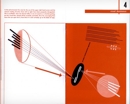
    Design and Paper: Number 13: Spread

    3. Designers’ Books — “what’s on the shelves of designers and other smart creatives.” Not to be confused with the also excellent designers-books.com pool or Book Design pool.

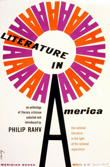
    Literature in America

    4. Alvin & Elaine Lustig Design — celebrates the work of Alvin and Elaine Lustig, both renowned for their incredible book cover designs.

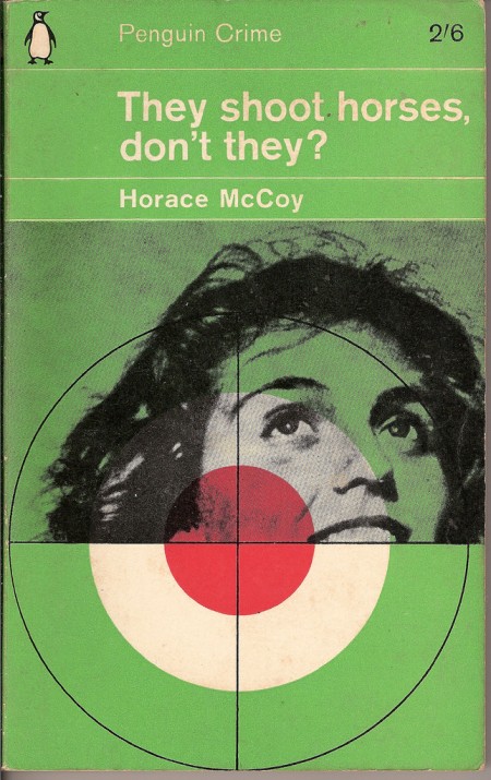
    They Shoot Horses Don't They

    5. The Penguin Paperback Spotters’ Guild — An astonishing collection of vintage Penguins, Pelicans, Peregrines, and Puffins. Also of interest: The Great Pan! Illustrated Pan Book Covers and Vintage Fontana Books.

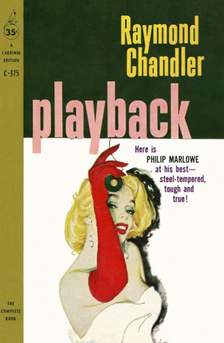
    Playback by Raymond Chandler Cover art by William Rose

    6. Pulp Fiction — As you would expect: detective novels, crime fiction, adventure comics, trashy romance, weird science, blaxploitation and more. See also: The Old-Timey Paperback Book Covers and The Crime & Mystery Book Covers.

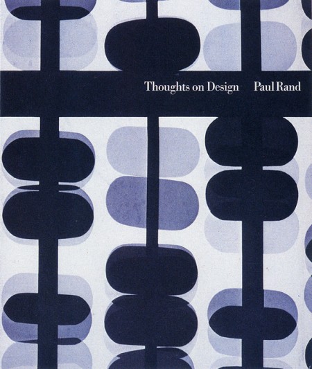
    Thoughts on Design by Paul Rand

    7. The Paul Rand Modern Graphic Design Fan Club — Like the Lustig Design group, this is not just a book pool, but it does, however, include many of Paul Rand’s iconic book designs, making it essential to this list in my opinion.

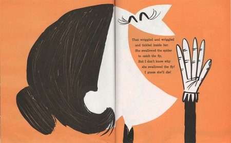
    I Know an Old Lady, by Rose Bonne. Pictures by Abner Graboff.
    8. The Retro Kid A collection of cool illustrated children’s books from the mid-1940’s through the mid-1960’s, curated by The Ward-O-Matic illustrator Ward Jenkins.

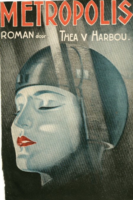
    metropolis thea v marbou

    9. The SciFi Books Pool Vintage science fiction covers from the 1940s, 50s, 60s and 70s.

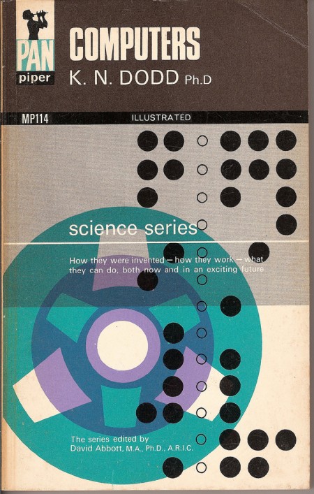
    computers

    10. Vintage Paperbacks — The place for amazing paperbacks that aren’t Penguins. Curated by graphic designer and art director Gregory Boerum, the focus is on quality stuff with design interest from the 1960’s and 70’s.

    So there we have it: 10 of my favourites. What are yours?

    10 Comments

    The Silver Lining

    The Silver Lining blog is so good right now it’s giving me a headache: Art, books, ephemera, photography… All the good stuff, all in one place…

    That is all. Carry on…

    (pictured: De Sainte in New York, book cover by Dick Bruna seen at The Silver Lining)

    2 Comments

    10 Websites for Vintage Books, Covers and Inspiration

    1. A Journey Round My Skull — “Unhealthy book fetishism from a reader, collector, and amateur historian of forgotten literature.”

    2. The Art of Penguin Science FictionA comprehensive collection of Penguin sci-fi covers from 1935 onwards.

    3. BibliOdyssey“Books… Illustrations… Science… History… Visual Materia Obscura… Eclectic Bookart.”

    4. Book (Design) Stories — Felix Wiedler’s incredible collection of modernist design and typography books from Germany and Switzerland 1925–1965.

    5. Book Worship — “graphically interesting, but otherwise uncollectible, books that entered and exited bookstores quietly in the 50s, 60s, and 70s”.

    6. I Was A Bronze Age BoyComic books, crime fiction and pulp magazines curated by Mark Justice. Awesome name. Awesome blog.

    7. Killer Covers of the Week — Pulpy goodness and vintage crime fiction covers expertly curated The Rap Sheet‘s J. Kingston Pierce.

    8. The Pelican ProjectThings Magazine‘s collection of Pelican paperbacks organized by decade.

    9. Pop Sensation — Rex Parker appraises, critiques and generally ridicules his vintage paperback collection.

    10. Spanish Book CoversSpanish pulp: detectives, masked gangsters, pin-ups, skeletons, and zombies! (French language)

    AND BONUS! 11. French Book Covers — But not entirely safe for work… It’s French. You have been warned.

    Let me know if I’ve missed any other great vintage book cover sites. AND  I’m working on a list of book cover related photostreams and groups on Flickr so please pass on your recommendations! Cheers.

    modernist book design in germany and switzerland 1925–1965 (and beyond)

    17 Comments

    Q & A with David Pearson, Type As Image

    Penguin Great Ideas

    Does British designer David Pearson really need an introduction?

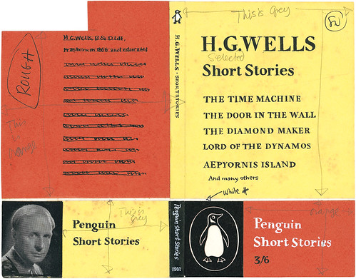
    Even if you don’t recognise the name immediately — and perhaps it is less familiar on this side of the Atlantic — then you will almost certainly recognise David’s type-driven design work: Penguin by Design by Phil Baines, Pocket Penguins, Penguin Great Loves, Penguin Great Journeys, Penguin Reference, and, of course, the astonishing Penguin Great Ideas series.

    When the first set of Great Ideas titles arrived they looked like nothing else in the bookstore. Each cover was unique and yet they all fitted perfectly within the series. Their thick paper covers, limited colour palette and bold typography were clearly a wink to the design history of Penguin books (and perhaps the Arts & Craft movement) but also imaginative, playful, and starkly modern.

    Since then, there have been three more sets in the Great Ideas series with a fifth on the way. David still works with Penguin, but has set up his own firm. He has designed covers for Éditions Zulma, and somehow found the time to help launch White’s Books.

    David and I chatted over email…
    Illustration by Michael Kirkham; design by David Pearson

    How did you get into book design?

    Whilst at college I was lucky enough to be offered a work placement by my Typography tutor, Phil Baines. The job was to design a large-scale art monograph for Phaidon Press and Phil walked me through every stage of the book’s production, from styling the edited manuscript through to the final layouts. I even got to run my designs past Alan Fletcher, who at the time was responsible for overseeing Phaidon’s visual output. This seemed like an absurdly privileged position for a student to be in. The first time I went to Phil’s studio he told me off for not aligning the letters on his hot and cold taps so you can imagine how fastidiously constructed my pages became under his tutelage. Before long I began to laugh at Phil’s funny ways and he in turn mocked my special design slippers. A friendship was born, nicknames were awarded and my first experience with books turned out to be an entirely lovely one. Moving into my third year, I knew that book design was for me and began to check Penguin’s website every week for job vacancies. For all sorts of obvious reasons I knew that I wanted to work for the company and made sure that I checked throughout my final year at college, desperate as I was to remain in London afterwards. I got lucky and landed a job as text designer (setting the insides of books) the day after I graduated.

    This is a terrible question, but I’m curious: Which came first, your interest in Penguin’s design history, or designing books about Penguin’s design history?

    Oh, absolutely the former. I was already an avid collector and the idea for a design retrospective was one that I’d run past my Art Director before it was eventually tagged onto the company’s 70-year anniversary celebrations. I’d always wanted to get into the archives and have a really good poke around and fortunately for me, this gave me the perfect excuse. If I was unaware of the magnitude of the company’s past achievements they very quickly became apparent as I worked my way through the vast isles of books.

    The Penguin archive
    Experimental layout from the Penguin archive

    What was it like working with designer and typographer Phil Baines on Penguin By Design?

    Having been given an enormous amount of freedom by the company (to personally manage the project) I found myself in a position where I could enlist an author. Phil seemed like the perfect choice because of his analytical and objective writing style. The last thing I wanted was a blinkered, frothing account of the company’s history because even a cursory glance round the archive revealed some decidedly dark periods. Phil and I keep very similar hours so the book took shape very naturally and it felt strangely normal to work through the night before heading to a pub together the following morning. Indeed, because there was no framework in place for our department to produce books of this kind, I had to rely on the goodwill of my Art Director, Jim Stoddart as I would design covers during the day and then the design book at night. The lines often became blurred and I was once asked to be escorted from the building as it was judged that I had not left for over two days. Phil is currently working on Puffin by Design, a partnering edition to Penguin by Design and as much as I would’ve liked to have been asked to work on it I suspect that we’re both better off that I wasn’t!
    Artwork by Phil Baines; design by David Pearson

    Your work on Penguin’s Great Ideas series won you a D&AD Yellow Pencil. What was the design brief for books?

    Like all the good ones it was a happy blend of strict parameters (most notably in terms of budget) and creative freedom (there being no existing blueprint to adhere to or living authors to appease). The series’ success should be attributed to many different factors: Editor Simon Winder’s original idea was a great one, implying that world-changing thought and writing equates to Penguin, while the finished books seemed to fit a model of what people wanted from the company, a reaffirmation of Allen Lane’s original philosophy; but above all the publisher displayed an unfaltering level of confidence in the project and allowed us to break some fairly established rules in the process.
    Artwork and design by David Pearson
    Artwork and design by David Pearson
    Artwork and design by David Pearson

    The fourth series of Great Ideas has just been released. Was it difficult to create interesting new designs that were consistent with the previous two series?

    Speaking from my own perspective I’d say that I’ve loosened up as a designer. Looking at my earlier efforts I think I was rather inhibited and it wasn’t until I brought in Phil that I could see the true size of the project’s potential. Phil added pace and variety through his very bold, expressive cover designs and this made me realise that I too could let my hair down a little.

    Artwork by Joe McLaren; design David Pearson
    Artwork and design by David Pearson

    How is running your own studio different from working at Penguin?

    There are certainly negative sides to being ‘out of house’. For example, I am no longer in a position to affect the approval of my work. Instead it has to very much stand up for itself, without the highly-sensitive designer attached. That said, I feel much calmer as a result. I may well still be in a honeymoon period but I’m enjoying managing every facet of my business – from doing the accounts to cleaning the windows. The rewards seem so much more tangible as a result.

    Could you describe your design process for book covers?

    Since the vast majority of what I do is type-driven, a fair amount of time is given over to researching letterforms. I am lucky enough to work just down the road from one of the world’s best typographic resources and thankfully they don’t mind me popping over to waste their time. Typophiles – in particular – can be a particularly unforgiving bunch and so time spent researching is never wasted.
    
    Design by David Pearson
    
    Design by David Pearson
    What are your favourite books to work on?

    Working within tight constraints is a blessing. There’s nothing quite so daunting as a completely open brief as you never get the feeling that you’re solving a problem, rather just satisfying your own whims. I always feel much more creative when my palette has been limited, either by the client or by myself.
    Illustration and design by David Pearson

    What are the most challenging?

    Very simply, the ones that attempt to house more than one idea or repeat a sentiment. I think that book covers communicate quicker if they are boiled down to their most essential elements or rather, they have the best chance to communicate if they do one thing and do one thing purposefully. Confidence and a clarity of purpose are not found in abundance in trade publishing.

    Illustration by Victoria Sawdon; design by David Pearson

    Massimo Vignelli says that designers just need 6 typefaces. Should designers limit the number of typefaces they use?

    Not at all. I am completely opposed to this view. While I appreciate that it takes time to fully understand and competently utilise a typeface I suspect that they all have a use for something. And doesn’t the use of such a limited palette suggest an unwillingness to shift from a preconceived agenda? This is all well and good if the client is buying into your look and trading from it but I would question whether this is a healthy starting point for someone working in the communications industry. Or, perhaps I’m just not enough of a Modernist to understand such an approach.

    What are your favourite typefaces to work with?

    I absolutely love Vendôme by François Ganeau and Roger Excoffon. Its over-emphasised, angular serifs brilliantly support its sensuous, bulking forms. I wasn’t in Paris in the Fifties, but Vendôme feels to me very much like Paris in the Fifties. Anything by the peerless Matthew Carter is a joy to use and I recently saved up to buy Martin Majoor’s Nexus family which I seem to be consistently delighted with.
    From David Pearson's ephemera collection

    Where do look for inspiration and who are some of your design heroes?

    Like most book designers I have a healthy collection of ephemera; matchbox and travel labels being my favourite, and a huge chunk of my salary is redirected towards book buying. My design heroes are rather predictable, but for good reason I think. Jamie Keenan’s covers always seem so fresh and live long in the memory because they require a level of decoding. Jamie is also one of those rare designers whose work is just as effective on either side of the Atlantic. Hans Schmoller’s meticulous and elegant typography reassures me on a great many levels and I can’t quite manufacture enough situations where I am working with the immensely talented Joe McLaren. Then there’s the Penguin roll call: Curtis, Miles, Gentleman, Games, Marber, Birdsall, Robertson, Aldridge, Pelham and of course, Tschichold.

    Design by David Pearson (not yet published/work in progress)

    What does the future hold for book cover design?

    It feels like this has been pretty well covered by people who are much more future literate than myself. All I can do, as a simple print designer, is live from day-to-day.
    Design by David Pearson (not yet published/work in progress)

    Thanks David!

    You can see more of David’s work at his Flickr page and the David Pearson Design site.

    27 Comments