Skip to content

Tag: Design & Book Covers

Missed Things: Friday

Floating — Toronto illustrator Michael Cho on his cover art and interior illustrations for The Amazing Absorbing Boy by Rabindranath Maharaj (published by Random House Canada).

The Ideal Studio Library — It’s Nice That interviews designer Jason Godfrey about his beautiful new book Bibiographic: 100 Classic Graphic Design Books, published by Laurence King,  (and yes, full disclosure, LK are distributed in Canada by my employer Raincoast Books):

My aim was to create the ideal studio library of graphic design books and put this into a book format. I had always felt that there was a need for a visual reference to that could give flesh to many reading lists that have been published… The really tricky choices were the more recent books as it is difficult to know whether they will become classic points of reference, time will tell if I made the right choices on these books.

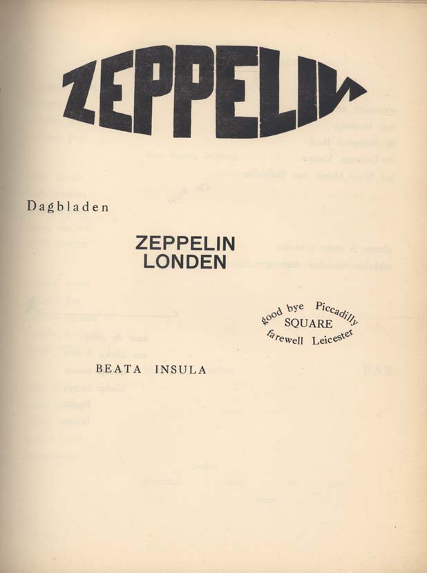
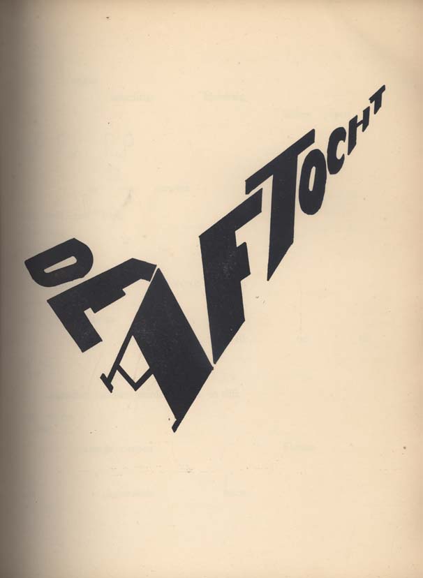
Bezette Stad —  A book of poems by Paul van Ostaijen, illustrated with woodcuts by Oskar Jespers, available in full at the University of Iowa Libraries’ astonishing International Dada Archive (via the lovely Aqua-Velvet).

And finally…

ENOUGH! — The hilariously on the money Editorial Anonymous:

I REALLY NEED A FRICKING BREAK FROM THE “FUTURE OF PUBLISHING” TALK… I don’t need to read any more of these articles, and neither do you.

A quick overview:

1. Publishing is a somewhat crappy business. Which makes it PRETTY MUCH LIKE EVERY OTHER BUSINESS.
2. Publishing has a future. NO ONE KNOWS WHAT IT WILL BE.

So everyone can stop
a. COMPLAINING
and
b. COMPLAINING.

Thank you.

No, no, Thank YOU.

3 Comments

Q & A with Paul Buckley, Penguin US

Photo by Erika Larsen. Design by Paul Buckley

It is not every day that I get an email from the Vice President Executive Creative Director of Penguin US, so it was something of a surprise when Paul Buckley sent me a note a few weeks ago about a book cover design mentioned in my interview with his wife Ingsu Liu.

I had been conspicuously unable to locate the image online and Paul was able to help. But it seemed like too good an opportunity to miss, so I asked the Brooklyn-based designer if he would be willing to do a Q & A about his work as well. Again, much to my surprise, not only did Paul say yes, he managed get his answers back to me in record time (with annotations and links included!)…

Of Mice and Men

How did you come to book design?

I went to SVA on an illustration scholarship, and was very intent on becoming an illustrator. While other parents were giving their kids children’s books, my father was giving me illustration annuals. But I supported myself during my college years working for various NYC design studios as a designer, learning through those around me… and at the same time pursuing freelance illustration assignments as well – basically learning both crafts simultaneously through different venues. Right after graduation I took a 3 month road trip spending my savings, and thus came home to Greenpoint needing an income. A studio manager at one of the studios I worked in during my early college years suggested me to her sister who was working at NAL/Plume/Dutton, as they needed a Junior Designer… I landed the position with a portfolio that was equal parts design and illustration. Though in the beginning I was very hardcore about becoming the best painter I could be, I quickly fell in love with designing book covers and never looked back… within two years we merged with Penguin. Though I’ve become far too busy (and lazy!) to pull out the oils and actually paint something, I did manage to get a few simple ink drawings in the Society of Illustrators this year. I realize these will pale in comparison to 99% of everything else done by the true working pros in the annual, but it was still a kick and an honor to have my work chosen for inclusion.

The World According to Garp

Can you describe your role at Penguin?

I act as a Creative Director overseeing a sizeable staff and many many projects. My Penguin publishing team is very open to me and my guys pitching ideas and we nicely act as an overall creative team, in a way that editorial and art together collaborate to create nice projects — most recently I’m directing a cover design book where we have the authors commenting on their covers, and a new series named Penguin Ink, where the world’s leading tattoo artist’s do covers for me. Recently in the stores is the gorgeous collaboration of Roseanne Serra with Ruben Toledo… this was all Roseanne’s brilliant art direction, and I had nothing to do with it — but it is gorgeous Penguin project that is very much worth checking out.

Art by Duke Riley
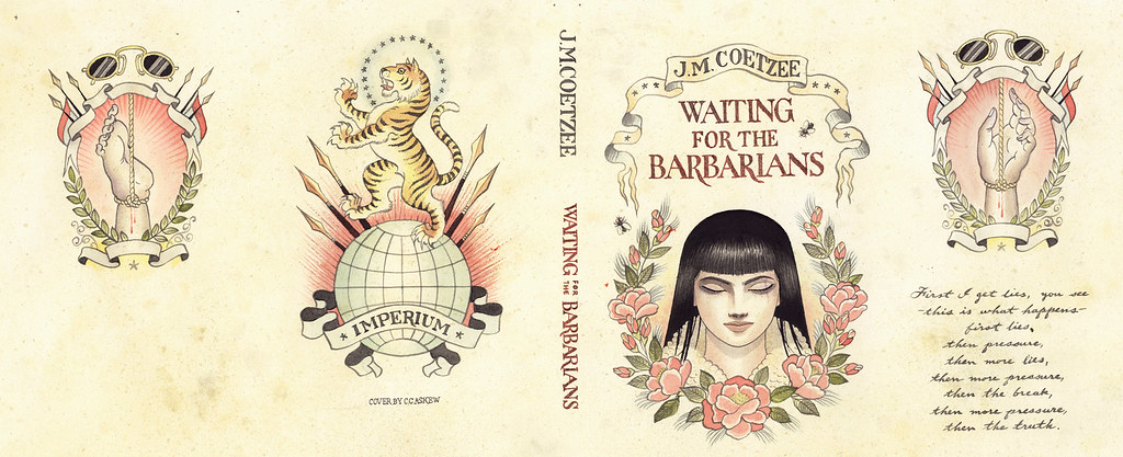
Waiting for the BarbariansArt by Chris Conn

How many imprints do you oversee?

Six

Does each imprint have a particular design style?

Yes, each imprint is very unique unto itself, as each Publisher/Editorial team brings their own style, as does each Art Director. In my group, Roseanne Serra and I collaborate on Penguin paperbacks, and to a lesser degree, with the Viking imprint as well. Roseanne art directs Pam Dorman books. Joe Perez smartly art directs Portfolio and Sentinel, which are brilliant business and political imprints. Darren Haggar art directs Penguin Press overseeing the packaging for literary giants like Thomas Pynchon and Zadie Smith… and while not it’s own imprint per se, Maggie Payette Art Directs our gorgeous poetry series.

The Jan Tschichold Penguin paperbacks are design icons in the UK. Is there a sense of that legacy within Penguin Group USA?

Very much so. We all have quite a few Tschichold books on our shelves. The UK Penguin art department, under the Art Direction of Jim Stoddart and John Hamilton, does an incredibly beautiful job of keeping that legacy alive.

How is American book cover design different from the UK?

I don’t know that it is all that different. In fact, Art Directors over here, and Art Directors over there, are hiring the same art and design talents on each side of the Atlantic.

Do you discern any current trends in American book cover design? Yes… very nicely a resurgence of designers and illustrators who do both the design and illustration; the whole package. Jaya Miceli, Chris Brand, Jon Gray, Gregg Kulick, Jamie Keenan, Rodrigo Corral, Ben Wiseman, Jennifer Wang, Tal Goretsky, etc – these are the folks creating the personally unique covers of today that will be the design icons of tomorrow.

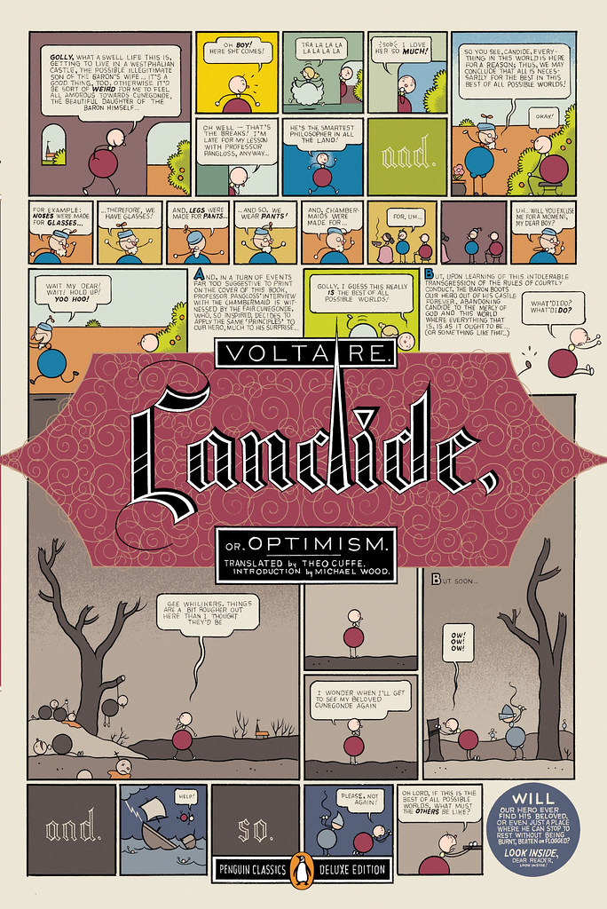
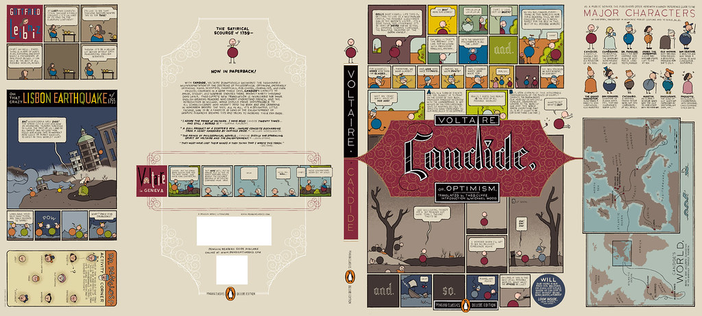
Art by Chris Ware

How did the Penguin Graphic Classics come about?

We do a handful of what we call Penguin Graphic Classics Deluxe packages every list, and when it was time do one for Voltaire’s Candide, I handed it off to Helen Yentus who was in my group at the time. Helen wanted to work with Chris Ware on it, and off it went with us all happy that he accepted the assignment. When Chris’s sketch came in, it just sort of blew everyone away… Up to that point we’d never had anyone grab editorial control of a cover that way… Chris had gone hog wild and wrote all his own copy and illustrated and designed the living hell out of every square inch of this cover from flap to flap. It took forever to make its way around the packaging meeting table with everyone grabbing hold of it, reading it and laughing out loud. A short time later, our Penguin Publisher Kathryn Court declared that we needed to do more of these. Kathryn really nurtures good art and design and is one of the reasons I’ve been here so long.

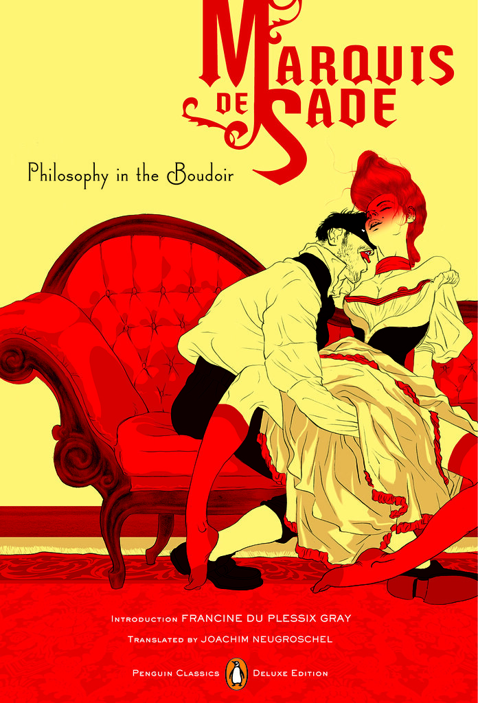
Cover by Tomer Hanuka with design by Paul Buckley and Tomer Hanuka


Art by Anders Nilsen
Art by Charles Burns
Art by Roz Chast

How did you match the artists with the titles?

The titles were given to us by the Penguin Classics editorial team, and Helen and I would sit in my office surrounded by comic books and simply have fun matching this artist with that title.

Art by Michael Cho. Design by Paul Buckley

Are their plans to expand the series? What new covers can we look forward to in the future?

We do about 6 a year and I think we are all comfortable with that number at the moment. I just finished White Noise with Michael ChoMoby Dick by Tony Millionaire just came out, as did Huck Finn by Lilli Carré, and Ethan Frome by Jeffrey Brown. In the near future, I’d really love to do something with Jim Rugg, Jeff Lemire, Mike Mignola, David Small, and I still hold out hope that one day Crumb will actually say to me “damnit you pesky bastard… ok, ok, I’ll do it”.

Art by Tony Millionaire


Art by Lilli Carre. Design by Paul Buckley

Do you still design yourself?

All the time… mostly in the evenings after everyone has gone home and I can focus without the constant distractions of the work day. My greatest hits are posted on my website.

 
Art by David Byrne. Design by Paul Buckley. 
Pigmented foil stamped on linen cloth
Art by Will Eisner. Design by Paul Buckley. 
Art direction by Ingsu Liu & Albert Tang
 Photo by Fredrik Broden. Design by Paul Buckley

Could you describe your design process?

I start each project with the hope that I’m going to do something unusual; and then I try my best to do just that — read the material and find a visually unique way to interpret it. I tend to go either very loud, or very subdued and moody. I do a ton of comps for every cover I work on — sometimes, 20 or more to explore what I’m thinking and all the tangents that come along during the process — I get nuts when freelancers send me two or three comps. I’ll show 3-5 of what I think are the best and receive comments and direction on those from editorial… when discussing why a designer did this or that, I think what people commenting on book covers seem to gloss over is that the publishers and editors have far more at stake than the cover designer — they have committed sums of money and must answer to the house and the author to make this book a success — so they are very strong about what they think the cover should be and nothing is being printed without their full consent.

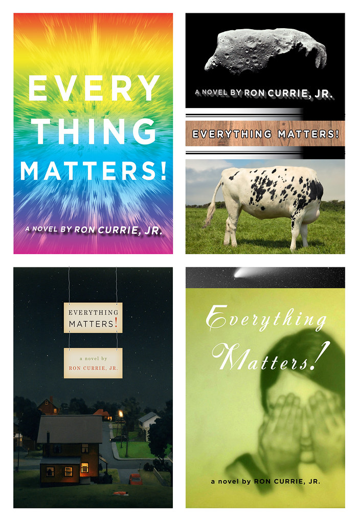
Here are a few rejects from the pile… I’m not saying these covers are better for the individual book, than what got printed… maybe the books would have tanked with these covers… but they do illustrate how in-house visions do not always sync:

Upper left: art by Paul Buckley. Upper right: various stock.
Lower Left: art by Amy Bennett with descending placards by Paul Buckley.
Lower Right: painting by Keniche Hoshine with added stock image.
(see final cover here)
Various antique endpapers combined with altered ebay images
and antique portrait of feral child.
(see final cover here)

Do you approach fiction and non-fiction differently?

Often, yes. Fiction needs a more peripheral approach where I’m looking to capture a mood to reflect the book’s tone, whereas non-fiction often needs you to stare it directly face on and state precisely what the topic is.

What are your favourite books to work on?

Any title where the Editor and Publisher are open.

What are the most challenging?

Any title where the Editor and Publisher are nervous.

Where do you look for inspiration?

Everywhere. My staff blows me away daily. My wife shows me beautiful work constantly. Editors show me stuff. Blogs like yours so nicely showcase how much great work is out there. Friends deluge my inbox with artist links. Illustrators. Photographers. Fine Artists. Music. Furniture. All talent is inspiring. Cruising Flickr and the web in general has me bookmarking new people daily, and I can spend hours google imaging the most absurd things that always tangent me to the greatest places. I found and purchased an image for a difficult book cover project recently just because I decided to google “leucistic squirrel” after I noticed a few in Prospect Park. I have no idea how we all existed before the internet.

What do you look for in a designer’s portfolio?

A unique talent. Distinction.

Front cover art by Frank Miller. Design by Paul Buckley

What does the future hold for book cover design?

There will be a market that just wants/needs to download the material for reading purposes, and there will be a market that is looking for an object. What Penguin does with the Graphic Classics is a great example– some student will download Gravity’s Rainbow cheaply, while an older Thomas Pynchon or Frank Miller fan with a little more cash in their pocket will want the beautiful book/object. So I believe the cover design market will shrink in that way. Textbooks and travel guides will go digital first as there is no real reason to carry all that in your backpack or pay for all that book production. For digital readers, big budget fiction and non fiction titles will have moving covers, more like mini movie trailers. If Grisham were still with us, his future digital reader cover would be something akin to us looking at a murky black screen… the reader would hear running footsteps and ragged breathing… then a loud shot rings out, and a big red splotch hits your screen and drips to form the title type. Then one blurb after another flies across the screen and after a moment Grisham himself pops up in the corner thanking you for purchasing his new book and asking if you’d like to peruse his backlist titles… and click this link if you’d like to pay an extra dollar to help our troops in North Korea, Iran, Afghanistan or Iraq. Interior-wise, there will be tons of product placement… not necessarily for gratuitous reasons; but because people, places and things are mentioned on every page in every book be it fiction or non fiction; and if folks desire a more interactive read that really helps them get into the book in a different way, then it’s possible there will be quick jump links to everything – for instance… if in this book, the character is having lunch in Balthazar and then running off to the Standard Hotel for an ongoing affair… then why not have Balthazar and The Standard pay a small fee to the publisher to provide these links; this seemingly free advertising? Big money to had there. I reserve judgement as to whether any of this is a good thing or a bad thing… but as publishing goes more digital, I think it’s naive to think these things wont happen to books just as they happen everywhere else.

Thank you very much!

You bet.

9 Comments

Q & A with Alex Camlin, Da Capo Press

Even though I first noticed the chunky Eisner-esque cover design for Douglas Wolk’s Reading Comics at The Book Design Review, it wasn’t until much, much later — when Ben Pieratt posted about the elegant redesign of The Harvard Review at  The Book Cover Archive blog back in June — that I registered that it was the work of designer Alex Camlin.

Both Reading Comics and The Harvard Review demonstrate Alex’s incredible attention to typography, his range of his influences, and the amazing diversity of his portfolio. Currently Creative Director for Da Capo Press, I caught with Alex via email earlier this month.

Briefly, could you tell me about Da Capo Press?

By most accounts, Da Capo started as a New York based trade paperback reprint house in 1975. At the time, many mid-to-large-sized publishers licensed paperback rights to reprint operations, rather than publishing their own paperbacks. In the beginning, Da Capo focused on licensing nonfiction, concentrating on music (jazz and blues/roots mostly), military history, and biographies. This continued through the late 90s, until Da Capo was purchased by the Perseus Books Group, who added the imprint to a growing portfolio that included Basic Books, Public Affairs and Running Press, among others. Da Capo was relocated to Cambridge, Massachusetts in 1999 to set up shop alongside another member of the Perseus group, the former trade division of Addison Wesley, renamed Perseus Publishing. Since then, Da Capo has evolved to publish its front list in hardcover and paperback originals, in many more categories. In the process, we managed to spin off a sister imprint—Lifelong Books—with a list focused on self help, childbirth, parenting, cooking, nutrition, and relationships. My first day on the job was also Da Capo’s first day in Cambridge, and we’ve been hacking away ever since on a shadowy fringe of the MIT campus. It will be 10 years in September!

How would you describe the role of Creative Director?

I’m basically just a glorified art director. My ‘staff’ has taken different forms over the years. Currently, it’s myself and one in-house art director who handle the entire list by either collaborating with freelance designers/photographers/illustrators, or engaging in some good old-fashioned DIY.

Approximately how many titles do you work on a season?

50-60 titles per season has been the norm for a while now. We publish two lists per year, Spring and Fall. Due to the changing market and current economic climate (stop me if you’ve heard this one before) our list is down-sizing a bit, and we will be closer to 90 titles per year by next Fall.

What are your favourites to work on?

I really enjoy working on books that are a bit off-beat or quirky. Recently, I’ve worked covers for a Karaoke memoir, a history of jetpacks, and a fake autobiography of Steve Jobs. I find that the books with moderate-to-low sales expectations (usually due to their niche subject matter) are the best to work on. Very few people bother to deconstruct what I’ve done, and the off-beat content usually leads to some interesting visuals.

What are the most challenging?

Believe it or not, it’s the parenting, pregnancy, and self-help books. Visually, these categories are so narrowly defined that it’s a real struggle to develop a unique look for a cover. Plus, the editors and authors who are publishing in these categories tend to favour literal interpretations, which can be quite limiting. So you will rarely ever see any of these in my portfolio, because the goal is usually to make them look the same as—but different than—all of the other books on the same subject. One up-side is that I’m intimately familiar with the range of pregnant-lady stock art that’s currently available, so if anyone out there needs some, just let me know!

How are final covers decided upon at Da Capo?

Initial comps are shown to and discussed by a ‘committee’ comprised of the publisher, marketing director, the book’s editor, and myself. We meet as needed, with greater frequency as the catalogue deadline approaches. I try to address all major concerns and present as many revisions as possible before the catalogue is printed. Covers are finalized somewhere between their appearance in the catalogue and their press date, after we field the reactions of the authors, our sales force and—in some cases—booksellers. Our overall process is probably a bit less formalized compared to other publishers.

Could you describe the design process for the Winnie and Wolf cover for Picador?

A.N. Wilson’s Winnie and Wolf is a historical fiction based on a relationship between Adolf Hitler and Winifred Wagner, the heiress of composer Richard Wagner. Their real-life friendship is well-documented, but the book builds on this to imagine a complicated love affair with Hitler’s rise to power and eventual demise as a backdrop. The themes of Wagner’s operas—primarily Parsifal—are referenced, and echo throughout the book. Picador wanted a new cover for their paperback edition, and I was hired by (the eminent and talented) Henry Yee to work on it. I knew immediately that the novel’s quirky-but-dark premise plus historical setting would offer a good range of possible imagery. I submitted four comps:

COMP 1: The first was my take on an interwar-era German poster, using a photograph of Winifred Wagner as the basis for the illustration. My only reasoning for this direction was that it sort of placed “Winnie” on a pedestal, which the narrator seems to do throughout the entire book. Mostly, it was just fun to create.

A series of propaganda photographs, by Adolf Hitler’s personal photographer, of the German dictator meeting ordinary Germans in 1932 and 1933 – around the time he came to power. (Photo by Heinrich Hoffmann/Hulton Archive/Getty Images)

COMP 2: I was ambivalent about this direction, mostly because I really wanted to avoid using Hitler’s image on the cover. The beautiful ornamental border comes from the cover to a playbill for a performance of Wagner’s Parsifal. The photograph is a piece of Nazi propaganda which is somewhere between symbolic and metaphoric representation of the love affair (the normally fierce and confident Winnie is observed as being girlish and entranced in the presence of Hitler). It also doubles as a literal representation of a scene near the end of the book. Ultimately, this direction was chosen for the final cover. I made a few adjustments and re-drew the title type for the final version. The photo was a black-and-white image which I tinted using some hand-tinted photos from an old Nazi book as a color guide.

COMP 3: I loved this one, mostly because of the way the illustration (a detail from an interwar-era festival poster) worked with the title. Also, in the book, Hitler is known to the Wagner children as “Uncle Wolf”, and spends a lot of time telling fairy tales and staging puppet shows for them. With the design, I was shooting for the look of a German children’s book from the 30s. Both direction and comp #1 were influenced by posters and other design featured in a great exhibition I saw several years ago at the RISD museum: Graphic Design In Germany 1890-1945, curated by Jeremy Aynsley.

COMP 4: The art depicts a scene in Wagner’s The Twilight of the Gods from a group of fantastic children’s book illustrations by Arthur Rackham. I thought that several themes from the book could be interpreted in this.

In the end, I was happy with comp #2 being selected. I guess it has the best of both worlds: fanciful Wagnerian themes—that are true to the story, coupled with Nazis—that sell books.

How did you become involved in the redesign of the Harvard Review?

The Review’s editor, Christina Thompson, asked me to speak to a class she was teaching at Harvard back in 2000 or 2001. She had recently been appointed editor of the Review and was planning on repackaging it, and agreed to let me submit some ideas for the cover. I started designing the covers at that time, and we finally had the opportunity to reconsider the entire package (cover and text) last year, for issue #35. It was great timing, because #35 featured the work of Kara Walker and Chuck Close (in addition to the usual selection of great writers)—not bad company.

Do you see any recent trends in book design?

Blogs by book cover designers like David Drummond, Kimberly Glyder, Henry Yee and The Design Works Group offer insight into the thought processes and mechanics involved in cover design, and I think this sort of journal-keeping is really validating for the profession. As for visual trends, I’m really enjoying the resurgence of hand-lettering on covers that has been happening for a while now. There’s something very pure, expressive and organic in handmade letterforms that can somehow be infused with style and attitude, but also timeless.

Who else do you think is doing interesting work right now?

Peter Mendelsund, Julia Hasting, Paul Buckley. Gray318 always does great work. Charlotte Strick’s design for FSG’s paperback edition of 2666 raises a bar (if not the bar)—other publishers should take note. One of the most inspiring covers I have seen lately is Carol Carson’s design for My Father’s Tears by John Updike. Peter Mendelsund discusses it here. It is deceptively simple, beautiful and timeless. Carson seems to have made a point of designing all-type jackets recently, which I totally admire. There is a purist inside of me that believes ALL covers should be all-type.

Where do look for inspiration and who are some of your design heroes?

I read eye and baseline magazines regularly. The Book Cover Archive is also a great resource, it’s been fun watching it grow as a sort of visual database. As for design heroes: W. A. Dwiggins, Jan Tschichold, Alvin Lustig, Massin, Sister Corita Kent, Alexey Brodovitch, Virginia Lee Burton, Wim Crouwel, Buckminster Fuller, Karl Gerstner, Josef Albers, my mom…the list goes on, but that’s a good cross-section.

What does the future hold for book cover design?

I don’t know. For the most part, people have stopped asking me to “make sure the title can be read in that thumbnail image on Amazon”—probably because someone told them that a 3-D, 3G full-color latte-brewing Kindle is going to be the next big thing. Sadly, too many trade publishers—under pressure from mega-store retailers—are focused on ‘packaging’, and are largely concerned with making covers that fit a certain category, rather than those that offer true insight or interpretation of what’s between the covers. On the other hand, the industry is saturated with brilliant designers who flocked to publishing because of people like Chip Kidd, Louise Fili, John Gall, Paul Bacon, etc. This keeps the practice of cover design highly competitive, and we are all better because of the current standard. When you look at some of the amazing stuff that actually makes it to press in spite of the modern publishing process, it’s encouraging and quite inspirational and hints at a future full of possibilities.

Thanks Alex!

Next week: Coralie Bickford-Smith, Penguin Press

9 Comments

Q & A with Michel Vrana, Black Eye Design

Michel Vrana, AKA Black Eye Design, has been on my radar since we first crossed paths on Twitter in the run up to Book Camp Toronto earlier this year.

I had hoped to run into the Montreal-based designer in person at Book Camp, but unfortunately, in the dehydrating hustle of the day, I didn’t get chance to introduce myself.

Nevertheless, a few weeks after the event, I came across a series of reissued cowboy books from publisher Gibbs Smith in a Raincoast sales meeting. The witty retro cover designs — with their pop culture references and knowing wink to the distinctive letterpress work of the Hatch Show Print studio — stood out among the more traditional covers in the catalogue.

It turned out that they were designed by Michel.

Small world, I thought.

A little later I found out that Michel also designed covers for Casual Optimist favourite Drawn & Quarterly (also distributed by Raincoast for the record).

And then it seemed Michel’s work was everywhere. Or perhaps it just seemed that way. My love of letterpress, comics, vintage magazines, typography, ephemera and stuff certainly make me notice his work, which often seems to draw on these elements.

Although we still haven’t met in person, we’ve stayed in touch through the electronic wonder of Twitter and email over the past couple of months, and despite some major changes at Black Eye Design during that time, Michel seemed a natural fit for this series of interviews.

You can see more Michel’s work at his design:related portfolio and, of course, follow him on Twitter @michelvrana.

 Briefly, could you outline the history of Black Eye?

In 1993, I started Black Eye Productions as a comic book publishing company. Inspired by Drawn and Quarterly, I sought to do justice to all the hard work that the cartoonists put into the books I published by making sure they were well packaged and designed. Over the years, I did more and more graphic design, and less publishing, in order to pay the bills, and eventually decided to dedicate myself design full time in 1998.

From 1998 onward, Black Eye Design became a boutique design studio specializing in publication design. I spent much of my time running the studio and art directing and not as much time as I wanted doing what I enjoyed most: the hands-on design. Starting in 2006, I rolled up my sleeves and started doing book design again, though I was really splitting my time between running the company and doing hands on work. In 2009, I decided to shutter the studio and concentrate on book design full-time. It’s really what I’ve enjoyed the most over the years, from those first days as a comics publisher onward.


Do have a ‘house’ style? How would you describe it?

I’m sure anyone looking at my work would see a style more than I can. I’m sure the word ‘retro’ applies. Someone once described the work I do as ‘prop design’, where the design emulates something else but that is not always the case. My business card, for example, is set up like a vintage boxing ticket. Two of my most recent fiction covers have the titles incorporated into a matchbox and a postage stamp. So that’s probably a trend in my work.

I try to incorporate, whenever I can, a subtle ‘punchline’ into my covers. For example, the book that has the match box is called The Last Shot; it’s a collection of short stories where many of the characters are stuck at a dead end in their lives, and are looking for that one ‘last shot’ to change things. The cover has a few spent matches, and a matchbox with one last match sitting in it. I like to think a reader is going to look at the title, look at the visual and then it will click and they’ll get that little ‘Aha!’ in their head, and feel like they’re in on the joke.

 The (English-speaking) Canadian book industry is largely focused in Toronto. What are the pros and cons of being a book designer based in Montreal?

It’s a pat answer, but in this day and age, you can be anywhere in the world and succeed as a graphic designer. As long as you get the word out there to the right people, you’ll find contracts. I’ve worked very hard in promoting my studio, and now myself. Not having lived/worked in Toronto, maybe it would be easier to find new projects if I lived there, but it’s hard to say for sure.

Could you describe your design process?

I front-load my process with questions, thinking and pencil sketching, rather than sitting down straightaway at the computer.

When I’m not sure I have enough info from my design brief, I’ll usually ask many questions of my publisher, editor, or art director for the project. I find that that really helps clarify things.

When possible, I also try to get a sample, or the whole manuscript to read. I use Stanza on my iPhone to read manuscripts and annotate them with ideas, as I read. When I don’t have a manuscript, I just start by writing out ideas and brainstorming.

I usually delay sitting down at the computer as long as I can. I sketch out rough thumbnails for myself, and sometimes even show these (very) rough sketches to the art director, editor or publisher I’m working with, to get the discussion going. I find that keeping everything loose and unpolished at the beginning frees me from getting too attached to any one idea, from it becoming too precious, and that keeps creativity flowing. It’s a valuable lesson I learned from designer Jan Wilker at the SVW 2008 workshop.

 What are your favourite projects to work on?

I’m going to be a cliché and say that I love working on all book covers. To me, the fun in visual problem solving remains the same whether it’s a kids’ humour book about Gross Stuff, or a collection of short stories by a budding young talent. That being said, my absolute favourite ones are the ones that require me to push myself out of my comfort zone and try something new. Scary, but fun.

What are the most challenging?

The ones with a short design brief. I’ve come to realize that these seemingly ‘easy’ projects are deceptively so, and the covers often require the most revisions. Now when I get a quick design brief, I try to dig deeper with my art director, editor or publisher to find out more about their goals with the cover.

What are some of the common frustrations working with publishers?

My number one frustration would be that sometimes publishers underestimate their audience. As a culture, we’re a lot more savvy about visual communication than many people assume. We’re all continually exposed to clever ad campaigns, posters, book covers; so let’s not underestimate the intelligence and experience of the audience. For books this seems especially important, since you’re talking about a segment of the population that’s especially literate.

 What do you think makes a good cover design?

Marketer Seth Godin hit the nail on the head for me, when he described the role of a cover as ‘to tee up the reader so the book has maximum impact’. The goal of a book cover is to engage the reader, and get them to pick it up, to interact with it (look at the back cover copy, maybe read a quick passage). That’s the stuff that sells the book. The cover is the invitation, and that invitation needs to be enticing.

Do you see any current trends in cover design?

Illustration and hand-drawn type are definitely a trend these days. And I think that Peter Mendelsund‘s design for Stieg Larsson’s The Girl with the Dragon Tattoo opened up the idea of type layered with the image. In fact, dimensional type, or maybe even ‘environmental type’ seems to be a meme in graphic design these days.

Where do look for inspiration?

I’m a big fan of ephemera: retro packaging, book design, comics. I love that stuff. I also try more and more to keep up to date with what other ‘big’ designers are doing, hopefully without finding myself overly influenced by their work. There are so many talented designers, photographers and illustrators online that it’s hard not to be inspired! Of course, if I ever get ‘stuck’ on a design, I find that tuning out for a while is the best way to go for me, knowing that somewhere in the back of my head, the ideas are still percolating.

 Who are some of your design heroes?

The first designer I was ever aware of was Art Spiegelman. The work he did on Raw magazine, and on Maus has always been influential (right down to my love of the font Metro, which Spiegelman often uses). David Mazzucchelli would also be another cartoonist/designer that’s always impressed me: from his work on Batman Year One to his self-published Rubber Blanket, to his newest Asterios Polyp.

In 1992 I picked up a copy of Jeanette Winterson’s The Passion in London, and it was part of an edition of tiny hardcovers published as Bloomsbury Classics. The design of that first book, and the series, has always stuck with me [see pictures pf the Bloomsbury Classics here and here]. Jeffrey Fisher is the amazingly talented illustrator who worked on the series.

I’m also a big fan of Paul Sahre: I bought Rick Moody’s Demonology completely based on the elegant Paul’s cover: a photo of the multi-coloured ‘Rocket’ candy. I thought the design was brilliant at conveying the idea of the book being a collection of short stories.

Amy King is great, her work shows such variety, but it’s all so well executed. John Gall‘s paperback covers for Haruki Murakami are lovely. Of course, Henry Yee‘s work always blows me away – his cover for The Adventures of Kavalier and Klay is a favourite. And let me not forget fellow Canadian designers Peter Cocking and David Drummond. Not to mention the work of my colleagues on twitter Ingrid Paulson, Christopher Tobias, David Gee.

 What do you think e-books mean for book designers?

It’s going to be interesting to see how new e-book readers shape the reading experience. I’m keeping my fingers crossed that fine typography and graphic design will continue to be important. What I can see in the future is the incorporation of more rich media into book design – childrens’ books with motion graphics, novels with musical cues, or even embedded video. Who knows, maybe we’ll even see book covers with motion graphics on the e-book front? Ultimately, I think it means that books are going to evolve. Down which path I’m not sure, but book designers will have to evolve along with them. Whether we end up with books that act like the publications in the Harry Potter world, or if they’re something completely different.

Thanks Michel!

Next Week: Alex Camlin, Creative Director at Da Capo Press.

Comments closed

Q & A with Ingrid Paulson, Ingrid Paulson Design

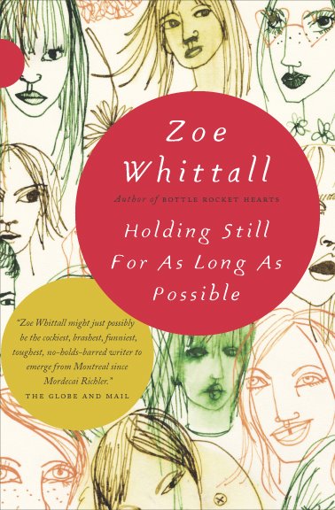
Holding Still cover

Before setting up her own design studio in Toronto, award-winning Canadian designer Ingrid Paulson was senior designer at McClelland & Stewart, and art director for Key Porter and Raincoast Books.

Although Ingrid worked at Raincoast, we didn’t actually meet until BookCamp Toronto earlier this year. We only had a brief a conversation, but it was just about long enough for me to blurt out that I wanted to interview her, and for the apparently unflappable Ingrid to say “OK” (and sound like she might mean it).

And so I do want to say a big thank you to Ingrid for coming through with such grace and patience, and for providing such wonderful answers to my not-so-wonderful questions.

Could you describe your design process for book covers?

In terms of workflow? The publisher gives me a title information sheet and/or a creative brief, plus (fingers crossed) either a few chapters or the entire manuscript for the book. I always ask to read the fiction, but for non-fiction I can manage well with a concise book description and perhaps the introduction. I submit a minimum of three cover concepts to my contact at the publishing house, and wait for feedback. Then I either redesign and resubmit, or, if I was ‘on to something,’ I tweak one of the concepts until we get it right.

In terms of creative process? Um. Well.

Some cover concepts appear in my head, fully formed, by the end of my first conversation with my publishing contact. Other get dragged out of me kicking and screaming, begging to stay in the dark void of my head. Sometimes I sketch out the covers — wee thumbnails in my moleskine — whereas other times I play a Google Images lotto search using various vague terms that would describe a feeling I want to associate with the book. Sometimes the font is the first thing chosen, or I envision the type at certain sizes and placed in specific places. Other times, the image is driving the cover and the type just has to play catch-up. I’ll envision a book as predominantly red, or dark, or punchy — and that all comes from what the author has written. I’ll respond to textured sentences with textured visuals (perhaps collage?) and bleak will meet bleak. (But not so bleak as to discourage someone picking it up. The bookbuyer is in my thoughts as well, as I try to envision them and their habits, quirks, and book needs.) Needless to say, my brain gets crowded.

And then there are the days when I just stare at a wall and hope against hope I’ll figure out something clever. I haunt a lot of bookstores.
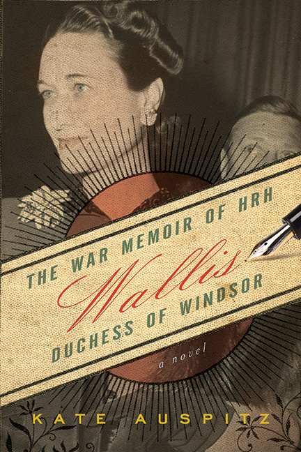
wallis

What are your favourite projects to work on?

The ones I get right on the first try.

I love working on fiction, but it takes the most concentration and, because fiction is so subjective, so evocative of the human condition (both funny and sad), designing a fiction cover can drive me nuts. There is never one absolute visual solution for fiction. Nonfiction, on the other hand, can get formulaic, but I love the simplicity of thought — punchline design, in many ways. So, for sanity’s sake, I prefer to keep a balance of fiction and nonfiction going. Cookbooks can be a blast to design, but I (sheepishly) think that comes from the photo shoot where we all end up eating most of the props (the ones that have flavour, or haven’t been sprayed with any shellac). And then there are the special projects where I’m asked to work on the cover and interior, and I am part of the planning and layout process, where I get to research the images, discuss things with the editors on a page-by-page basis. Those projects are rare, but they keep me happy for a few years at a time.

What do you think makes a good cover design?

Being able to lure someone into picking up the book and reading the back, which takes about 1.5 seconds of their time. Job done. How to do that? If we in publishing knew, we’d also be able to predict bestsellers. The best I’ve figured out is to keep it a simple visual package — don’t let the type look out of place with the image, don’t use the same colours as everyone else is using that season, stay away from looking too much like any of the other books, but make it look like a book. I dunno. The cover should evoke an emotional pull from the bookbuyer, that moment of ‘yes, that’s interesting and looks like what I want to read.’ That solution changes from book to book.

What are some of the common mistakes publishers and designers make with covers?

For publishers, they’ll try to make their book look similar to someone else’s (bestselling) book, as if to catch the wave. This is not clever, it just means the publisher is out of ideas or is feeling the year-end coming and needs to hook on to a sales-winner. It’s the publisher that took a design chance on a different look — and came out the winner in terms of sales — that is the ultimate winner. The rest end up on the remainder table eventually. Daunting. They don’t call it a ‘gentleman’s profession’ for nothing. (Or ‘gentlewoman’s’. I’m just citing the old, old adage.)

For designers, it is not being able to pitch their cover effectively. If a designer can articulate the reasons for their choices of colour, type, and image, then they have a fighting chance of getting that design through. Otherwise they are leaving it to speculation. I’ve worked both sides of the table — inhouse art director, freelance designer — and I know that it is ten times harder for a freelancer to get that voice heard in the meetings. But inhouse staff can get asked to revise designs far more often than the freelancer, as the perceived economies behind a salaried staff versus a per-project contractor sometimes give the publisher too much leeway on revisions. I’ve been inhouse with a book cover that I simply didn’t ‘get,’ but there was no way to contract out the job, as, due to costs, the publisher refused. It was a painful, long design process for all involved (not just me), and they ended up with something inferior to what they would have gotten with a designer who understood the book. As an Art Director, I could’ve just handed it to a specialist designer and, with a few good notes, gotten something much more suitable for the book.

I guess that leads to a codicil: know when to walk away. Yes, we all want to try new book categories. Just know when to draw the line, so to speak.

British and American book design styles are often seen as quite distinct (with critics and proponents of both!). Is there a Canadian style of book design?

What there is known of Canadian book design is an amalgam of quiet, well-crafted literary press style — usually hand in hand with DIY letterpress style — smashed against a desperate need for full-bleed sepia landscapes (or sleeping sepia people) and egregiously large title type. We err on the side of poetic, which can look like a wash in the stores (or worse — too literary, which could alienate those poor readers still recovering from their English high school reading list). We avoid edgy.

There is some astonishing design coming out of the cracks across the nation — David Drummond comes to mind, as does the brain trust under Peter Cocking at Douglas & McIntyre — and I hope that will win out. Clear, slightly subversive, more in tune with our world-famous sense of humour. Intelligent is the word that comes to mind.
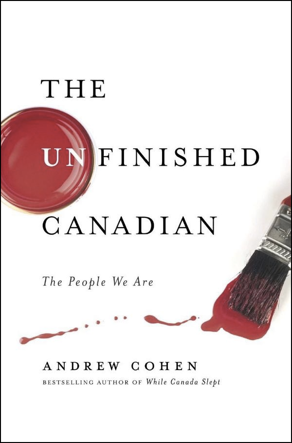
Do Canadian book designers have unique opportunities? Are they accompanied by particular challenges?

Figuring out new and exciting ways to design both hockey and ‘whither Canada’ books, which are a yearly staple on publishers’ lists. We are handy and imaginative with maple leaf imagery and the colour red.

You’re an artist as well as a book designer. Is there a tension between your artistic sensibility and the commercial design process?

Every day, and the design wins. I’ve tried to avoid overlaps, but words are images to me, so lately I’ve been working on art based around words. I try to keep it as three dimensional as possible (since my day work is two-dimensional), but then font choices become a factor and I run screaming. It helps to know that both Jenny Holzer and Barbara Kruger worked in designer/typesetter jobs early in their artistic careers.

The challenge lies in accepting and separating out design and art from their ultimate goals: design is created to communicate a product; art is created to communicate the world, in whatever form, or whatever scope, the artist chooses. There is no client in art.

How is designing book interiors different from designing their covers?

Interiors are, in many ways, a much more detailed exercise in communication. For a text-only book, I have to make sure that the reader never really sees the design, else it distract from their involvement with the text. For a picture book, the pictures stand tall, so the design should just assist the pictures. But a cover is a marketing tool, and the cover must try, in no uncertain terms, to woo the reader. It must stand out.
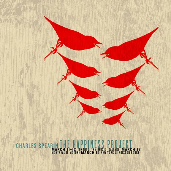
poster

Where do you look for inspiration?

Currently? Other designers (book and non-book), as well as music poster design. There is a great revival (when did it go away?) of one-off poster designs for gigs. They are all silkscreened or letterpressed limited-edition beauties. I used to look at rave fliers all the time (when raves were the thing). I look online. I remember stuff my mom — who was an antiquer in the 1970s — used to show me, old ads and magazines. I read a lot (beyond manuscripts), so I end up with this polymathic knowledge of, say, alchemical symbols and Greek demigods. We used to be such a visual culture, pre-literacy, and I think in many ways we’re heading back there. My job is to connect the shorthand symbols of the culture, both old and new. It can fascinate me for hours, why LOLCats is the thing (and then not the thing, but what did the visual say of us?), or looking at, say, a Dutch design student’s incredibly cool/obscure website.

Who else is doing interesting work right now?

I love designers with latitute — ones that aren’t just one-trick (or one-look). Who comes to mind? Coralie Bickford-Smith, Jason Gabbert, Terri Nimmo, David Gee, Gabriele Wilson, Peter Mendulsund… They all have style that can bend to the project. I could go on, but that’s today’s list. It will change and expand tomorrow.

You’re very active with your website, blog, and Twitter etc. Is it important for a designer to engage with people online?

You know, every time I blog (or answer nice questions like yours), I sit back afterward and fear that my opinion is going to lose me a client. There is this balance one must keep when designing, as the client is always right (or deserves the design they get, depending on the outcome), yet what designers put out there does contribute to our visual worldscape. So, I try to contribute.

But I work from home (or, in Toronto parlance, I have a ‘live/work situation’). Blogging keeps me from talking to the wall too much, or thinking that the cat cares when I’m sweating to find the right sans-serif. It has been fascinating to watch how many book designers have joined Twitter lately — we all seem to find each other, this odd subgenre of designers, and I think in the future, that will result in some mind-blowing design (or a great convention in Bend, Oregon). My purpose online is to build community, to share ideas, to groan when needed, and if other non-designers join the conversation, well, then it just becomes this great party.

With the growing popularity of e-books, what is next for book cover design?

Ack! I don’t know. I really don’t. We’ll see what happens. What I do know is that there will always be a role for design, but what that role takes is anyone’s guess.

Thanks Ingrid!

Comments closed

Something For The Weekend, August 7th, 2009

Winnie and Wolf — cover design by Alex Camlin (the chap behind that rather wonderful Harvard Review overhaul). I’m hoping to speak to Alex for the designer Q & A series later this month.

And just while were on the subject, Caustic Cover Critic looks at the new designs for the Penguin World War II Collection.

In Search of Lost Time — David L. Ulin, Book Editor of the LA Times, on the lost art of reading:

Today, it seems it is not contemplation we seek but an odd sort of distraction masquerading as being in the know. Why? Because of the illusion that illumination is based on speed, that it is more important to react than to think, that we live in a culture in which something is attached to every bit of time.

Here we have my reading problem in a nutshell, for books insist we take the opposite position, that we immerse, slow down… Yet there is time, if we want it. Contemplation is not only possible but necessary, especially in light of all the overload.

But, if you sympathize with this perspective be warned: you are weak and you just don’t love books enough (and you’re probably a calcified narcissist).

Talking Books — I don’t agree with everything here (OK I actually disagree with a lot of it and, I’m sorry, describing the Globe & Mail as “daring” is just  delusional), but Ian Brown, writer, arts journalist and broadcaster has some interesting things to say about Canadian literature and culture in a sprawling interview over at Conversations in the Book Trade:

[T]he novel is no longer the prime example of literature. Nor does it need to be. Too much attention can ossify a genre. If anything is in trouble, it’s literary fiction–but again, only because there are so many alternative ways to consume good writing these days. The book itself is a fantastic technology, but literary fiction has some serious competition for my attention.

And as this has been something of slow week, and because I was chatting about it with book designer Jason Gabbert on Twitter (who is responsible for the lovely C.S. Lewis redesigns above), I’m just going to take this opportunity to (re)plug my image library on Image Spark and (while I’m at it) my slightly stream-of-consciousness inspiration blog The Accidental Optimist.

4 Comments

Midweek Miscellany, August 5th, 2009

Foucault — A nice new cover design from David Drummond (approval pending).

(And apparently I like photos of the backs of people’s heads)

Kill Your DarlingsPrint asks book designers Carol Devine Carson, John Gall, Paul Buckley, Rodrigo Corral, John Gray, Gabriele Wilson, Paul Sahre, and Peter Mendelsund about the covers that didn’t quite make it:

every book jacket designer has at least one that got away—a fresh, inventive cover that was shot down en route to the bookstore shelf. These “lost” covers form a parallel universe in which the books we read and love exist in entirely different skins.

Re-typing History — The Financial Times reports on typographer Mike Parker’s challenge to the accepted history of the ubiquitous Times New Roman:

The… evidence for his version of history is a brass pattern plate bearing a large capital letter B. He holds the plate up to show the familiar form of the letter, its characteristic curves and serifs. The point, he says, is that such pattern plates represent a technology that was not used after 1915. The creation of Times New Roman was announced in 1932.

Bite-Size Edits — Baking books with the Book Oven chefs.

Forgotten Bookmarks — the “personal, funny, heartbreaking and weird things” found in books at a rare and used bookstore.

The Book Depository launches in the US. There are details at The Book Depository blog.

And finally…

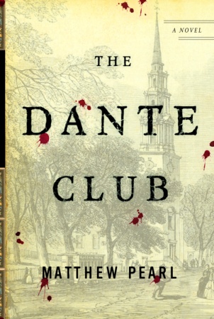
Trial and Error — Author Matthew Pearl discusses the evolution of the cover for his novel The Dante Club. It’s nice to read about an author not having a hideous experience with a publisher for a change, and I actually think that the cover design for The Dante Club, while not flashy, gives a lot of great visual cues to readers about the nature of the book (which is really what it is about isn’t it?).

1 Comment

Q & A with Ingsu Liu, W.W. Norton

Having spent a lot of my life in the UK, I wasn’t particularly familiar with venerable New York independent publisher  W.W. Norton and Co. until my stint at Toronto’s (now doomed) Pages Books and Magazines where their books were frequently on tables.

Although I left Pages a few years ago, I was recently reminded of the breadth and quality of Norton’s books — and, of course, their covers — by their decision to archive their book cover designs on Flickr.

In a roundabout way, the launch of the design archive also put me in touch with Steve Colca, Norton’s online marketing manager. He in turn, hooked me up with Ingsu Liu who kindly agreed to talk about the design process at Norton for this week’s Q&A.

Currently V.P. art director at W.W. Norton, Ingsu Liu graduated from the graphic design program at Pratt Institute in 1988 and began her career at Penguin, William Morrow and Vintage Books before accepting a position at Norton in 1997.

Briefly, describe your role at Norton

I oversee the hardcover jacket imprint.

How many designers are on your team?

I oversee two in-house art directors; together we collaborate with various outside freelance designers, illustrators, art researchers and photographers.

Approximately how many covers does Norton require each season?

About 55 to 75 books each season. We do 2 seasons, for a total of roughly 125 books a year.

Is there a ‘house’ style?

I certainly hope not. I believe it’s most beneficial to be diverse, so that each book jacket can have it’s own voice. This helps to keep the list fresh and my job more fun.

Do you approach fiction and non-fiction differently?

It really depends on what the book requires, but the basic process is the same. First I talk to the editor, publisher, and marketing… then drawing from those conversations, the book brief, the author’s writing, the current market place, the comparative titles and what the book is about, I then decide which direction the jacket should go and set out to assign the best designer or artists for that title. My focus is on what’s best for the particular title, everything else comes naturally after.

Which books provide the biggest challenges?

The titles that no one can agree how best to market the book and therefore what sort of jacket it should have. Also, big print runs where there is more at stake. Then, there’s the occasional book where the author’s 6 year old daughter gets to dictate the jacket design.

What do you look for in a cover design?

Craftsmanship, mood… but a strong concept will always rule the day. Also, the surprise factor is pure gold; nothing is worse than the “same design, different day” effect. A design should, at the very least, have its own point of view.

How are final covers decided upon?

After I have decided on who is best to work on the cover design, I start presenting the designs at our jacket committee meetings. There we narrow it down to one final choice. Then — when there is not a six year old involved — the author, the author’s agent, the editor, the marketing and the publisher all have to sign off on one final jacket design. Sometimes, after we finally get all these diverse interests on the same boat, a single book buyer can kill our jacket and we start the whole process all over again.

Do you think there’s a tension between producing creative covers and what will play in the market?

See the last sentence in my answer above. That said, we are constantly being subjected to various subjective opinions. It is my job, when I can, to filter through it all and to use the good advice and to discard the bad… and unfortunately, the folks with the bad advice often have the loudest voice. See Dick Cheney.

Have you any recent favourites?

Obsession: A History by Isaac Tobin (University of Chicago)

Milk by Barbara deWilde (A.A. Knopf)

Pride and Prejudice and Mansfield Park by Leigh-Anne Mullock

Metamorphosis and Other Stories by Mother (Penguin Classics)

Waiting For The Barbarians by Paul Buckley (Penguin)

Sedaris by David Drummond (University Of Minnesota Press)

The Paranoid Style by Brett Yasko (Vintage)

The list goes on and on, and on….

Do you discern any current trends in American book cover design?

Most obvious is the rebirth of interest in comic artists. Whether it is a whole book or just a jacket image, I never get tired of seeing great comic art. Growing up in Taiwan, I spent countless hours lost in thousands of comic books, it is what inspired my interest in art and has kept my fascination to this day.

Also it’s nice to see so many designers and artists collaborating so that hand-done art is being combined beautifully with all these hi-tech designs and applications. This mix of raw and slick often creates the most interesting packages.

Are they any designers whose work you particularly admire?

Sagmeister, Will Staehle, Evan Gaffney, Louise Fili, Peter Mendelsund, John Gall, Paul Buckley, David Drummond, Patti Ratchford, David High and Gabriele Wilson. The fact is there are too many to list…

Are there any book or design blogs you read regularly?

I mostly still enjoy going to the book stores to be inspired, but Eye Magazine, the annuals from Print, Communication Art, AIGA, and the Type Directors Club are the good old standby’s for me. For blogs, I like FaceOut Books, The Book Design Review, Design: RelatedThe Book Cover Archive, and most recently The Casual Optimist. And now that you’ve interviewed me, your blog is totally awesome!

With the growth in e-books, do you think cover design will continue to be important?

I very much hope so. I love holding a beautifully produced book in my hands. But the fact is that one must embrace the future — for it’s coming whether you want it to or not.

Thanks Ingsu!

With special thanks to Steve Colca, Manager of Internet Marketing at W. W. Norton & Co. for arranging the interview

UPDATE:

Since originally posted on August 4th, 2009, some of the images accompanying this interview have been changed. The previous images were my selections from the W.W. Norton Design Archive on Flickr chosen to illustrate the work of some of the designers mentioned in the Q & A and to reflect the diversity of books designed and published by the team at W.W. Norton. To avoid confusion, all the current images were art directed by Ingsu Liu.

Design credit for the individual covers included in this post:

Flash Fiction Forward Design by Rodrigo Corral
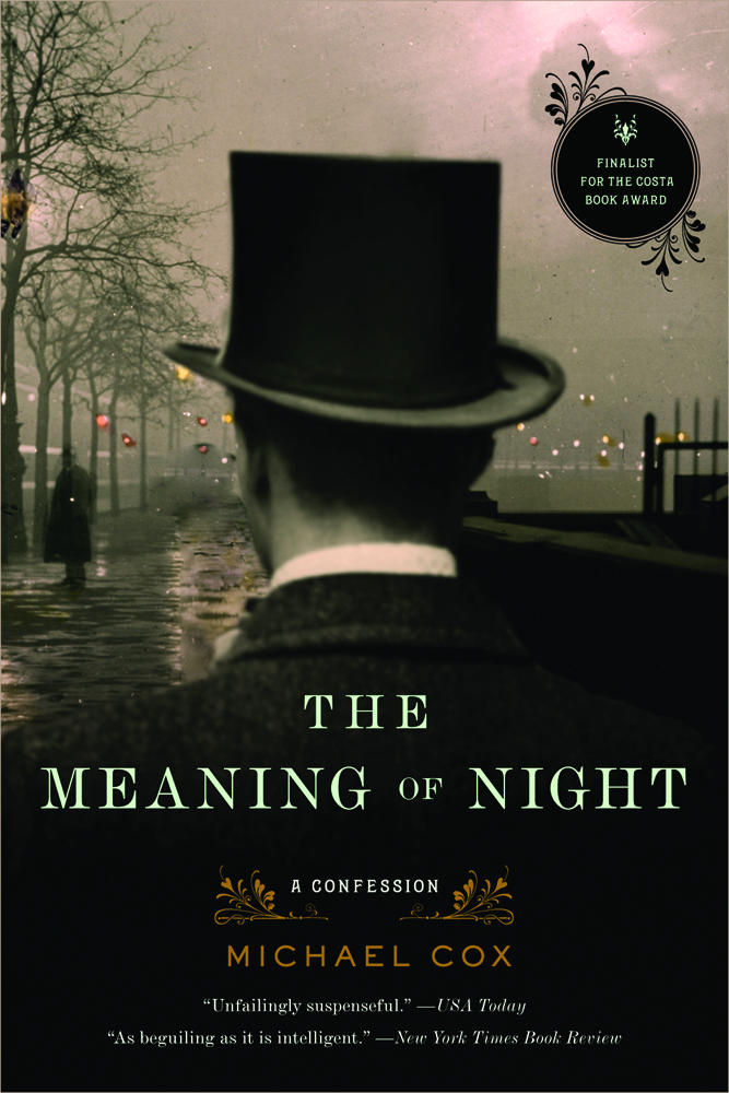
The Meaning Of Night Design by Patti Ratchford
Busted Design by Jon Grey
What Can I Do When Everything’s On Fire? Design by Evan Gaffney
Stitches Design by Paul Buckley

4 Comments

Midweek Miscellany, July 15th, 2009

Vintage Camus — Seen at Bente Miltenburg‘s Flickr photostream (via A Journey Around My Skull).

An Intricate Dance — Author Sonya Chung describes her experience of the cover design process (and the weird — slightly tortured — anxieties that accompany it) for her debut novel Long For This World at The Millions blog (via Duke University Press on Twitter):

I am still a little nervous – having no control over the final printing process, color-correcting, etc. – about what this cover will look like. But I also realized that as each response piled on one after the other in my inbox, I was beginning to delight in the wackiness of the whole thing.

And on a related note, writer Neelanjana Banerjee looks at stereotypical images of Asian Americans on book covers in Hyphen Magazine (issuu document). Henry Sene Yee, creative director of Picador, makes an interesting general point — which I think is often forgotten — about ‘recognizable codes’:

“Russian constructivist font for Russian books; torn paper and beige for Westerns; italics, diamond rings and legs for women’s fiction… The writer is tapping into this culture; so is the designer, and so is the reader.”

GroupThink — After a bit of a hiatus, designer Christopher Tobias is back blogging with a series of discussions on book design:

Beginning today, I plan to post an ongoing series of questions aimed at book designers as a way of opening discussion about various topics related to our industry… Others outside of book design are certainly free to field the questions or give input. I hope that together we can compile a nice collection of discussions for the benefit of those in the profession now and in the future.

Swiss — A bilingual, expandable book designed for the UK art and design gallery Blanka by Dylan Mulvaney: “It honors Josef Müller-Brockmann as well as conveys the principles of Swiss Graphic Design as exemplified by the leader of the revolutionary Swiss Style.” (via SwissMiss and Swiss Legacy).

Good — Christopher Simmons has a quick chat about The Good Design Book project with Grain Edit:

I frequently come back to the definition of design proffered by Charles Eames: “Design is a plan for arranging elements to achieve a particular purpose.” If you break that down, it contains 5 equal parts: the plan (strategy), the arrangement (layout or formalism), the elements (content), the achievement (result) and the purpose (the goal). Good design can therefore be thought of as design based on a good strategy and which features a good arrangement of good content for a good purpose. And of course it needs to yield good results.

And lastly… Following the survey of Mick Wiggins work (mentioned previously here),  Caustic Cover Critic discusses those rather lovely Steinbeck covers with the illustrator:

The Steinbeck gig was about as dreamy a gig as an illustrator can hope to land: 24 covers to date, I think. It was not difficult in the sense of inspiration—he’s so good at evoking mood, and his settings are described so beautifully—but the flop-sweat for me was intense. Steinbeck’s such a classic figure in the literary landscape and bookshelves, delivering art that disappointed was not an option.

4 Comments

High-Rez Himes

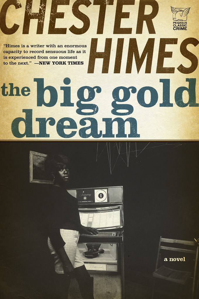
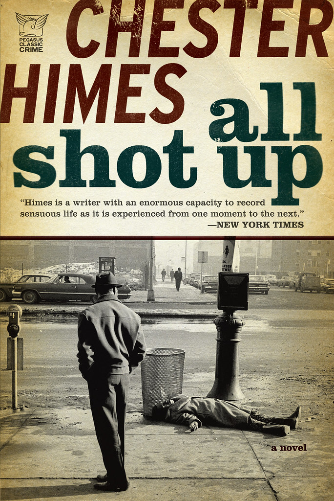
After my slightly snarky comment yesterday about publishers and designers making hi-res cover images readily available, Michael Fusco emailed me with said images for his fantastic Chester Himes covers for Pegasus.

Here they are in their full typographic glory:

Worth the wait I think…

You can see more of Michael’s work at his website and design:related portfolio.

3 Comments

Monday Miscellany, June 29th, 2009

Gestalten’s Naïve: Modernism and Folklore in Contemporary Graphic Design, edited by Robert Klanten and Hendrik Hellige,  reviewed at The Designer’s Review of Books.

Served — Jeremy Ettinghausen, Penguin UK’s Digital Publisher, explains the rationale for their new (v. cool sounding) project for kids We Make Stories:

[A]s the debate about the value and price of digital content rages on, I’m testing out a new mantra on my suspicious colleagues; services not content. The idea, ill-formed as it is in my head, is that while we might continue find it a challenge to get consumers to pay for digital content, we might be able to use our skills, expertise and experience to create services that people will pay for. Services are what we do for writers, so perhaps there might be services we can create for readers.

Proof I think — were it still needed — that not all the most interesting book stuff is being generated in Seattle.

Friction — Laura J. Murray’s excellent critique of Brett Gaylor’s documentary RiP: A Remix Manifesto for Culture Machine (PDF). Murray’s comments about a copyright  ‘war’ and choosing ‘sides’ certainly resonated with me:

I’m not on any side, because I’m not in a war. Such language is a) a kneejerk echo of the Hollywood/recording industry message, b) offensive to anyone who has ever experienced a blood and guts war, and c) a joke to those who are not already convinced of the importance of remix. But most importantly, it is, d), an unproductive way of framing our current copyright challenges, because it suggests that the debate won’t end until one side has achieved total victory.

Amen.

The State of the Union — A big sprawling spaghetti post from the the chaps at Three Guys and One Book (loosely) about the state of publishing from the perspective of readers (mostly). I don’t agree with all of it by any means, but some of it sticks…

Less, But Better — A profile and brief interview of design hero Dieter Rams at BBH Labs. Just FYI — If I ever write a publishing manifesto (ha!), it will be called Less, But Better: A Publishing Manifesto. And just for the hell of it, here are Dieter Rams 10 principles of good design:

  1. Good design is innovative
  2. Good design makes a product useful
  3. Good design is aesthetic
  4. Good design helps us to understand a product
  5. Good design is unobtrusive
  6. Good design is honest
  7. Good design is durable
  8. Good design is thorough to the last detail
  9. Good design is concerned with the environment
  10. Good design is as little design as possible

Most, if not all, of these principles could be applied to publishing. Who (or where?) is publishing’s Dietar Rams?

And finally…

Big Gold Dream — Michael Fusco’s great redesigns for the Pegasus Classic Crime reissues of Chester Himes seen (of course) at FaceOut Books. Michael Fusco has some more great cover designs on his website.

(And a quick side note to publishers and designers — it was impossible to find decent hi-res image of these covers. If you want people share your brilliant work, you need to work on this. Ideally I want images that are at least 400px x 600px)

1 Comment