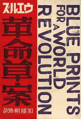
Blue Prints for a World Revolution — seen at the Antiquarian Bookshop 108 Buddhas, which has an amazing collection of avant-garde journals and books from Japan and Eastern Europe in their gallery section (via Michelle McCormick’s Inspiration Resource ).
12 Steps to Better Book Publishing — Good stuff from Jonathan Karp, publisher and editor-in-chief of Twelve Books in Publishers Weekly:
It seems likely that the influence and cultural centrality of major publishers, as well as other producers of information and entertainment, will diminish as digital technology enables more and more people to create and share their work. This is exactly why publishers must distinguish themselves by doing better what they’ve always done best: champion books that offer carefully conceived context, style and authority.
The State of the Industry — Neil Nyren, senior VP, publisher and editor in chief of G.P. Putnam’s Sons talks to author J.T. Ellison at Murderati (via @sarahw).
Poetic Interiors — Some lovely typography for Arrays of Conscious by Chanson Duvall at Beyond the Covers.
Embracing Change — Victoria Barnsley, chief executive and publisher at HarperCollins UK, profiled in The Guardian:
There are still concerns about the digital future, such as how to continue making money. “There are some very big questions that we still have to answer – the biggest one being value,” says Barnsley. “How to make sure that consumers are going to be prepared to pay for digital content, because a lot of them are getting quite used to getting it for free?”
And yet…
Why newspapers can’t charge for online content — Dan Kennedy elsewhere in The Guardian:
I have no philosophical objection to the idea that news organizations ought to be able to charge for their online content. The problem is that it’s highly unlikely to work – mainly because there are too many sources of free, high-quality news with which they’re competing.
Font of Ill Will — Vincent Connare, designer of Comic Sans, profiled at the WSJ:
The font, a casual script designed to look like comic-book lettering, is the bane of graphic designers, other aesthetes and Internet geeks. It is a punch line: “Comic Sans walks into a bar, bartender says, ‘We don’t serve your type.'”
And finally…
Soldiers of Lead — An introduction to layout and typography for use in the Labour Party (via Design Observer).
Comments closed
