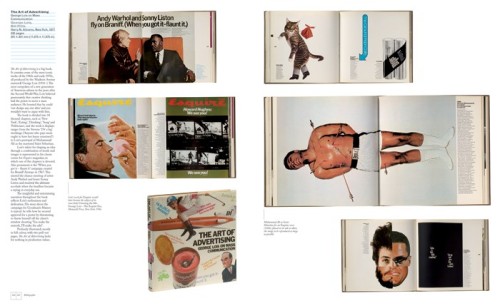
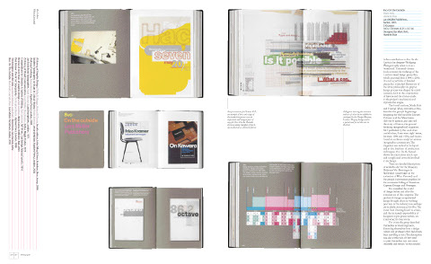
 Jason Godfrey’s Bibliographic: 100 Classic Graphic Design Books was one of my favourite books last year.
Published by Laurence King in the UK, the book is distributed by Raincoast in Canada (Chronicle Books in the US) and so I was fortunate enough to have the opportunity to ask Jason a few questions about the book and get some lovely spreads from the publisher.
My original plan was to run the interview on the (recently redesigned) Raincoast website, but ultimately the interview was a little too long for our blog there, so I’ve decided to republish the whole unexpurgated monster here.
As I mentioned on in my original Raincoast blog post, Bibliographic is not history of graphic design or even a definitive list of 100 books on the subject — it’s more of an essential design book shopping list — and basically I really wanted to know why Jason decided to make the book, how he decided on the final selections, and what exactly was informing his decisions.
We corresponded by email…
What was the inspiration for Bibliographic?
There was a need for a illustrated resource of graphic design publishing. Many books and articles contained very good reading lists but I had always found them rather detached without the visual reference. The best graphic design books are important artefacts in the history of graphic design and many of the books are becoming difficult to find and access.

What criteria did you use to select the books?
The only rule that was applied throughout was that the books had to be visually interesting, there seemed little point in photographing books that would not look appealing on the page. That the books were designed by some of the cream of graphic design this turned out not to be a big problem but it did mean that some important critical analyses had to be put to one side.
Did you ask other designers for their recommendations?
Whilst mentioning to other designers that I was working on Biblographic I found that they were very keen to promote their own favourite titles and it did help extend the list and also confirm the importance of books that had already been chosen. As part of the book I asked about 20 designers to give me a list of 10 books from their own library, this was an idea borrowed from the designer Tony Brook at Spin who had earlier published a newspaper Spin 2 with reading lists from 50 designers.

Was it difficult to decide which recent books to include?
To gauge which newly published titles will come to be seen part of the canon of graphic design books is not the easiest of tasks. Looking back from a distance helps to establish the relevant trends and lends more perspective to any choices. Regardless the best books all seem to be those that can tell a good story. One recent book, Mark Holt and Hamish Muir’s 8vo: On the Outside (Lars Müller Publishers, 2005) did just this, exploring the process of the studio’s work and the effect of technological on this process and output in a thoroughly engaging book.
There are photographs of every book included in Bibliographic. Were any of the books difficult to locate?
A number of the books are from my own collection others I borrowed from friends and colleagues. Some were so precious I had to send the photographer Nick Turner over to where the their owner could keep them in sight at all times. A handful of books I could only locate at the St Bride Printing Library who were kind enough to facilitate their shooting.
Were there any books you wanted to include but couldn’t access?
Early in the process of compiling my list of 100 books I decided that many of the early examples of early 20th Century graphic design books particularly those of the typographic revolutions of the 1920s and 1930s would be too difficult to access as they are now the preserve of museums. It would all have taken me too far from my premise that Bibliographic could be representative of a working studio library.
Which books came close to being in the 100, but didn’t quite make the final cut?
Tough choices had to made particularly where an author or series of books were successful. Alan Fletcher is very well represented in the book and I couldn’t justify putting in the excellent Identity Kits: A Pictorial Survey of Visual Signals (Studio Vista, 1971) a book he co-authored with Germano Facetti the then art director at Penguin Books. Another book that came very close was Robert Bringhurst’s The Elements of Typographical Style (Hartley & Marks, 1992) which I felt lacked the visual punch necessary for Bibliographic.

Of the books you don’t own in Bibliographic, is there one that you particularly covet?
The 1926 Deberny & Peignot, Specimen Général would be a welcome addition to my library. There was copy in a studio I worked for and I was forever using it as a point of reference or just to admire the elegant section dividers designed by Maximilien Vox.
When did you start collecting design books?
There are a few books that I have from when I was a student but I didn’t seriously start collecting until I had been working professionally for a few years and made a decision to stop buying records in favour of what I found to be the more fulfilling occupation of acquiring books.
What is on your ‘to buy’ list?
New Graphic Design in Revolutionary Russia (Lund Humphries, 1972) by Szymon Bojko is a book I am trying to locate. I have yet to see a copy but it was designed by Herbert Spencer the author and designer of Pioneers of Modern Typography (Lund Humphries, 1969) and so I am expecting an interesting book.
In the introduction to Bibliographic, Steven Heller says he has a separate apartment for his books! How extensive is your library?
Mine is not as nearly extensive as Steven’s although it does take up a large part of my studio and I am in need of extra shelving at the moment. It also needs saying that in common with most designers my collection also contains many books on the arts, photography and others of general interest.

What is your own design background?
I graduated from the Royal College of Art in London and worked for a number of years at Pentagram Design, then moved to New York and Austin, Texas before returning to London and setting up my own studio.
What were the challenges of designing a book about design books?
After the efforts of writing Bibliographic the actual design was very enjoyable. Because each spread contains only one book the challenge was in arranging the images to create an enjoyable flow throughout the book. The spreads from the photographed books are so rich with graphic imagery that I was worried that the pages would look like graphic wallpaper if all the images were kept in pro, but changing the scale of the spreads helped to create changing areas of white space and focus the readers attention on one spread at a time.
Could you describe your process for designing books?
Knowing the amount of copy and image count for an average page is the start for any book design project. From this point I can begin to form a grid (invariably using the guides in Derek Birdsall’s excellent Notes on Book Design (Yale University Press, 2004), chose the typefaces, text and headline styles, treatment of imagery and other pagination. This will go to form sample spreads that are approved by the publisher before advancing on the book proper.

What does the future hold for book design?
The evolution of book design seems to move at a glacial pace, its foundations are based on a template centuries old with some 20th Century tweaks by the likes of Lászlo Moholy-Nagy and Gyorgy Kepes. Advances in printing technology have and will allow for more flexibility in how pages are laid out and inevitably there will be new fashions and styles to accommodate but little wholesale change.
Thanks Jason!
Like this:
Like Loading...


