Skip to content

Tag: Canada

Vol 459 Series Design by David Drummond

9782896494927

These stylish covers were designed by Canadian designer David Drummond for a series of new novels from Montreal-based publisher VLB éditeur. In the series, four different authors imagine the same plane journey on flight 459 from Paris. Planes on covers has spot UV:

9782896494866 9782896494880 9782896494903

1 Comment

Le Quartanier Série NOVA by Catherine D’Amours

Nova-06

Catherine D’Amours of Pointbarre Collective recently got in touch to tell me about NOVA, a series of ten novellas she designed to celebrate the tenth anniversary of Montreal-based publisher Le Quartanier. Opting for a minimalistic grid and a sober sans-serif font, Catherine designed ten illustrations and typographical stamps for the covers and, as you can see, the results are quite beautiful.

Nova-08

Nova-03

Nova-02

2 Comments

Q & A with Jessica Sullivan

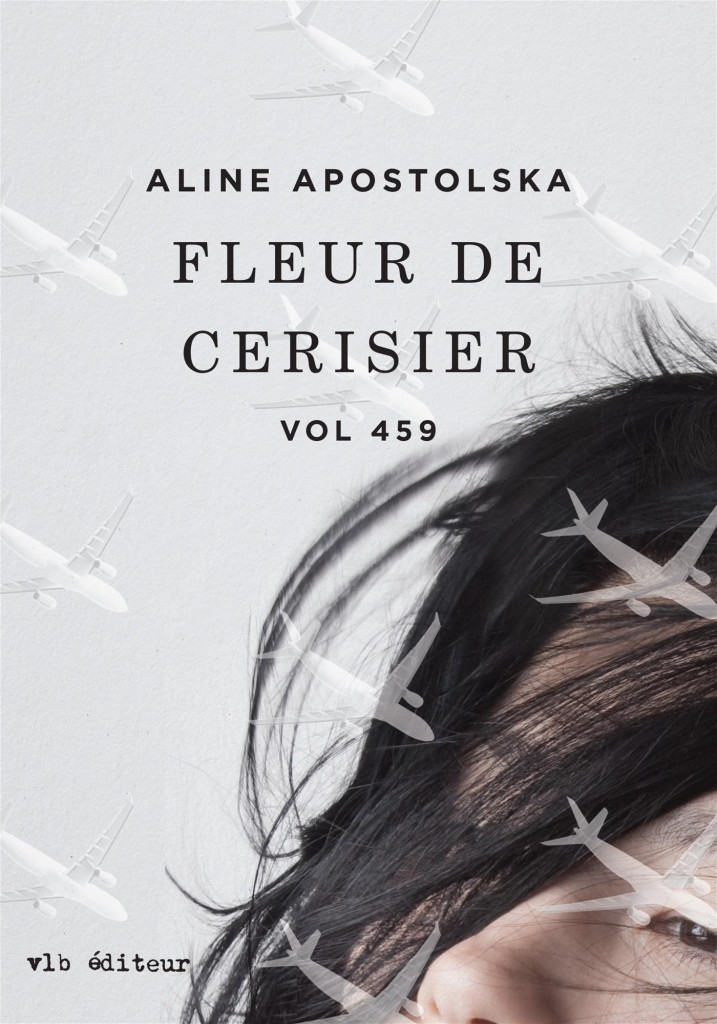
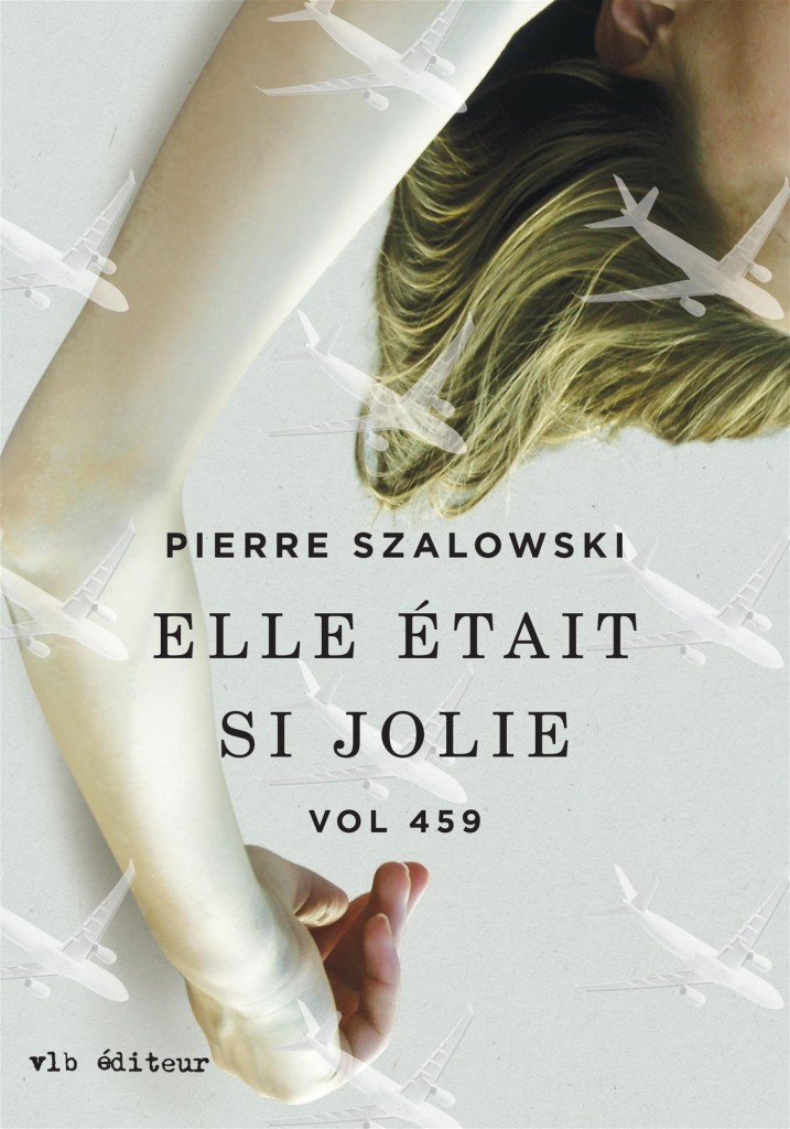
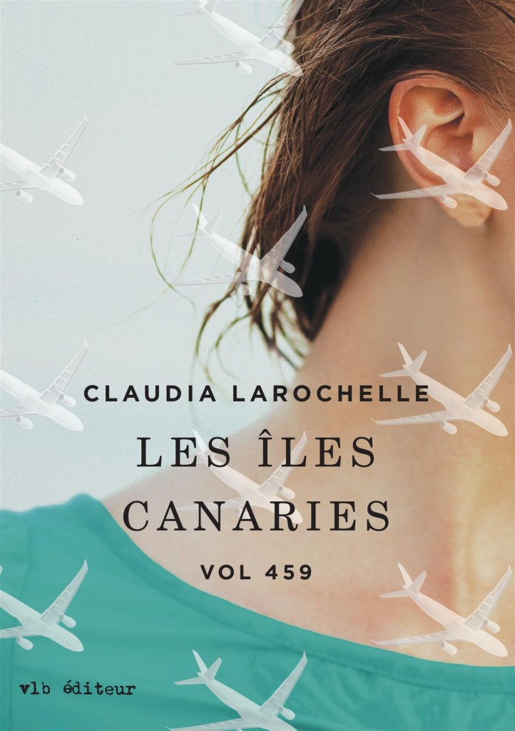
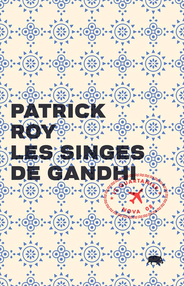
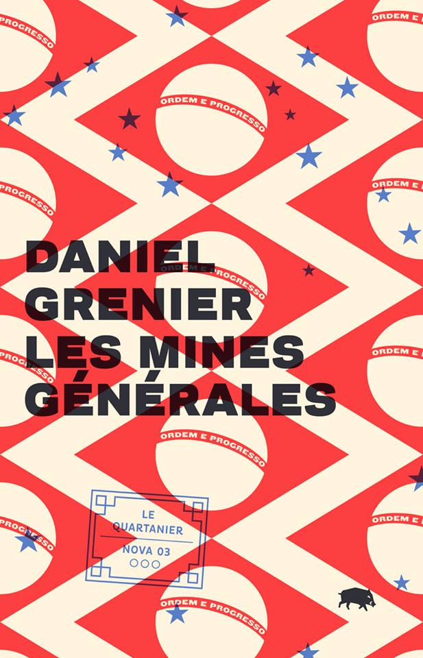
If you saw my post on Canadian book covers last year, then you’ve already seen the work of Vancouver-based designer and art director Jessica Sullivan.

I first came across Jessica’s name in 2009. I was trying to convince Peter Cocking, then art director at Douglas & McIntyre, to agree to an interview. Peter, in his way, was having absolutely none of it (and still isn’t, really), but he did suggest that I talk to his senior designer Jessica Sullivan, “the best book designer in the country.” Nothing came of it then, but I did start to pay attention to Jessica’s work — to be honest, it was hard to miss her distinctive style, impeccable typography, and quite how many Alcuin Awards she was winning!

Now, five years after that original conversation with Peter, Jess is now working as a freelance designer and part-time art director for Greystone Books, and still delivering some of the best book covers in the country. In this interview she discusses her work, her career, and offers some advice for designers starting out today.

Jess and I corresponded by email.

When did you first become interested in design?

I took an art class for the very first time in grade ten. My teacher was a graphic designer and one of his clients was A & W. My 15-year-old self thought that was just about the coolest job I could have imagined.

From that day forward any time anyone asked me what I wanted to be when I grew up, I said Graphic Designer. Even though I didn’t really know what that meant.

Did you study design at school?

My determination to be a designer was thwarted by a scholarship to UBC, so after a bit of a detour, I rerouted and attended the Emily Carr Institute of Art + Design and received a BA in Communication Design.

Where did you start your career?

I think I started my career at school. I had this perception that landing a design job on my own was going to be impossible (I’m not sure why). I had it in my head that my first job would materialize through one of my instructors. I treated school like a very long job interview, only not so well-dressed. By fourth year an offer came by way of my typography instructor Peter Cocking, then Art Director at Douglas & McIntyre. A position was created for me and the two of us became the new in-house design department. And a book designer was born.

How long were you at Douglas & McIntyre?

9.5 years. During my tenure I married, had babies, designed hundreds of books and experienced a bankruptcy—theirs, not mine.

Has working freelance been very different from working in-house?

In almost every way. I’ve always enjoyed my job, but now I enjoy so many more aspects of it. There is a lot that’s rewarding outside of the work itself. You’re fairly invisible in an in-house scenario. There’s little you can change about process and there is an historical nucleus to the way things are done. It’s a lot simpler to affect change when it’s just me I’m dealing with. I’m pretty easy to work with.

Are you still designing books and book covers?

Yes, absolutely. I just design more than books now.

What have you worked on recently?

I’ve recently designed a book series for MOA [Museum of Anthropology] at UBC, I’m currently working on a visual identity for an editing and writing services company which I’m having a lot of fun with, and I just wrapped up a project for an exhibition of Japanese woodblock prints from the 1800s. I also continue my work with Greystone Books as their art director. A position which adds balance and bit of chaos to my work flow and ensures I leave the house at least once a week. It also guarantees a few good laughs—it’s a great office to work in.

What are your favourite kinds of projects?

I love it when after your first meeting you’ve not only fallen for the project itself (you have a vision for it, you can’t wait to get started, you can SEE how you’re going to make a difference and bring something to this thing) but you’ve also fallen for the people, the client. Every time this happens, and I’ve been very fortunate over the past 14 months as it’s happened quite frequently, I walk away from those meetings like there are tiny, little clouds under my feet.

What kind of books present the greatest creative challenges?

Fiction covers. I don’t know if I hate them or love them. It’s such a hard market, competitive and over saturated, so the cover becomes of utmost importance. It’s usually the most painful genre when designs are rejected, and I’m generally unfazed by rejections at this point in my career, it’s just part of the job. But I’m fairly opinionated regarding fiction and powerless in terms of persuasion, so it can make for a tortured process. And I might be over exaggerating a bit here.

Can you describe your process for designing a book cover?

If it’s fiction, I read the book, otherwise I read the synopsis and familiarize myself with the content and tone. Then I think. That’s probably the most important stage. Generate as many ideas and concepts from all that thinking. Source imagery or create imagery or have imagery created. Add type. Explore, test, judge, select, refine. Judge, select, refine. Judge, select, refine. Sleep. Wake up and see if I still agree with myself. Submit.

What advice would you give a designer starting their career?

1. Be professional at school. Be on time, hand things in by deadline. Design communities are often small. You will encounter your instructors out in the world. They will remember you if you pissed them off with your laziness. They will not hire you.

2. You only get out of school what you put into it. They can’t teach you to be a good designer; that comes from work and practice. Ensure that every instructor you encounter enriches your education—you are paying for it.

3. Continue to grow. If your job becomes boring—challenge yourself. Give yourself personal goals within your projects. Ensure that everything you create is adding to your own personal archive. When you’ve amassed what you need don’t be scared to leave and move on to the next challenge.

Is there a supportive design community in Vancouver?

I’m not really sure. I do feel I am part of a supportive community—although it’s not actually composed entirely (or much at all) of fellow designers. I’ve been told one exists in Toronto, and I have to admit, I am very curious about it all.

Where do you look for inspiration, and who are some of your design heroes?

I try to be aware of my surroundings, to makes connections of all kinds, not just in design. I like old things and new things and mixing the two together. I’m always looking at stuff. Printed stuff: books, magazines, wallpaper, packaging. Moving stuff: movies, documentaries, TV, birds. Invented stuff: art, architecture, interior design, music, fashion. Stuff that just exists: fish—which have the most amazing colour palettes, snow affirms the beauty of white space.

I am a fan of Barbara deWilde, Gabriele Wilson, John Gall, Paul Rand, Charles and Ray Eames, Charley Harper, B. C. Binning, Rex Ray. I’m not sure if any of them ever rescued anyone though.

What books have you read recently?

That’s a hard one. I’ve been so busy lately that I honestly haven’t had time to read anything besides work related matter. I used to read in transit and at night, so I consumed a lot of books on a monthly basis. Now I write proposals and tend to email on the bus rides and research in the evenings and fall asleep before I can finish a page of the book that’s sitting next to my bed, Ingenious Pain. The last book I read that I really devoured was Million Little Pieces which is strange because I almost exclusively read novels.

Do you have a favourite book?

That’s not possible. I can’t even say I have a favourite author. There’s just too many, too much to choose from. And I read all kinds of fiction, some of my favourites: A Spot of Bother Mark Haddon, Tom Bedlam George Hagen, On Beauty Zadie Smith, As I Lay Dying William Faulkner, The House of Mirth Edith Wharton, The Collector John Fowles, The Chimney Sweeper’s Boy Barbara Vine, The Mysteries of Pittsburgh Michael Chabon.

What does the future hold for book cover design?

I don’t really see that much changing, to be honest. Unless we’re no longer allowed to use paper, and we go back to the time where stories are housed in people’s memories. And then I’ll be useless for a number of reasons. I have a terrible memory for that kind of detail.

Thanks Jess! 

4 Comments

Emily Carroll Through the Woods

I really like Emily Carroll‘s online horror comics, so I’m really pleased that a collection of her work is going to be published by Simon & Schuster next July. Through the Woods will include comics like His Face All Red as well as some new, but similarly dark and folkloric, short stories Carroll has been working on.

(via Robot 6)

Comments closed

50 Canadian Book Cover Designs

Lists are always problematic, but CBC Books longlist of Canada’s Most Iconic Book Covers seems strangely underwhelming somehow. Setting aside what counts as ‘Canadian’ (some of the books on the list were not designed by Canadians for example), ‘iconic’ covers are inevitably those that have stuck around and we are most familiar with, not necessarily those that are well designed or particularly interesting to look at. Needless to say, the list says more about our fondness for certain books and authors than about the current state of Canadian book cover design. Perhaps it isn’t really fair to judge the CBC’s contest this way, but it makes the list less interesting than it might otherwise have been (to me, at least).

That said, I am terrible, no good Canadian. 10 years and one Canadian passport later, I still feel like the immigrant I am. It’s not that I feel particularly British any more (if I ever did), it’s more like I haven’t finished unpacking yet (which might literally be true come to think of it)! In nearly five years of blogging I haven’t dedicated a single post to Canadian book design. To remedy to that, below are 50 (FIFTY!) recent book covers designed in Canada. Some of them are well-known, some of them are award-winners, some of them were recommended, some I’ve posted before, and some are just personal favourites. I can’t say they’re ‘iconic’ but they are all great covers. Enjoy. (Pictured above: The Bedside Book of Beasts by Graeme Gibson; design by Scott Richardson; published by Doubleday Canada).

15 Comments

Something for the Weekend

The Many Lives of Donald Westlake — Michael Weinrab on the work of Donald Westlake, for Grantland:

The Outfit is 213 pages, which is actually somewhat long by the standards of the early Parker novels. There are 24 Parker titles in all, and most of the early ones are tight little symphonies of spare and rigid prose, split into four distinct movements; they somehow manage to adhere to a rough formula and still blow your hair back every time. Their tone is brutal and unsentimental, and their themes are Nietzschean to the extreme: People act, without adverbial accompaniment, and the whys and wherefores are utterly beside the point. The protagonist is a career criminal, a sociopathic utilitarian who despises small talk. When someone asks him if he had a good flight to his destination, he thinks, This wasn’t a sensible question. He is concerned entirely with the successful execution of crimes and with his own self-preservation amid this process. One memorable chapter ends with the line, “He buried him in the cellar in the hole the kid had dug himself.”

The Parker novels, written by Westlake under pseudonym Richard Stark, have been republished by the University of Chicago Press, with covers designed by David Drummond.

Simulations  — Tim Maughan on Extreme Metaphors, a new collection of interviews with J.G. Ballard, at Tor.com:

You can perhaps argue that Ballard missed the big change that was to come just years after his death—the apparent crisis of global capitalism, the shift of industrial and financial production towards the east, and the tightening pressure on the suburban middle classes that this would result in. But the kicking back against these pressures, in the form of the online rebellion and well mannered protest of Anonymous and the Occupy movement, seem to fit perfectly into this description. Both are, in many ways, more of a simulation of a protest than an actual protest themselves—one involves doing little more than clicking a mouse, the other seemingly owing more to music festivals and camping than to hard-fought political resistance.

Let It Bleed — An interview with cartoonist Yoshihiro Tatsumi at Hazlitt:

The parents were really up in arms about these bad books. Manga at that time was different than it is now. It was friendly manga, so little kids could read it too… On the page you have the same number of panels, the people move from left to right and they’re all the same size and it all looks the same on the page… There was no movement or anything like that. We took inspiration from movies, doing zoom shots or close-ups. Using the camera. We wanted to use these techniques in manga, really violent movement. We were trying to move the panels in a realistic kind of way, to make work without lies, true work.

Tatsumi, Eric Khoo’s 2011 film based on Tatsumi’s memoir A Drifting Life, is currently showing at the Lightbox in Toronto.

And finally…

The Names Change But… The conclusion to Mark Medley’s fascinating series on House of Anansi, ‘A Publisher’s Year’, at the National Post:

“The truth about publishing is that publishing houses change their names and identities all the time. It’s the nature of this perilous trade. When I started in the business there was a Collins, and there was a Harper & Row. I can’t even remember when it became HarperCollins. There was Doubleday Canada, and all of its imprints, and there was a Random House, and all of its imprints…”

Publishers fail and new publishers emerge to take their place.

Comments closed

Epilogue: The Future of Print

Epilogue: The Future of Print is a wonderful student documentary project by Hanah Ryu Chung about book and print culture in Toronto. In the film, eight local book and print professionals talk about their work and what the future holds for the printed word:

(via Letterology)

Comments closed

Montreal in the 60’s

Montreal in the 60’s is a short film by assembled by Jim Dayshine from archival images from the National Film Board of Canada.

I posted this at the other place earlier today, but I’m re-posting it here because it is beautiful and more people need to see it.

(Thanks Derek)

Comments closed

Midweek Miscellany

Comics critic Paul Gravett profiles cartoonist and illustrator Luke Pearson. Coincidently, Pearson has created an amazing cover for a new Penguin edition of Lucky Jim by Kingsley Amis (pictured above).

Desirable Comparisons — Part three of Mark Medley’s series on House of Anansi for The National Post:

“We want it to appear as a very serious, big, ambitious book,” Bland says. “Which is hard to do in a way that doesn’t look like other big books.”

He shows [Pasha] Malla some text-heavy covers that bring to mind the likes of David Foster Wallace, Jonathan Franzen and Jonathan Lethem.

“For Pasha, for various reasons that aren’t mine to say, these are not desirable comparisons,” Bland says. “For us, they’re very desirable comparisons.”

Thousands of folk songs and interviews recorded by Alan Lomax are now available for free online.

See also: NPR ‘Alan Lomax’s Massive Archive Goes Online

Neue Haas Grotesk — Christian Schwartz has restored the classic Swiss sans serif typeface for the digital era. There’s a history of Neue Haas Grotesk / Helvetica here.

The Books in My Head — The Quill and Quire profile Canadian independent comics publisher Drawn & Quarterly:

Part of what sets D&Q apart is its focus on high-quality design, incorporating elements like glossy embossing on covers. “We want to treat the comic as the nicest object possible,” says [creative director Tom] Devlin.

While Devlin says he collaborates with authors on design, D&Q’s willingness to cede creative control has given the company a reputation as something of an artist’s haven. Seth says he prefers to work independently, providing the publisher with camera-ready artwork for computer production. “They almost never interfere with my design plans,” he says. “I would not be the designer I am today without D&Q allowing me to make the books I see in my head.”

(Full disclosure: As mentioned in the story, D+Q are distributed in Canada by my employer Raincoast Books)

And finally…

With a retrospective at the Oakland Museum of California and the publication of The Art of Daniel Clowes: Modern Cartoonist, Carol Kino profiles Daniel Clowes for The New York Times:

“I never thought of myself as a museum artist who’s doing work for the wall,” he said. “For me the book is the final result.” He assumes that most people who see his work at the museum won’t know who he is. “But if they have some connection to something they see,” he added, “and then they read the book, the more I’ll feel like the show was a success.”

1 Comment

Riga Black Balsam

I’m sorry — there won’t be a round-up of fascinating things from around the internet today. A lot of emails and late night with some of Canada’s most illustrious book designers is largely to blame. Take my advice, if a book designer offers to buy you a drink, the sensible thing is to say “no.” Pictured above are shots of Riga Black Balsam. The less you know about those the better. Trust me.

Comments closed

Midweek Miscellany

The cover for Hope: A Tragedy by Shalom Auslander designed by John Gall.

The Invisible Man — Lee Konstantinou, author of Pop Apocalypse, reviews Art Spiegelman’s MetaMaus for the LA Review of Books:

[T]here is something obsessive about MetaMaus, which says as much about the price of success in the contemporary literary marketplace — and its attendant culture of celebrity authorship — as it does about its subject. When a book like Maus makes a big impact, we often condemn its creator never to move on to new projects. MetaMaus give evidence that Spiegelman has endured a fate not unlike that of Ralph Ellison after he published Invisible Man in 1952. Like Ellison, Spiegelman has rightly earned enormous praise, and, also like Ellison, he has become his own best interpreter. But just as Ellison produced no major work after Invisible Man other than the unfinished, posthumously published Juneteenth…, Spiegelman has yet to produce a work of comparable depth and sophistication to Maus.

The Road — Julie Bosman on the future of Barnes & Noble for The New York Times:

If something were to happen to Barnes & Noble, if it were merely to scale back its ambitions, Amazon could become even more powerful and — well, the very thought makes publishers queasy.

“It would be like ‘The Road,’ ” one publishing executive in New York said, half-jokingly, referring to the Cormac McCarthy novel. “The post-apocalyptic world of publishing, with publishers pushing shopping carts down Broadway.”

…Without Barnes & Noble, the publishers’ marketing proposition crumbles. The idea that publishers can spot, mold and publicize new talent, then get someone to buy books at prices that actually makes economic sense, suddenly seems a reach. Marketing books via Twitter, and relying on reviews, advertising and perhaps an appearance on the “Today” show doesn’t sound like a winning plan.

See also: B & N won’t sell books from Amazon Publishing and Amazon’s Revenue Slumps.

And finally…

The fascinating first article in a year-long series on the inner-workings of Canadian publisher House of Anansi Press by Mark Medley for the National Post:

A significant amount of time is spent discussing paperback editions of books that recently came out in hardcover. “Right now, we’re seeing the market is really and truly paperback and e-book,” [publisher] MacLachlan says. “So, we have some hardcovers that we thought would [sell] in the fall that haven’t gone as well as they should. And so, rather than wait a whole year to reintroduce the book into the marketplace, let’s do a paperback edition sooner than later.”

Comments closed

The Joy of Books

After organizing their bookcase at home, Sean Ohlenkamp and his wife Lisa Blonder Ohlenkamp have now done a beautiful job of ‘organizing’ the shelves of Toronto independent bookstore Type Books on Queen Street West:

Lovely.

Comments closed