It is possible that the cover for Follow Me by Joanna Scott — with its lovely typography and curious undertones of David Lynch’s small town America — was the first time I noticed the name of designer Karen Horton. But then again, it might have been because of something on Design:Related, which she co-founded, or her blog Daily Design Discoveries, which is (as the name suggestions) a daily source of eclectic design inspiration.
Certainly, once I started to notice Karen’s name, I kept noticing it.
I’m grateful to Karen for taking time out from her busy schedule to reply to my emails and questions, and for providing all the amazing covers accompanying the Q & A (full credits and notes can be found at the end of the post).
What inspired you to become a book designer?
Working as a book cover designer almost happened by accident. Shortly after graduation I moved to NYC. I wanted to work on print design and started by applying to either magazines or book publishing houses almost exclusively. If the right opportunity came along to work at a magazine, I might be on a different track today. I liked the idea of designing something tactile and I already loved books.
 Until recently you were the Art Director at Little, Brown & Company. Where did you work previously?
The first position of my professional career was as a Junior Designer in the Ad/Promo department of St. Martin’s Press. One of my responsibilities involved being a liaison between the Ad/Promo department and the Trade Art division. This might’ve been my lucky break. I felt that I was a nag visiting the cover designers weekly to remind them we needed layered files and cover tiffs for an upcoming catalog. When a junior level position opened in the cover art department, the art directors thought of me and suggested that I apply. I’m so thankful that I had the chance to work among such a talented group of designers and mentors. The job was very challenging and after a couple of years I began to question if I was a book cover designer just because I fell into that role and if it was my real niche. I wanted the experience of designing more than what fits within the constraints of a 6×9 rectangle. This led to my next position at The Children’s Museum of Manhattan where I had opportunities to work with my hands with an endless variety to the kinds of projects I collaborated on. The people working with me were fantastic, but I knew from the beginning that I missed book publishing. It took leaving it for me to appreciate what I left behind.

My next book-publishing job was at Oxford University Press where I started as a Design Associate and quickly moved up to the level of Art Director (partly due to unusual circumstances). It was surreal to have a team reporting to me, and this proved to be very rewarding. I have an incredible amount of respect for the editors and quality of books published by OUP, and there are many reasons why I loved the culture within a university press. All the same, I didn’t have the personal confidence yet to be in this leadership role and believed I still had much to learn before becoming the kind of art director I aspired to be. Also, I sought the opportunity to work on fiction in addition non-fiction books. After OUP, I worked at Little, Brown and Company as a Senior Designer and was later promoted to an Art Director.
 Could you describe your design process?
This varies dependent on the kind of assignment. For fiction titles I will always start with reading the full manuscript if available. I spend a good amount of time thinking, researching, and when applicable looking for historically appropriate typefaces. Although, sometimes I might be better off spending more time on the execution of my ideas than the preparation before-hand.

What are your favourite books to work on?
This is a hard question; there isn’t a clear favorite. Having a personal connection to an aspect or subject can greatly contribute to my enjoyment. Last year I had the privilege of designing the Picador paperback edition of Israel is Real. My mother is Israeli so I naturally had an interest.
What are the most challenging?
The same things that can make a project enjoyable can also contribute to the challenges. When you feel too attached to a cover design it can become tough to edit down your ideas and discard ones that you have an attachment to and may not appeal to the wider audience. In the past I’ve had the habit of saving my favorite projects to the end, wanting all the time to try out all options and make the design perfect.
 Now you’ve left Little, Brown & Co., What’s next for you?
It’s too soon to tell. I’m still spending a good portion of my time designing book covers for various clients, including Hachette. The flexibility of working from my own studio will eventually allow more time to devote to the Design:Related project. The responsibility of managing a social community while having a full-time job was becoming increasingly difficult. I didn’t bring my Design:Related tasks to the office, but at a point it was evident that I was needed in a greater capacity if the site would succeed. I was always feeling behind (and lacking sleep) and the CEO and fellow co-founder of the site also had a full-time job he recently left. We both decided to make a greater investment of our time in order to take the project past the level of a side project and onto the next chapter.
For people unfamiliar with the site, could you describe Design:Related?
Design:Related is an online community where designers can share inspirations and resources to fellow creatives in a broad range of fields related to design. It also provides networking opportunities and portfolio tools to help with your online presence as a creative professional.

What motivated you and your co-founders to start it?
While Matt Sung (CEO, co-founder) and I were in school at the University of Florida we started conceptualizing a site for designers to share their work and ideas. It took a few years after graduating for us to transform our initial concept into a fully functioning design network.
Approximately how many users does it have now?
For now these numbers are subjective to me and the figures change daily. What’s interesting is how many quality members we have who contribute to the integrity of the site by sharing relevant design news, inspirations, comments, and encouragement to students. We are working on enhancements to the overall experience and functionality of the site that we hope will help continue to grow the network in a positive direction.
 What is your current role at Design:Related?
I’m the Co-founder and Content Director. Since we are still a small team with limited resources, all who are involved with the project are continuously juggling tasks outside of their designated responsibilities.
You also blog at Daily Design Discoveries. Do you think it’s important for designers to have a strong presence online?
It’s important for a designer to have an online presence separate from Facebook, but I don’t think having a blog is necessary. For me it is just a welcome distraction from my real work. As a co-founder of Design:Related, all of the content I make is tied to our brand, which adds importance and value. With my Daily Design Discoveries blog I don’t overthink my posts, which is nice from time to time.

Where do you look for inspiration?
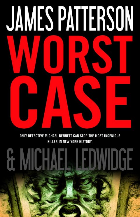
One of my favorite past times is browsing a flea market or used bookstore. As a kid I used to beg my mom to take me to garage sales on weekends. I’m fortunate to be walking distance from The Strand and the Chelsea Flea Market. This is dangerous for my bank account though. Some book assignments can lead you on field trips. For the book Worst Case by James Patterson, the kind of imagery I was looking for was limiting with just search browsers. My Creative Director suggested that I spend a couple hours browsing the Metropolitan Museum of Art. Right when I was about to leave, I found the perfect book at the museum’s shop. It is more exciting when you find imagery in an unexpected source.
 Who are your design heroes?
Although I admire many designers, Alvin Lustig comes to mind.
What does the future hold for book cover design?
I wish I knew. At times I think the profession of being a book cover designer is in jeopardy with the increasing popularity of reading on smartphones and other portable devices. There may be greater emphasis placed on starting with a strong design, without the luxury of relying on fancy printing effects or being neatly displayed in a shop window. For example, designers may need to review their covers as small thumbnails to determine the legibility of delicate text and elements when sitting in an iBooks shelf. Who knows? Maybe in an over-saturated marketplace, with rampant closures of bookstores, design could be more important than ever before.
Thanks Karen!
Images:
- Follow Me by Joanna Scott
Jacket photograph ©Christine Callaghan/Arcangel Images
Creative Director: Mario J. Pulice
Publishing house: Little, Brown and Company
- The Natural History of Uncas Metcalfe by Betsey Osborne
Art Director: Michael Storrings
Cover illustration from Bibliotheque des Arts Decoratifs, Paris/Archives Charmet/The Bridgeman Art Library
Publishing house: St. Martin’s Press/Griffin imprint
- I Never Loved a Man the Way I Love You by Matt Dobkin
Art Director: Michael Storrings
Cover photograph of Aretha Franklin ©Michael Ochs Archives
Publishing house: St. Martin’s Press/Griffin imprint
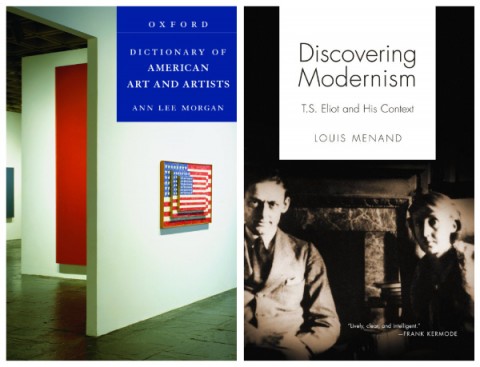
- Dictionary of American Art and Artists by Ann Morgan
Jacket photograph: Installation view: 20th Century American Art, 1989. Whitney Museum of American Art, New York.
Paintings, left to right: Summer Table (detail), 1972-73 © 2007 Brice Marden/Artists Rights Society (ARS), New York. Day One (detail), 1951-52 © 2007 Barnett Newman Foundation/Artist Rights Society (ARS), New York. Three Flags, 1958 © Jasper Johns/Licensed by VAGA, New York, New York.
(Karen’s note: securing the image rights for this photo was very difficult/tricky because not only did it include an interior wall from the Whitney Museum, but included artwork from three different artists. I worked with a photo researcher who helped with dealing with the vendors directly.)
- Discovering Modernism by Louis Menand
Cover photograph of T.S. Eliot and Virginia Woolf courtesy of Princeton University Library
Publishing house: Oxford University Press
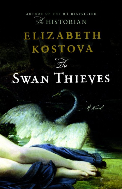
- The Swan Thieves by Elizabeth Kostova
Creative Director: Mario J. Pulice
Jacket painting credit: Leda, 1832 by Francois Eduard Picot, Paris collection © Peter Willi/Superstock
Publishing house: Little, Brown and Company
(Karen’s note: final jacket has foil and embossing, printed on Neenah Eames painting paper stock)
- Israel is Real by Rich Cohen
Art Director: Henry Sene Yee
Cover painting of Jerusalem: William Holman Hunt/Getty Images
Publishing house: Picador USA
- Kabul in Winter by Ann Jones
Art Director: Henry Sene Yee
Cover photograph © Ann Jones
Publishing house: Picador USA
- The Lion’s Eye by Joanna Greenfield
Creative Director: Mario J. Pulice
Cover photograph of lion © blickwinkel / Alamy
Publishing house: Little, Brown and Company
- My Paper Chase by Harold Evans
Creative Director: Mario J. Pulice
Cover photograph of Harold Evans © Lord Snowdon
Publishing house: Little, Brown and Company
- Angel Island by Erika Lee & Judy Yung
Art Director: Brady McNamara
Jacket photos provided by authors and the Angel Island Immigration Station Foundation
Publishing house: Oxford University Press
- China: Fragile Superpower by Susan L. Shirk
Art Director: Kathleen M. Lynch
Jacket photograph © Andrew Wong/Getty Images
Publishing house: Oxford University Press
- Worst Case by James Patterson
Creative Director: Mario J. Pulice
Jacket photograph from Faces in Stone: Architectural Sculpture in New York City by Robert Arthur King. © 2008 by Robert Arthur King. Used by permission of W. W. Norton & Company, Inc
Publishing house: Little, Brown and Company
(Karen’s note: final jacket has foil and embossing)
- Don’t Blink by James Patterson & Howard Roughan
Creative Director: Mario J. Pulice
Jacket painting credit: Leda, 1832 by Francois Eduard Picot, Paris collection © Peter Willi/Superstock
Publishing house: Little, Brown and Company
(Karen’s note: final jacket has foil and embossing)
- The Postcard Killers by James Patterson & Liza Marklund
Creative Director: Mario J. Pulice
Jacket Photo imaging by Debra Lill
Jacket photographs: man running ©Yolande de Kort/Arcangel Images; woman in running © Roberto Pastrovicchio/Arcangel Images; street in Stockholm, Sweden © Karin Smeds/Getty Images
Publishing house: Little, Brown and Company
(Karen’s note: final jacket has foil and embossing)
Like this:
Like Loading...


