Skip to content

Tag: awards

Australian Book Design Awards Catalogue 2016

Earlier this week I received a copy of the 2016 Australian Book Design Awards Catalogue designed by Alissa Dinallo. My photos don’t really do it justice, but it is a thing of beauty:

ABDA 16 Catalogue

ABDA 16 Catalogue Hot Little Hands

ABDA 16 Catalogue Endpapers

You can buy a copy of the catalogue from the ABDA wesbite.

Comments closed

Australian Book Design Awards Winners 2016

Design by Laura Thomas (Scribe / 2016)

Congratulations to all the winners of the Australian Book Design Awards 2016 announced yesterday in Melbourne!

Lion-Attack design Allison Colpoys
Design Allison Colpoys
KingRich-design Darren Holt
Design Darren Holt


T2thebook-design Evi O
Design Evi O

See all the winning designs on the ABDA website.

Comments closed

Lead the Autobiographical Novelist to the Literary Prize

autobiographical novelist Tom Gauld

Tom Gauld on Karl Ove Knausgaard for The Guardian.

Comments closed

Making It Up: The Bookseller Interviews Mr Keenan and Gray318

Mr Keenan and Gray318

I love this Bookseller interview with designers Jamie Keenan and Jon Gray, co-founders of the Academy of British Cover Design (among other things):

ABCD tends to recognise and reward brave, striking and fresh approaches, rather than more “conventional” cover aesthetics. I ask the pair whether they feel designers have more freedom these days; whether, as books become imbibed with more longevity and are seen as less disposable, publishers are more amenable to the idea of cover art as art, rather than as a marketing tool. They are reticent; Keenan responds: “It’s strange, because when you do see a weirdo cover – for a reason, not just for the sake of it – quite often they are really successful. If you think of a book as an actual package and compare that to other forms of packaging, its really old-fashioned in a lot of ways.

“Imagine a poster for, say, the next iPhone, and it has a quote on it like you’d see on a book cover – ‘this is the best phone I have ever had!’ – you just think, this is so old-fashioned, that kind of endorsement idea. On a book cover it’s the norm. A lot of advertising you see, you aren’t really sure what it’s for but it draws you in, whereas a lot of book covers are really overt – they tell you exactly what the book is about. We’re supposedly becoming more and more visually literate, but book covers are still, in some ways, quite naïve.”

Gray concurs: “It feels like a real nervous habit, the quote on the front. Is that really helping a book to be sold? Can [shoppers] not just read that on the back and get the same idea…on the front, is it really making someone think: ‘aha!’?”

“The greatest and the worst thing about book cover design is that no one really knows if it’s incredibly powerful or a complete waste of time,” Keenan says. “Quite often when you get a brief, you’ll be sent other covers that the [client] likes and some of them will look absolutely terrible…but it was a bestselling book! So that automatically becomes, in their eyes, a sort of ‘good cover’.”

“There’s no science to it,” Gray agrees.

You can almost hear them sipping their pints.

Comments closed

ABCD Award Winners 2016

Congratulations to all the winners and shortlisted covers at the third annual Academy of British Cover Design Awards! Make sure you read Daniel Benneworth-Gray‘s report on last night’s “shindig” at the Creative Review, but in the meantime, all the winning designs are below:

Children’s
fox and the star

The Fox and the Star, written, illustrated and designed by Coralie Bickford-Smith (Particular Books / August 2015)

Young Adult

Asking For It design Kate Gaughran
Asking For It by Louise O’Neill; design by Kate Gaughran (Quercus / September 2015)

Sci-Fi / Fantasy

a-man-lies-summer
A Man Lies Dreaming by Lavie Tidhar; design by Ben Summers (Hodder / March 2015)

Mass Market

hausfrau-UK
Hausfrau by Jill Alexander Essbaum; design by Jo Thompson; illustration by Maricor/Maricar (Mantle / March 2015)

Literary Fiction

Memoirs of a Dipper design by Gray318
Memoirs of a Dipper by Nell Leyshon; design by Gray318 (Fig Tree / June 2015)

Crime / Thriller

9780241972762
Whisky Tango Foxtrot by David Shafer; design by Richard Bravery (Penguin / June 2015)

Nonfiction

egg design by Clare Skeats
Egg by Blanche Vaughan; design by Clare Skeats (Wiedenfeld & Nicolson / March 2015)

Series Design

Great Northern design James Paul Jones
Great Northern? by Arthur Ransome; design James Paul Jones; illustration by Pietari Posti (Vintage / March 2015)

Classics / Reissue

Far From the Madding Crowd design Sinem Erkas
Far From the Madding Crowd by Thomas Hardy; design by Sinem Erkas (Orion / September 2015)

Women’s Fiction

I Love Dick design by Peter Dyer
I Love Dick by Chris Kraus; design by Peter Dyer (Profile Books / November 2015)

You can see all last year’s winners here.

Comments closed

50 Books / 50 Covers 2014 Winners

Young God design by Rodrigo Corral

Design Observer has announced the winners of their 2014 50 Books | 50 Covers competition, organized in association with AIGA and Designers & Books.

The fifty winning covers can be seen here

Brave New World design by La Boca

…and the fifty winning books, here.

A Maze and A Muse design Jenny Volvovski

My 2014 cover selections are here.

On Such a Full Sea design by Helen Yentus
1 Comment

Australian Book Design Awards Winners 2015

Congratulations to all the 2015 Australian Book Design Awards Winners!

caro was here design gayna murphy
Caro Was Here by Elizabeth Farrelly; design by Gayna Murphy

consumer-behaviour-in-action design regine abos
Consumer Behaviour in Action by Peter Ling, Steven d’Alessandro, Hume Winzar; design Regine Abos

A Fairy Tale by Jonas T. Bengtsson; design by Allison Colpoys

fictional woman design tara moss and matt stanton
The Fictional Woman by Tara Moss; design Tara Moss & Matt Stanton

Movida Solera by Frank Comorra & Richard Cornish;  design by Daniel New
Movida Solera by Frank Comorra & Richard Cornish; design by Daniel New

What Came Before by Anna George; design by Laura Thomas

You can find all the winning designs on the Australian Book Designers Association website.

Comments closed

Australian Book Design Awards 2015 Shortlist


Australian Book Designers Association recently announced the shortlist for the Australian Book Design Awards 2015 and, as in previous years, there are some great covers to be seen.

I particularly like that they have an award for Young Designer of the Year. The designers shortlisted this year are Alissa Dinallo, Hazel Lam, and Imogen Stubbs:

The full list can be downloaded as a PDF from the ABDA blog. The winners will be announced Friday, May 22nd in Sydney.

Comments closed

Inside Marion Deuchars Studio

dandad-deuchars

D&AD visits Marion Deuchars in her studio to talk about her work and creating hand-lettered signs for Judging Week 2015:

Comments closed

How the Literary Prize Winner is Chosen

literary-prizes-tom-gauld
Tom Gauld gets to the heart of the matter once again. (Although if Edward St. Aubyn’s recent satire Lost For Words is anything to go by, I would have expected more cock-ups, backstabbing, and adultery!)

Comments closed

Australian Book Design Awards 2014 Shortlist

ABDA_2014_shortlist
Peter Long, Senior Designer at Black Inc. Books, has kindly let me know that the shortlist for the Australian Book Design Awards has been announced.

The Book Design Awards are Australia’s longest running  graphic design awards, but in 2013 the Australian Publishing Association decided to discontinue them. To keep the awards running for a 62nd consecutive year, a group of Australian designers formed the ABDA as an independent, non-profit entity in March 2014.

There is some lovely work up for this years awards, and you can download full a list of the nominees as a PDF. Here are a few of the book covers that caught my eye:

Best Designed Literary Fiction Book

letters-to-the-end-colpoys
Letters to the End of Love by Yvette Walker; design by Allison Colpoys (UQP July 13, 2014)

luminaries
The Luminaries by Eleanor Catton; design by Jenny Grigg (Granta September 2013)

Best Designed Non-Fiction Book

the-end-cull

The End by Bianca Nogrady; design by Sandy Cull (Vintage May 2013)

madness-colpoys
Madness: A Memoir by Kate Richards; design by Allison Colpoys (Viking January 2013)

Best Designed Young Adult Book

messenger-cull
The Messenger by Markus Zusak; design by Sandy Cull (Pan Macmillan Novemeber 2013)

zac-mia-chong
Zac & Mia by A. J. Betts; design by W. H. Chong (Text Publishing July 2013)

The winners of the Australian Book Design Awards will be announced in Melbourne on August 22nd, 2014.

1 Comment

Q & A with Nick Asbury, Corpoetics

I was quite taken with the lovely design and gentle subversion of  Corpoetics — a chapbook collection of ‘found’ poetry taken from the ‘Corporate Overviews’ of well-known brands and corporations — when I first saw it at Ace Jet 170 in February.

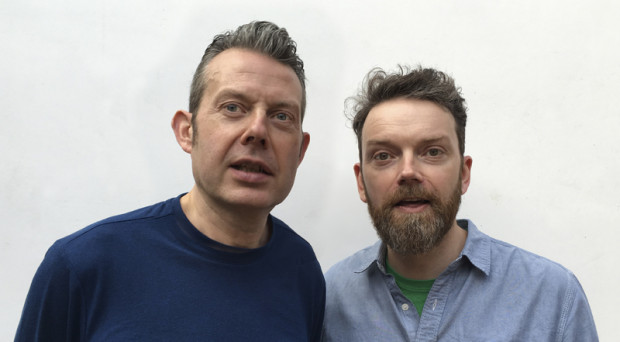
Author Nick Asbury was kind enough to get in touch after I mentioned the project here, so when Corpoetics recently won a Yellow Pencil for Writing for Design at the 2009 D&AD Awards, it seemed like a perfect excuse to talk to Nick a bit more about the project, the corporate use of language, and interesting not-for-profit work…

What inspired Corpoetics?

My day job is as a writer for businesses and brands, so I’ve long been immersed in the corporate world. I’ve often sought refuge in reading and occasionally writing poetry, so I guess it was inevitable that the two would cross over at some point.

How would you describe ‘found’ poetry?

I came across a good quote by Annie Dillard, talking about the ‘doubling effect’ you get in found poems. ‘The original meaning remains intact, but now it swings between two poles.’ I think that’s about right. You get an interplay between the original meaning and where you’ve taken it — and there’s a lot of potential for humour and subversion, particularly when the source material is from the corporate world.

The language of several of the poems is almost Orwellian. Do you have a sense that corporations (deliberately or otherwise) dehumanise language?

Yes, dehumanise is exactly the word. A lot of corporate language is designed to erase any sense of individual responsibility. It’s much safer to talk about how ‘a decision was taken’ rather than saying ‘I took a decision’. So you get this very passive, depersonalised way of talking. Then there’s the widespread tendency to hide behind jargon and non-committal abstractions. In some cases, it’s deliberately intended to conceal or exclude. But a lot of businesses drift into it without realising — it just becomes the norm for writing in a business context.

The poem I wrote about Halliburton is probably the most Orwellian in tone. It takes their words and lets their emptiness ring out in this very eerie way. But it didn’t take a lot of rearranging — it’s more like a condensed version of the original.

As a copywriter and consultant, do you feel a certain irony in the subversion of corporate language in Corpoetics?

Definitely. When I first had the idea, I was very aware of biting the hand that feeds me. But then the aim is not just to subvert corporate language and hold it up to ridicule (although some poems do). I also wanted to pick brands that I liked. People like Greggs The Baker — a fixture on British high streets — or Pot Noodle, a famously throwaway junk food here in the UK. It was interesting taking their words and seeing where they went. Pot Noodle became a story of a relationship that begins in furtive excitement and ends in squalor, much like the experience of the product itself.

Is it possible for business writing to have warmth and wit, or is it inherently evil?

That depends whether you think all businesses are inherently evil. I don’t. We all need to earn money and make a living — and work is a noble and necessary thing. Whether it’s the local bakery or a multinational giant, plenty of businesses make an honest living and do good things. Those businesses have a good story to tell — and there’s room for warmth and wit in the telling. Of course, the unfortunate truth is that a lot of ‘good’ business writing is a matter of spin — making companies seem better than they are. But the very best writing will always be for good companies with something truthful to say.

Have you had any response from the companies featured in Corpoetics?

Yes, KPMG got in touch. I took a deep breath when the email arrived, expecting a stern ultimatum from the legal team. But it was very positive. They said they wanted to feature it in their internal company newsletter and run a competition to get people to send in their own poems. I’d like to have seen the results, but still haven’t managed to track them down.

Why did you decide to publish Corpoetics as a book rather than make it a web-based project?

It seemed a very natural thing to do. Poetry just feels more satisfying when it’s in print. I work as one of a partnership (Asbury & Asbury) alongside my wife Sue, who is a graphic designer. So we thought about turning it into a design project as well as a writing project — taking graphic elements from the companies featured and rearranging them in some way. But we decided it was overkill. It’s ultimately a project about language and we wanted to let the words do the work.

Is the visual presentation of written language important to your work?

Yes — ever since I started out in business writing (about 12 years ago), I’ve worked closely alongside graphic designers. In fact, most of my work is commissioned by design and branding companies, so it’s a natural fact of life. I’d find it hard to write anything without having some sense of the way it will be presented visually. It’s never just about the words or the design, but the overall act of communication.

So good writing and good design go hand-in-hand?

Yes, ideally. I find a lot of the best designers are pretty good with words. Both professions have the same base skills. You need to analyse a brief, empathise with an audience, spot lateral connections, tell a story, make an imaginative leap. The disciplines only separate out right at the end, when the designer goes off to do the pictures and the writer gets typing.

What other projects are you currently working on?

I usually have three or four paying projects at any one time. At the moment, I’m writing an annual review for a British charity, some marketing literature for a hotel operator, and an advertising campaign for an Austrian law firm. Alongside all that, as Asbury & Asbury, we continue to work on our own projects. The latest is a collection of children’s poetry called ‘Songs For Animals‘, but it may not see the light of day for a while yet.

Can you tell me about 26?

It’s a not-for-profit collective of writers, editors, journalists, designers, publishers — anyone with an interest in language, both in a business context and more generally. As you might have guessed, the name comes from the letters of the alphabet, the DNA of language — and naturally, it costs £26 a year to be a member. I got involved shortly after it started up in 2002 and am now one of the directors responsible for running the whole thing — or trying to. It’s operated entirely on voluntary time and can be quite chaotic, but they have produced some really interesting collaborations, resulting in books, exhibitions and a whole series of public talks and events. It’s principally UK-based, but there are chapters springing up in South Africa, Sweden and elsewhere. I’d urge anyone with an interest in the subject to join. You’ve got nothing to lose. Except maybe £26.

Thanks Nick. Corpoetics is available for £5 plus p&p from  Asbury & Asbury , with proceeds going to the National Literacy Trust, a UK charity dedicated to changing lives through literacy.

1 Comment