Skip to content

Tag: art

Robert Rauschenberg and the Subversive Language of Junk

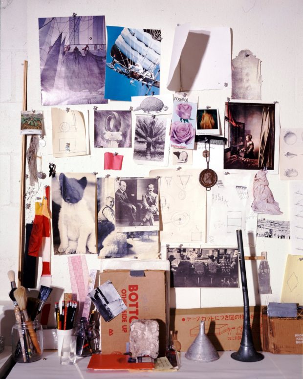
Rauschenberg’s ‘muse wall’, a collection of objects and images that inspired him, in his print shop, Captiva, Florida, around 1979. Photograph: Emil Fray/Robert Rauschenberg Foundation

With a major Robert Rauschenberg retrospective opening at Tate Modern in December, Alex Needham, writing for The Guardian, visits the late artist’s island home of Captiva, Florida:

Rauschenberg started visiting in 1962, before moving to Captiva nine years later, describing it as “the foundation of my life and my work… the source and reserve of my energies”. His work by then had become ambitious and complicated; Captiva forced a return to simplicity, and the first things he produced were a selection of wall sculptures made from battered cardboard boxes.

For the world beyond Captiva’s white sands, however, a reacquaintance with Robert Rauschenberg is long overdue. In Britain, there has been no major retrospective of his work since 1981, while the last big US survey, at the Guggenheim in New York, took place in 1997. That will change next month, when Tate Modern opens a London retrospective; it will then move to Moma in New York next May, and after that to the San Francisco Museum of Modern Art.

Rauschenberg left a bold and indelible mark on the 20th century. His combines, which integrated the flotsam and trash of everyday life, including the artist’s own duvet in Bed (1955), were neither painting nor sculpture, and proved that anything could be the material of art. At Tate Modern, pride of place will be given to Monogram 1955–59, a horizontal canvas on which perches a stuffed goat with a tyre around its midriff; the work thrilled and scandalised when it was first shown at Castelli’s gallery in New York, and rapidly became synonymous with the artist’s iconoclasm. Since then, his relevance has only increased, says Leah Dickerman, co-curator of the new retrospective: “When you open a gallery and see the art that’s made out of the stuff of the real world, that’s coming off the walls, that’s interdisciplinary in its approach, all that is the legacy of Rauschenberg.”
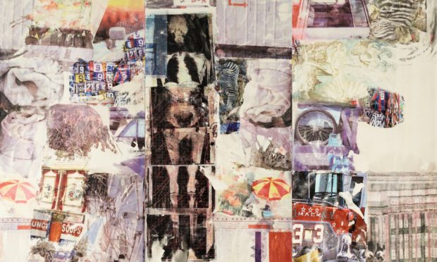
 

Detail from Rauschenberg’s Mirthday Man (1997)

Also at writing for The Guardian, Olivia Laing, author of The Lonely City and The Trip to Echo Spring, looks back over Rauschenberg’s career:    

Making the combines, Rauschenberg felt he was cracking “the secret language of junk”. They could be composed of anything: a goat corseted by a tire; a stuffed bald eagle. One of the very first, Untitled (Man with White Shoes), contained – deep breath – fabric, newspaper, a photograph of Jasper Johns, a handwritten letter from Rauschenberg’s son, a drawing by Twombly, glass, mirror, tin, cork, a pair of the artist’s socks and painted leather shoes, dried grass and a taxidermied Plymouth Rock hen.

All the same, there’s a limit to how much world you can cram into a sculpture, and as Rauschenberg’s success grew he became increasingly fascinated by replication. Back in 1952, he’d experimented with transfer drawing, and in 1958 he embarked on a grand project of illustrating Dante’s Inferno using lighter fluid to transfer images on to paper. In 1962, Andy Warhol introduced him to a far more sophisticated technique: the wizardry of using photographic images on silkscreen canvases.

Now he could reuse and resize his own photos and those he snipped from newspapers and magazines, giving him an unprecedented power of composition. Anything could be incorporated: John F Kennedy; a water tower; Bonnie and Clyde. As he gleefully observed of the silkscreen paintings: “It’s as much like Christmas to me as using objects I pick up on the street.” He was giddy for them, until in 1964 he was awarded the Golden Lion at the Venice Biennale. Terrified of stasis, the next day he called his New York studio and asked his assistant to burn all the screens.

See also: Hal Foster on Rauschenberg retrospective for the London Review of Books,  

Comments closed
William Eggleston, the Pioneer of Color Photography

Wolfgang Tillmans
Wolfgang Tillmans

Augusten Burroughs’ strange and sad profile of photographer William Eggleston for T, the New York Times Style Magazine:

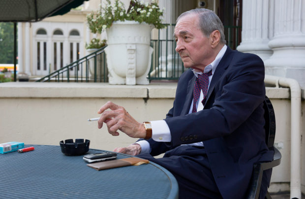
WE LEAVE THE OFFICES of the Eggleston Trust and go to his apartment. The first thing one sees upon entering is a bright red plastic sign with a yellow border, printed with capitalized white sans-serif text. It warns, “THE OCCUPANT OF THIS APARTMENT WAS RECENTLY HOSPITALIZED FOR COMPLICATIONS DUE TO ALCOHOL. HE IS ON A MEDICALLY PRESCRIBED DAILY PORTION OF ALCOHOL. IF YOU BRING ADDITIONAL ALCOHOL INTO THIS APARTMENT YOU ARE PLACING HIM IN MORTAL DANGER. YOUR ENTRY AND EXIT INTO THIS APARTMENT IS BEING RECORDED. WE WILL PROSECUTE SHOULD THIS NOTICE BE IGNORED. THE EGGLESTON FAMILY.” It is a devastating thing to see. Heartbreaking. I was also an alcoholic for decades, the kind who had shakes and saw spiders. I’m not even through the hallway and my mind is racing from “I want that sign” to “What kind of doctor prescribes alcohol for an alcoholic? Where was he when I was drinking?”

I ask if his drinking ever got in the way of his photography. “I’ve never been able to take a picture after a drink,” he says. “It just doesn’t work. Maybe — I don’t know what it is. It’s not like I’m too drunk to take a picture. I just — the whole idea of it just goes away after one or two drinks.” Eggleston perches atop the bench in front of his Bösendorfer concert grand piano. An active ashtray and a sweating tumbler of icy bourbon on a burn-marked coaster sit inside the piano directly on the frame. He reaches for the glass and takes several small, noisy sips and his body visibly relaxes. I know his relief, exactly. “I’m gonna get this drink down,” he tells me. And as soon as he does he wants another. He suggests that I pour one for myself and join him but I tell him that I don’t drink anymore, that once I start I can’t ever stop. He replies, “Well, I can stop, but I’ll admit I want another one.”

The profile is accompanied by a short film by Wolfgang Tillmans:

Comments closed

The Bolted Book Now on Kickstarter

The Designers & Books Kickstarter to publish a facsimile of Fortunato Depero’s 1927 ‘Bolted Book’ (mentioned previously here) is now live:

Comments closed

Elaine Lustig Cohen, Pioneer

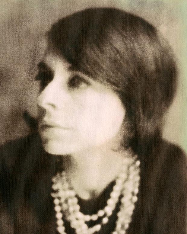
Elaine in 1964, photographed by Naomi Savage (1964)
Elaine Lustig Cohen, photographed by Naomi Savage

I was sad to hear that designer Elaine Lustig Cohen had died aged 89 last week. She will forever be associated with her more famous husband Alvin Lustig, but she was a remarkable designer in her own right and her influence, as Steven Heller notes at Design Observer, extended far beyond her studio:

Elaine’s professional standing far outlasted her years of practice because beyond being a pioneer, she was also the benefactor in so many ways for graphic design history, and an advocate for so many other historians, practitioners—and especially women. It is this enduring integrity and generosity that ultimately defined her highly treasured life.

Following Alvin Lustig’s death, Elaine specialized for some time in designing book covers and jackets, initially following her late husband’s aesthetic, until finding her own style and vision. For over a decade she earned commissions from museums, architects, and book publishers—including Noonday Press, whose publisher, Arthur Cohen, would become her second husband. Her own studio closed in 1967, although Elaine continued to design catalog covers for Ex Libris (the antiquarian bookstore she and Cohen ran together) focusing on avant-garde modernist books and documents. She turned instead to making art—inspired in part, by Constructivism, Dada, and the Bauhaus—and continued to do so until the end of her life.

hard_candy

In a profile of the designer for Eye magazine in 1995, Ellen Lupton noted what made ELC’s book covers so distinctive…

In her covers for Meridian Books and New Directions, designed from 1955 through 1961, Elaine Lustig Cohen used abstract structural elements, expressive typography, and conceptual photographs to interpret the books’ contents. Working at a time when most book covers employed literal pictorial illustrations, Cohen visualized titles in contemporary literature and philosophy through a rich variety of approaches, from stark abstractions and concept-driven solutions to obtuse evocations that bring to mind the recent work of Chip Kidd and Barbara de Wild for Knopf.

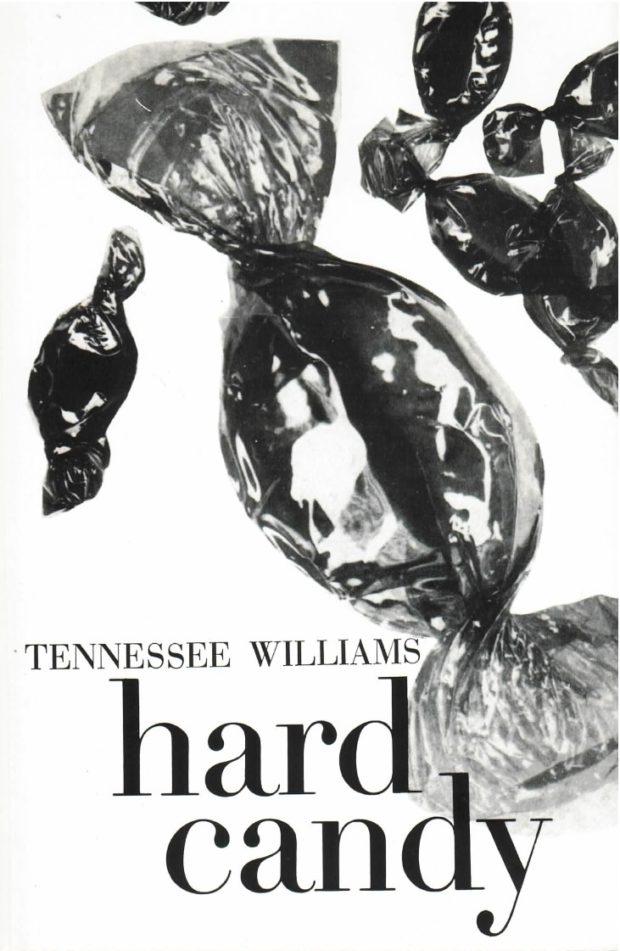
Elaine Lustig Cohen’s cover for the journal ‘The Noble Savage’ 4 (1960) features a time-worn classical statue festooned with a typographic moustache and blasted with a star-burst pull-out quote from Darwin. For Yvor Winter‘s ‘On Modern Poets’ (1959), Cohen photographed a loose arrangement of plastic letters, while she used a field of pebbles to obliquely represent ‘The Varieties of History’ (1957). If such solutions are suggestively poetic, Cohen could also be brilliantly blunt, as in her choice of oversized, cello-wrapped bonbons for Tennessee Williams’s ‘Hard Candy’ (1959).

…A point echoed in the New York Times obituary:

She designed museum catalogs and furniture. As a book-cover designer, she followed in Mr. Lustig’s precisionist footsteps but eventually established her own, more free-form style.

“I tried to reflect the spirit of the books,” she said in a video made by AIGA, the graphic arts organization, when she was awarded its medal in 2012.

Her jacket for “Yvor Winters On Modern Poets” looked as if plastic letters had been placed on a tabletop, then jostled by a passing child. A book about St. Augustine featured his name twice, as the arms of a cross. The jacket for Tennessee Williams’s short-story collection “Hard Candy” showed extreme close-ups of cellophane-wrapped sweets, seeming to fall through the air.

You can see a selection of ELC’s book covers on her website, and the video referenced above is here:

Comments closed

The Bolted Book

7-27-16_9515-970x728
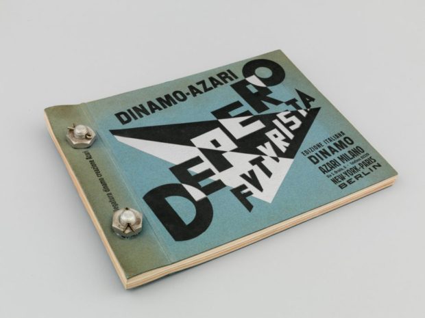
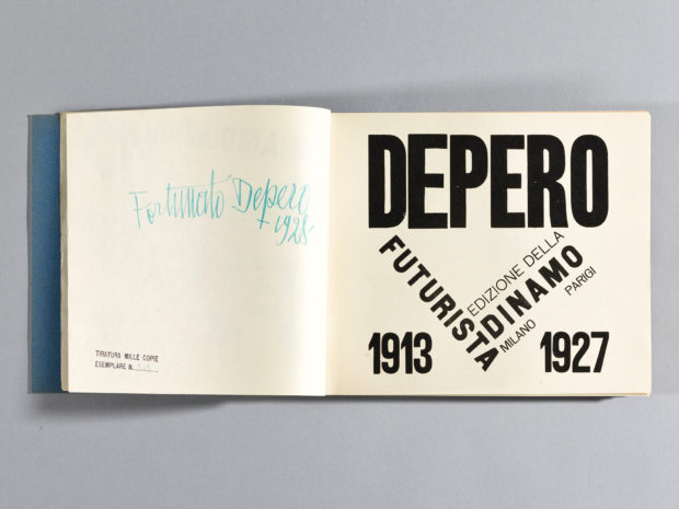
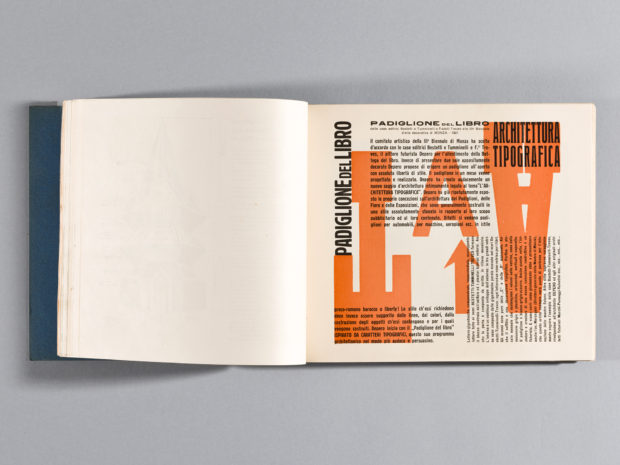
Designers & Books, in collaboration with the Center for Italian Modern Art in New York and the Mart, the Museum of modern and contemporary art of Trento and Rovereto, Italy, is launching a Kickstarter campaign on October 18 to publish a new facsimile edition of Depero Futurista, the 1927 monograph of Italian Futurist Fortunato Depero. Famously bound by two industrial aluminum bolts, “The Bolted Book” is full of typographic experimentation and widely recognized as a masterpiece of avant-garde book-making.

At the project’s website you can see each of the book’s (amazing) 240 pages in detail, read translations from the original Italian and annotations of selected texts, and learn more about Depero’s life and work.

depero-bolted-book-04

depero-bolted-book-49


Comments closed

Luc Sante on Jean-Michel Basquiat

basquiat-studio

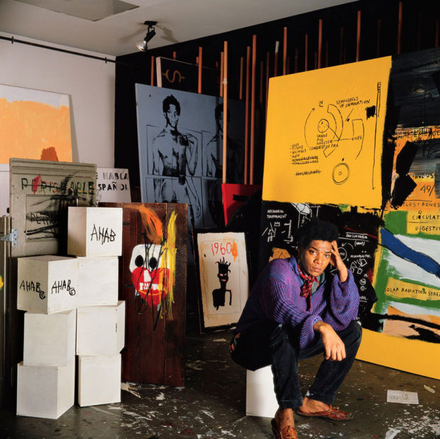
New York Review of Books blog has posted Luc Sante’s reminiscences of artist Jean-Michel Basquait:

The last time I saw Jean I was going home from work, had just passed through the turnstile at the 57th Street BMT station. We spotted each other, he at the bottom of the stairs, me at the top. As he climbed I witnessed a little silent movie. He stopped briefly at the first landing, whipped out a marker and rapidly wrote something on the wall, then went up to the second landing, where two cops emerged from a recess and collared him. I kept going.

A month later he was famous and I never saw him again. We no longer traveled in the same circles. I was happy for him, but then it became obvious he was flaming out at an alarming pace. I heard stories of misery and excess, the compass needle flying around the dial, a crash looming. When he died I mourned, but it seemed inevitable, as well as a symptom of the times, the wretched Eighties. He was a casualty in a war—a war that, by the way, continues. Years later I needed money badly and undertook to sell the Basquiat productions I own, but got no takers, since they were too early, failed to display the classic Basquiat look. I’m glad it turned out that way.

Save

Comments closed

Ed Ruscha: Buildings and Words

Ed Ruscha: Buildings and Words is a short documentary, commissioned by MOCA in Los Angeles, exploring two of the recurring themes in the artist’s work. It was written and directed by Felipe Lima, and is narrated by Owen Wilson:

Apparently Ruscha calls his font ‘Boy Scout Utility Modern’, which immediately makes me wonder if Wes Anderson is a fan.

1 Comment

The Great Discontent: Jean Jullien

Photo by Daniel Arnold

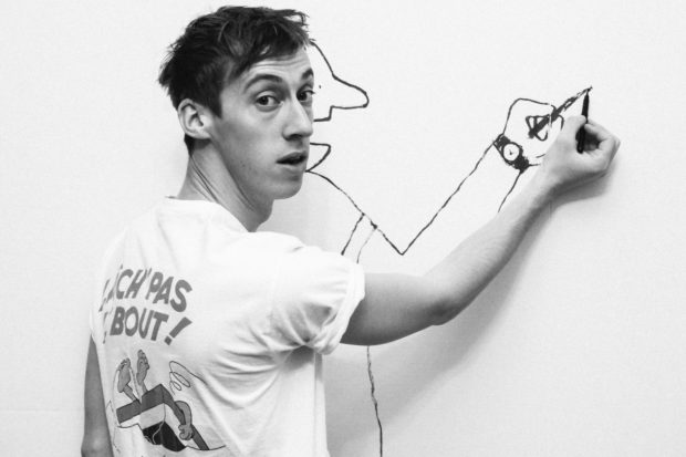
Tammi Heneveld interviews London-based graphic artist Jean Jullien for The Great Discontent:

My parents definitely introduced me to a lot of culture. My dad was keen on French bandes dessinées (comic strips) and music, which probably had something to do with my brother becoming a musician later on. My mom was very interested in architecture, product design, and classic and modern art, which she introduced us to…

…I was always more focused on graphic design, but I ended up doing illustration in a convoluted way. I started using a brush pen to break free from working on a computer all of the time and to experiment creatively. I felt quite comfortable with it and could draw letters as well as characters. That’s when I realized that the practice of illustration and graphic design aren’t necessarily exclusive. I also discovered designers like Alan Fletcher, Saul Bass, and Paul Rand, whose work all had a great sense of playfulness and a tactile aspect that I was really fond of.

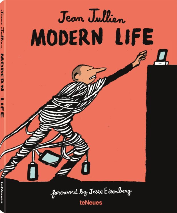
Modern Life, a compendium of Jullien’s best known work, will be published by teNeues next month.

modern life Jullien

Comments closed

New Penguin Essentials

Embers design Gray318

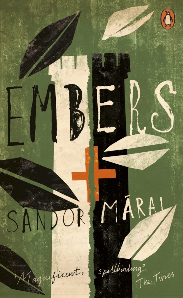
The latest additions to Penguin’s ‘Essentials’ series, released this month, have some rather splendid new covers, including Jon Gray‘s wonderful design for Embers by Sandor Márai, Julian House’s typographic design (with echoes of Robert Brownjohn) for The Spy Who Came in from the Cold, and David Foldvari‘s illustrated design for How Many Miles to Babylon by Jennifer Johnston.


You can see more of the new Penguin Essentials covers, and read about the design process, at Design Week.

Comments closed

A Window onto a Window

photograph by Ike Edeani

In this profile of Peter Mendelsund in the June issue of Rhapsody Magazine, there is a lovely bit about the designer’s architect-artist father:

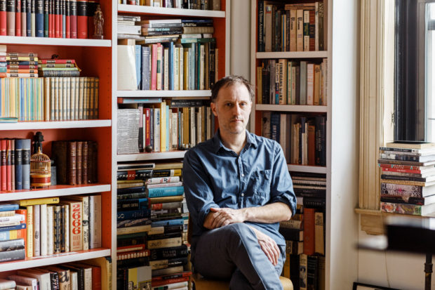
In the living room of Knopf associate art director Peter Mendelsund’s Upper Manhattan apartment, inspiration is everywhere: a battered, sea-green first edition of Ulysses; a toy version of the rocket Tintin takes to the moon; the vertebra of a blue whale; and, on top of his baby grand piano, a wooden model of a convention center made by his father, in the mid-’70s, when he worked for a New York architecture firm. It was never built, because the firm didn’t win the competition (Renzo Piano did), nor were any of his other models, because, in his late 30s, Benjamin Mendelsund was diagnosed with a brain tumor and devoted the rest of his life—he died at 48—to sculpture and painting. “He cut out all the bureaucracy of architecture,” Mendelsund says, “and turned to this.” He points to a small canvas painted entirely black except for two rectangles—two faded photos of a barn’s loft, its window open to the bright of day.

That image of a window onto a window is central to the signature style that’s made Mendelsund one of our preeminent book jacket designers: geometric, fascinated with negative space, striving to capture infinity through simplicity. You see the painting echoed in his cover for Martin Amis’s 2006 novel, House of Meetings, for which he photographed a tiny simulacrum of a room, its perspective slanting toward a miniature door. You see it in his many book jackets with drop-cuts—holes carved out of an image—like the diamond torn from a woman’s face on an early cover for The Girl With the Dragon Tattoo, back in 2005 when it was called The Man Who Hated Women. And you see it in his May 11, 2015, New Yorker cover, which features an American flag smashed like a storefront window, a single star-shaped hole evoking the myriad emotions of last year’s civil unrest in Baltimore.

His father’s second act as an artist also helps explain how, at 33, Mendelsund had the confidence to abandon his career as a classical pianist (“Eventually, I realized that I’d never truly be world class”) and reinvent himself. His wife suggested he try something visual—he was always drawing; he had designed their wedding invitation. “Sometimes the obvious things take a long time to see.”

Comments closed