Ducking in just under the wire, here is my list of favourite of new books of the year. It’s not meant to represent the “best” of 2010. Rather, it’s a completely unscientific, very subjective list of books (arranged in alphabetical order) that I enjoyed. As I mentioned in my previous post, I found compiling the list a bit of a challenge and yet, for all that, there’s an air of withering predictability about the selections. There are no surprises. But even if this wasn’t a particular stellar year for reading, there were still lots of books I was excited about and that can only be a good thing.
I should also mention, for the sake of disclosure and all that, the top 10 includes one book distributed by Raincoast Books in Canada, and the list of honourable mentions refers to a couple of other titles I have helped promote in some minor capacity. They’re included here because I actually like them, not for any nefarious marketing reasons, but I guess you’ll just have to take my word for that. In any case, all these titles are identified with an asterisk…
And with that out of the way, on to the list!
Born Modern: The Life and Work of Alvin Lustig*
Elaine Cohen Lustig & Steven Heller
Chronicle Books
ISBN 9780811861274

I am a little embarrassed to start this list with a title distributed by Raincoast, but it comes first alphabetically and, I can honestly say tat Born Modern was the book I was most looking forward to this year. And I was not the only person excited about the book. When I tweeted about it from the Raincoast sales conference, the response was immediate. Almost every North American book designer I’ve ever spoken to cites Lustig — who designed covers for New Directions Press in the 1950’s — as an influence. The book designer’s book designer, then… A must-have.
C
Tom McCarthy
Knopf
ISBN 9780307593337

Tom McCarthy’s C was, as mentioned previously, one of the defining books of the year for me, standing — perhaps unfairly — opposite the ubiquitous Freedom. If I am honest though, I liked it less than McCarthy’s previous novel, the starkly compact Remainder (one of my favourite books of the last 10 years). At times, the sprawling, crawling C felt like it was held together with the sticky-tape of McCarthy’s singular intellect (a thought reaffirmed by seeing him in conversation with Douglas Coupland in Toronto). But somehow, in the end, it still works in some sort of baffling, gorgeous way.
The book was also perfect excuse to finally talk to Knopf cover designer Peter Mendelsund for the blog. The Q & A with Peter and Tom about C is here.
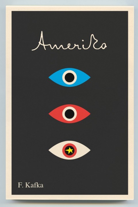
The City and the City
China Miéville
Del Rey
ISBN 9780345497529

I am cheating a little by including The City and the City because it was first published in 2009. It was, however, published in paperback in 2010, and as that’s how a lot of us still buy our fiction, I’m bending the rules to include it.
The novel itself is essentially a detective story, but what lifts out of the ordinary is the imaginary space in which it takes place. Architecture, geography and maps are clearly important to Miéville, but where, for example, Perdido Street Station creates a fantastically baroque city of ghettos and towering alien architecture, The City and the City is only slightly off-kilter — familiar but unsettling — and the book is even better for it.
Joy Division
Kevin Cummins
Rizzoli
ISBN 9780847834815

This was my Christmas present (thank you Mrs C.O.!) and it is — pretty obviously I would think — for fans only. Still, I’m guessing there’s quite a few out there. In any case, the book is a collection of beautiful black and white photographs of Joy Division and the late Ian Curtis by Manchester-born photographer Kevin Cummins. It includes Cummins’ iconic pictures for the NME of the band standing on a snowy bridge in Hulme, Manchester, as well as photographs of live performances and the band back stage. The book was stylishly designed — with more than a whiff of Peter Saville — by London design agency Farrow.
Just Kids
Patti Smith
Ecco
ISBN 9780060936228

Other than owing a copy of Horses, I can’t say that I’m particularly familiar with the work of Patti Smith, or Robert Mapplethorpe for that matter (other than the sort of stuff must people know about his art, and that he was connected to Sam Wagstaff, no relation). But, it doesn’t really matter. Smith’s memoir about her relationship with Mapplethorpe is a touching and self-deprecating look at their early years together in New York and their adventures in the art/music scene of the late 1960’s and early 1970’s.
Memories of the Future
Sigizmund Krzhizhanovsky, translated by Joanne Turnbull
NYRB
ISBN 9781590173190

I am definitely cheating by including this in the list as it was published in 2009. That said, it was published late in 2009, I missed it, and it’s too good not to be in this year’s top 10.
The book itself is a collection of seven short stories written between 1922 and Krzhizhanovsky’s death in 1950, all of which were suppressed by Soviet censors. The stories are reminiscent of Gogol’s short fiction and Bulgakov’s novellas, and suffice to say, they’re all bonkers. But in a good way. I loved the story Quadraturin about the man who gets lost in his black, ever-expanding apartment, and the strange time travel title story which concludes the book.
Penguin 75: Designers, Authors, Commentary (the Good, the Bad…)
Paul Buckley
Penguin
ISBN 9780143117629

Seeing as I spend so much time talking about cover design, I would be remiss if I didn’t include Penguin 75 in my top 10. Released to celebrate Penguin’s 75th anniversary, it’s a surprisingly diverse and candid look at the recent cover designs from Penguin’s US outpost in New York. I talked about Penguin 75 with art director Paul Buckley and book designer Christopher Brand here.
Parker: The Outfit
Darwyn Cooke
IDW
ISBN 9781600107627

The previous book in Darwyn Cooke’s Richard Stark adaptations, The Hunter, was on last year’s list, so perhaps it is hardly surprising that the sequel, which I think is better, is in this year’s top 10 as well. In new book, the formidable Parker — now with a new face — turns the tables on ‘the Outfit’, who quickly wish that they’d let sleeping dogs lie. Cooke seems in more confident form with this adaptation and the result is a stylish and fast-paced noir that looks incredibly cool. My pithier Advent Book Blog pitch for The Outfit is here.
The Shallows
Nicholas Carr
W.W. Norton & Co.
ISBN 9780393072228

I had a frisson of recognition reading Carr’s description of internet affected attention spans and I doubt I was the only one who thought “oh god, that’s happening to me” while reading The Shallows. The book is too long — a shorter book would’ve been even more effective — but it is still compelling. Carr doesn’t say technology is wrong, but reminds us that for all its benefits, we should be mindful of the consequences and what we might be losing.
Werewolves of Montpelier
Jason
Fantagraphics
ISBN 9781606993590

I wrote about my love for Jason’s comics when Werewolves of Montpellier was about to be released earlier this year, and the book itself didn’t disappoint. Ostensibly the book is about a thief called Sven who disguises himself as werewolf to rob people’s apartments and incurs the wrath of the town’s actual werewolves. It is, however, as much about friendship, identity, loneliness, and, ultimately, Sven’s unrequited love for his neighbour Audrey. In a lovely one-page scene, Audrey stands behind Sven, hugging his shoulders. “Do women come from another planet?” she asks. “Yes, women come from another planet,” Sven replies. The whole book is achingly brief, but Werewolves of Montpellier is possibly my favourite Jason book to date.
Honourable Mentions
American Trademarks edited by Eric Baker and Tyler Blick*
Footnotes In Gaza by Joe Sacco (December 2009)
I.O.U.: Why Everyone Owes Everyone and No One Can Pay by John Lanchester (published in the UK as Whoops!)
KENK by Richard Poplak and Nick Marinkovich*
Large Scale: Fabricating Sculpture in the 1960’s and 1970’s by Jonathan Lippincott*
The Lost Rolling Stones Photographs: The Bob Bonis Archive, 1964-1966 by Larry Marrion
The Rocketeer: The Complete Collection by Dave Stevens (December 2009)
Shirley Craven and Hull Traders: Revolutionary Fabrics and Furniture 1957-1980 by Lesley Jackson (October 2009)
So there you go. If this hasn’t met your requirements, Largehearted Boy is aggregating every online “best of 2010” book list he can find, and Fimoculous is aggregating all of the lists related to 2010 in categories ranging from ‘Advertising’ through to ‘Words’. That should keep you busy…
Happy New Year!
aggregates all of the lists related to 2010aggregated all of the lists related to 2010)
Like this:
Like Loading...


 The Rejection of Literalism
 Design Dossier: Graphic Design for Kids


