Skip to content

Tag: 50 books/50 covers

50 Books / 50 Covers Winners 2015

A Manual for Cleaning Women design Justine Anweiler
design Justine Anweiler

Congratulations to the winners of this year’s 50 Books | 50 Covers competition organized by Design Observer in association with AIGA. All fifty winning books can be found here; the winning covers here.

ball design by Kelly Winton
design Kelly Winton
oreo design Erik Carter
design Erik Carter
Comments closed

50 Books / 50 Covers Kickstarter

50-50 kickstarter

I should have mentioned in my 50 / 50 post yesterday, that Design Observer has launched a Kickstarter campaign to create catalogue of this year’s winners:

As others have noted, it is a little odd that the project is being announced now when the winners have been chosen rather than when the competition opened (why wasn’t the cost of the catalogue factored into the entry fee?), and I wonder if a traditional publisher could not be found to partner on this project, but even if it feels like something of an afterthought, a well-designed catalogue would still be a lovely thing to have.

Comments closed

50 Books / 50 Covers 2014 Winners

Young God design by Rodrigo Corral

Design Observer has announced the winners of their 2014 50 Books | 50 Covers competition, organized in association with AIGA and Designers & Books.

The fifty winning covers can be seen here

Brave New World design by La Boca

…and the fifty winning books, here.

A Maze and A Muse design Jenny Volvovski

My 2014 cover selections are here.

On Such a Full Sea design by Helen Yentus
1 Comment

2015 Design Awards

Happy New Year!

Now that all the amateur ‘best of 2014’ lists are out of the way, it’s time for the professionals submit their covers to the actual design competitions. Last week 50 Books / 50 Covers opened for entries. Meanwhile the closing dates for this year’s Australian Book Design Awards and ABCD15 in the UK are fast approaching…

50 Books / 50 Covers

Design Observer announced the opening of the 50 Books/50 Covers competition for books published in 2014. The competition will accept online entries from January 7, 2015 to March 18, 2015. See the guidelines for more details.


View the 2013 50 Books and 50 Covers 

ABCD 15

If you live in the United Kingdom, the Academy of British Cover Design (ABCD) has announced the opening of its second annual cover design competition. Books published between January 1 and December 31 2014 by any designer based in the UK are eligible. All entries must be received by the 31st January 2015.

View the winners of ABCD14

Australian Book Design Awards

The Australian Book Designers Association (ABDA) has also announced the 63rd Australian Book Design Awards. The awards are open to any book designed and published for the first time in Australia between 1 January 2014 and 31 December 2014. Entries close on Friday 23 January 2015.

View the winners of the 2014 ABDA Book Design Awards

Comments closed

50 Books / 50 Covers 2013 Winners

5050-2013

If you’re an American book designer you probably know already that the winners of the 2013 Fifty Books / Fifty Covers show were announced yesterday.

Organized by Design Observer in association with AIGA and Designers & Books,  50/50, which recognizes the best work in contemporary book and book cover design, dates back to 1922, and is the oldest continuously operating graphic design competition in the United States. It is what you might call a ‘big deal.’

Of course, you can always quibble with lists like this — there are a some covers from last year that I loved that aren’t winners. But it’s wonderful to see book designers get some deserved recognition, and there are some great covers on the list that I overlooked.

Here are a few of my favourite 50 Covers winners that weren’t on my own 2013 list (nor in my postscript):

9780199811809-Thomas Ng
The Aesthetic Brain by Anjan Chatterjee; design by Thomas Ng (Oxford University Press)

no_one_is_here_gray_318
No One is Here Except All of Us by Romana Ausubel; design by Gray318 (Riverhead)

9780226078991-tobin
Personae by Sergio De La Pava; design by Isaac Tobin (University of Chicago Press)

shady-jason-booher
Shady Characters by Keith Houston; design by Jason Booher ((W. W. Norton & Company)

this-yentus-booher
This and Other Plays by Melissa Gibson; design by Helen Yentus and Jason Booher (Theatre Communications Group)

Comments closed

ABCD and 50/50 Design Contests 2013

Design Observer has announced that they are now accepting entries for this year’s 50 Books/50 Covers competition. The submission deadline is February 20th 2014.

Design Observer, in partnership with AIGA and Designers & Books, began hosting the competition in 2011, and you can see the winners from the previous two years here.

Meanwhile, if you are a designer based in the UK, The Academy of British Cover Design (ABCD) has also announced the opening of its new annual cover design competition.

The competition is open to any cover produced for a book published between January 1 and December 31 2013. Entries must be received by January 31st, 2014.

Comments closed

Something for the Weekend

Somehow I missed that the second volume of Baltimore came out in June. It will soon be on the ‘to read’ pile along with the new Darwyn Cooke ‘Parker’ book The Score.

And just so you have ample advance warning: The Golden Age of DC Comics: 1935-1956 by Paul Levitz will be published by Taschen early next year:

See also: Sean T. Collins list of the 15 Essential Batman Graphic Novels at Rolling Stone.

Changing tack completely…

How it Felt to be There — Neal Ascherson reviews Ryszard Kapuściński: A Life by Artur Domosławski  (translated by Antonia Lloyd-Jones), for the LRB:

Domosławski has written a book which is three sorts of cautionary tale: about journalism engaged or disengaged, about the political maze through which intelligent Poles made their way in the later 20th century, about the endless capacity of human beings to believe their own fictions and keep secrets from themselves. He ends up still confident about Kapuściński’s stature as a writer, still attracted to the memory of him as a friend, but amazed at what he has found out. As one of Kapuściński’s former lovers said, ‘he was a complex man living in tangled times, in several eras, in various worlds.’

The brilliant Isaac Tobin, senior designer at University of Chicago Press, interviewed at From the Desk of…

Almost all book covers I design are secretly collaborations with Lauren [Nassef], especially the successful ones. She’s often both the source of the initial idea, and an invaluable editor and critic — she always sees the dozens of variations I go through before settling on a final design, and tells me what’s working and what isn’t.

My 2009 interview with Isaac is here.

The folks behind Designers and Books have announced Designers & Books Fair 2012 to be held  Saturday October 27, and Sunday October 28 at the F.I.T Conference Center in New York.

See also: nominations for the new 50 Books / 50 Covers, co-sponsored by Designers and Books, Design Observer and AIGA. There are some astonishingly good entries. My list for 2011 looks meagre by comparison.

Have a great weekend.

Comments closed

Midweek Miscellany

Designer Catherine Casalino discusses her cover design for Darren Shan’s Procession of the Dead at Faceout Books.

50 / 50 — An interesting Design Observer piece by Ernest Beck on the controversy around AIGA’s 50 Books/50 Covers and the changing roles of book designers:

“The design aspect hasn’t changed, but it will,” notes [Chris] Sergio, who like other book designers believes that books and covers will endure in both print and electronic versions. “Digital versus print is a zero-sum argument,” he says. “These roads are not mutually exclusive. If anything, we want to see more competition and more critical exploration [of book design]. That’s why it would have been a shame to blend it all down into one big thing.”

Paula Scher, a partner at Pentagram Design, agrees that book design — in whatever form — is important because people still relate to visual imagery. “It’s the emotional connection,” she says. “People still remember record covers although nobody has records anymore.” Book jackets matter, whether they are on a piece of paper or in an electronic version, she continues “because when none of it matters because it’s digital or nobody does it or it doesn’t save the planet, then we murder our own craft and give excuses to be mediocre and lower standards bit by bit.”

Indelible Replicas — Author Philip Ball (Unnatural: The Heretical Idea of Making People) reviews The Information by James Gleick for The Observer:

Robert Burton, the Oxford anatomist of melancholy, confessed in 1621 that he was drowning in books, pamphlets, news and opinions. All the twittering and tweeting today, the blogs and wikis and apparent determination to archive even the most ephemeral and trivial thought has, as James Gleick observes in this magisterial survey, something of the Borgesian about it. Nothing is forgotten; the world imprints itself on the informatosphere at a scale approaching 1:1, each moment of reality creating an indelible replica.

Also in The Observer

P. J. Harvey on writing and her new album Let England Shake (via A Piece of Monologue):

“I certainly feel like I’m getting somewhere that I wanted to get to as a writer of words. I wanted to get better, I wanted to be more coherent, I wanted there to be a greater strength and depth emotionally, and all these things require work – to hone something, to get rid of any superfluous language. I’m inspired by the other great writers I go back to and read again and again, and think how did they do that?”

Such as? She indicates a volume of Harold Pinter’s poetry that she has brought with her. “Pinter leaves me speechless. Just unbelievable. A poem like ‘American Football’ or ‘The Disappeared’. TS Eliot of course. Ted Hughes. WB Yeats. James Joyce.” She leans forward, freshly excited. “Just that feeling of reading something profound and having your breath quite literally taken away by the end of a piece. I’m reading John Burnside’s poems at the moment. Do you know his work? I’m getting that feeling – just reaching the end of every poem, going ‘Oh my God!'” She clutches her chest and laughs. “And all of these writers offer me a greater understanding of what it is to be alive, and that is such an incredible thing art can do for other people. It made me want to try and get close to this strange, mysterious thing that people can do with words.”

And finally…

The Local Grammar Nazi — Robert Lane Greene, author of You Are What You Speak, on the fluidity of language:

It’s certainly easier to know one set of rigid rules than to develop a fingertip-feel for the nuances of syntax, word choice and mechanics. This is why the book “Elements of Style” is such a hit. William Strunk and E.B. White’s canonised system for language use is short and sharply worded. Read, memorise and you need never think again… Readers are taught any number of things, such as when to use “that” instead of “which” and how one should never begin a sentence with “However, …”. But such guidelines should be understood as the authors’ preferences, not grammatical commandments.

Writing in English offers far more room for manoeuvre than some may realise… A lot of people don’t like this fluidity. Life is tricky in a world without rules. Fortunately, language does have rules, but they are more like bedrock principles than a detailed set of by-laws covering every do and don’t. A good usage dictionary should explain the principles, not simply command.

Comments closed

Something for the Weekend

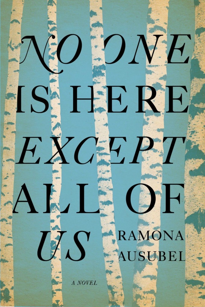
FF Spinoza — A nice looking new type family designed by New York-based art director Max Phillips:

With the goal of readability in mind, Phillips named the typeface after 17th century rationalist and lens-grinder Baruch Spinoza, a man whose job it was to help people see clearly.

The family is meant as an elegant workhorse, a classic text family with just enough individual character to hold its own in display sizes. It was inspired by mid-century German book faces like Trump Mediæval and Aldus, and by the types of Nicolas Kis. The forms are narrow and economical, with open counters. The line is firm and distinct. It has strong thick strokes and serifs to help it grip the page. Its intended virtues are firmness, clarity and modesty.

Interestingly, Phillips is also author of the Shamus Award-winning mystery Fade to Blonde, and co-founder of the pulp-infused Hard Case Crime imprint.

Sign ManualThe New Yorker takes a look at Helvetica and the New York City Subway System by Paul Shaw:

Though Helvetica was always the choice font for typographic synchronization, it was simply too expensive to ship over from Amsterdam, where it was made (back in the days of metal type, lead font plates had to be imported, a costly endeavor, since the plates had to be custom manufactured to fit American printing presses). In the early sixties (much like today) New York City Transit just didn’t have the money. Instead, the MTA used a similar font called Standard, or Akzidenz-Grotesk, which took nineteen years to fully phase out. It wasn’t until 1989 that the MTA officially ratified the decision to replace it with Helvetica in its “Sign Manual.”

The review is accompanied by a slideshow of images from the book.

Something Irretrievably LostRob Young, former editor of The Wire magazine, talks about his latest book Electric Eden: Unearthing Britain’s Visionary Music with Mark Thwaite at ReadySteadyBlog:

[T]here will always be a tradition, running underneath the more visible forms of pop and rock music. At certain times it comes into focus and is a fairly hip reference point for various artists; at other times – much of the 80s and early 90s, for example – it’s practically invisible and/or unredeemable.

Right now we’re on an upswing, possible as an inevitable reaction to the huge leaps forward in digital and electronic music in the 90s; also because, when making or locating all sorts of music has become so easy and accessible, there’s a certain nostalgia for an indefinable organic quality to the production and a sense that music can be about more than purely formal concerns. This, I’m sure, is connected at some instinctive level with the destabilising effects of recent political developments here. It’s very noticeable that folk revivals tend to occur when people are afraid of something being irretrievably lost.

The Computational Process — Ted Striphas, author of The Late Age of Print, on the distinction between ‘“algorithmic culture” and “culturomics”:

I must confess to being intrigued by culturomics… Having said that, I still want to hold onto the idea of algorithmic culture. I prefer the term because it places the algorithm center-stage rather than allowing it to recede into the background, as does culturomics. Algorithmic culture encourages us to see computational process not as a window onto the world but as an instrument of order and authoritative decision making. The point of algorithmic culture, both terminologically and methodologically, is to help us understand the politics of algorithms and thus to approach them and the work they do more circumspectly, even critically.

And finally…

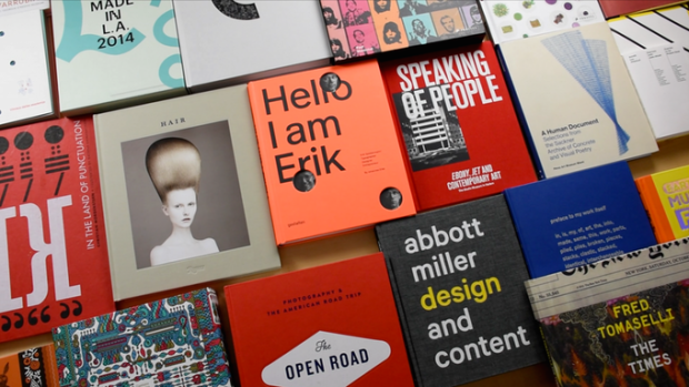
Just a reminder that the late and final deadline for AIGA’s reinstated 50 Books/50 Covers is April 21, 2011.

2 Comments

Midweek Miscellany

L’Exception Française —  The Guardian on an exhibition in Paris celebrating the centenary of French publisher Gallimard:

Gaston [Gallimard] himself always protested that he had never had any ambition or even vocation to be a publisher. And when in 1910 he was invited to join the “adventure” of the Nouvelle revue française (Nrf), it was an example of what became a rule, letting his friends “guide his life”. Modest, somewhat detached, well turned-out and above all, perhaps, “without side”, he was to prove a magnet for writers of violently contrasting aesthetic and political allegiances. He had charm, and he had luck. He drew towards him, and elected to that most exalted of circles, the comité de lecture, such arbiters of literary taste and intellectual vigour as Jacques Rivière, Jean Paulhan, André Malraux, Albert Camus and Raymond Queneau.

Gallimard, 1911-2011: Un siècle d’édition is at the Bibliothèque nationale de France until 3 July, 2011.

Dry Eyed — David L. Ulin revisits James M. Cain’s Mildred Pierce for the LA Times:

“Mildred Pierce” is less a work of noir than it is a straightforward realist novel: dry-eyed, unsentimental, in which a woman finds grace, of a kind, first by surpassing her limitations and then by recognizing them. That’s a metaphor for what it means to be a grown-up, for what it means to have to take care of a family, to sacrifice in the name of a greater good. It’s also an acute portrait of a society in transition — that of Los Angeles between the wars.

A Map of Wrong Turns — Robert Darnton breaks down why the Google Books settlement failed for the NYRB:

The cumulative effect of these objections, elaborated in 500 memoranda filed with the court and endorsed in large part by Judge Chin’s decision, could give the impression that the settlement, even in its amended version, is so flawed that it deserves to be pronounced dead and buried. Yet it has many positive features. Above all, it could provide millions of people with access to millions of books. If the price were moderate, the benefit would be extraordinary, and the result would give new life to old books, which rarely get consulted from their present locations on the remote shelves or distant storage facilities of research libraries… How can these advantages be preserved without the accompanying drawbacks?

See also: John Naughton on the settlement in The Observer.

Geographic Ingredients — An interesting article by Alison Arieff on communities of local manufacturers for The New York Times:

“For decades we have developed a culture of disposability — from consumer goods to medical instruments and machine tools. To fuel economic growth, marketers replaced longevity with planned obsolescence — and our mastery of technology has given birth to ever-accelerating unplanned obsolescence. I think there is increasing awareness that this is no longer sustainable on the scale we have developed.”

Interestingly, one of the companies Arieff mentions is DODOcase who use traditional bookbinding techniques to make beautiful cases for iPads and e-readers.

And finally…

A quick reminder that tomorrow, Thursday March 31st 2011, is the deadline for AIGA’s 50 Books/50 Covers competition. You can enter online here.

Comments closed

50/50 Reinstated

Richard Grefé, executive director of AIGA, has announced that the 50 Books/50 Covers competition will continue:

In seeking to balance AIGA’s celebration of design in all its dimensions, we recently merged the historic AIGA competition for books and covers… into the broader competition, “365: Design Effectiveness,” which includes interactive, cross-media and print design. Book designers, publishers and admirers reacted strongly to this news with a public petition to “Save 50/50,” gaining more than a thousand signatures in mere days.

We have listened to these passionate voices in the design community, and we have reinstated “50 Books/50 Covers” as a distinct competition. Our intention was not to reduce our support for book designers, but to present AIGA as representative of—and respectful toward—all design disciplines equally. We apologize to those who construed the original decision as a reduction in AIGA’s commitment to the importance of book and cover design; that was not the intention, although it was clearly the impression. We also apologize for tinkering with something that is held so dear by so many; and we were remiss in how we vetted and communicated this change.

Thank you Christopher Sergio and Catherine Casalino for organizing the petition to save 50/50, and thank you AIGA for listening. YAY.

2 Comments

Save 50/50 Petition

Save AIGA 50/50

Book designers Christopher Sergio and Catherine Casalino have created an website and online petition asking AIGA to reconsider its recent decision to end its annual design competition  50 Books / 50 Covers:

This year—after nine-decades—AIGA has decided to quietly discontinue the 50/50 competition.

Their decision was made without public announcement or explanation, and implemented without fanfare. The usual 50/50 deadline came and went, but the “Call For Entries” never went out. The presumption seemed to be that no one would notice its loss.

But people have noticed. And as it turns out, many of us care. In the few short days since the design community first realized what was going on, people have expressed the desire to preserve a competition dedicated solely to excellence in book design. There has been a common consensus that even in the digital age celebrating the physical book is important.

That is why we have created this website and online petition—to help spread the word even further, to give voice to a larger audience, and to perhaps see if enough momentum might be built to save the 50 Books / 50 Covers competition.

If you are a fan of design in any medium, or of reading in any format, we ask you to help us take a stand for the combination of both forms of expression.

50 Books/50 Covers is one of only a few design competitions dedicated to excellence  in book design. It is important that it continues.

Save 50/50

Comments closed