Steve has recorded eight episodes for the first season, with a new episode released each week, and a second season planned for 2024.
The first episode, released earlier this month, is a wide-ranging conversation with David Pearson. David discusses his time at Penguin, working freelance, the issues of low pay in the industry, as well as his design process and the challenges of creating interesting work.
I hope you’re safe and well wherever you are. What do we have this month? A few British covers for a change, a bit of Canadian content, a couple of indie presses, and even something from a university press, not to mention covers from all the usual suspects. Enjoy!
Anam by André Dao; design by Tiana Dunlop (Pan Macmillan / August 2023)
I like the cover of the US edition of Bridge published by Mulholland Books too. Let me know if you know who designed it and I’ll add in the credit! It was designed by Kirin Diemont.
Jonny also re-designed the previous books in this series to match. They’re a lovely set that somehow feel very British, and very Faber. They sort of remind me of postwar pub signs and vintage lettering on canal barges. Anyway, I like them a lot.
My ‘to be read’ wall feels particularly bad at the moment. I did, however, read an ARC of She’s a Killer by Kirsten McDougall on vacation, which is fun if you like an unreliable narrator who is not quite a genius, but very possibly a sociopath (and has an imaginary friend).
Even though it’s still just about July — a supposedly “quiet” month in publishing — I’m running late once again. Hopefully everyone is on vacation and won’t notice that it’s basically August already and I am here sliding in under the wire. There are some great covers this month though. A bit of collage, some really nice typography, and lots of pink and red. Enjoy!
The Absolutes by Molly Dektar; design by Yeon Kim (Mariner / July 2023)
I like this cover a lot, but I’m shamelessly stealing it from Lit Hub’s most recent book cover round-up (a benefit of being last to post!), so I hope the design credit is correct because I couldn’t verify it before posting!
I had this noted as down as July cover, but the book was actually released in June. The cover of the Two Lines Press edition of Running Through Beijing by Xu Zechen has also been re-designed to match.
This reminded me of the 2017 cover of Smoke by Dan Vyleta designed by Mark Abrams with an illustration by the late Colombian artist Alejandro García Restrepo who passed away last month.
Tom Gauld‘s Midsummer’s Eve cartoon for The Guardian is from last month (obviously!), but I’m borrowing it to make a bit of boring and overdue social media housekeeping more interesting!
While I haven’t yet asked Wizard Toby to deactivate the Casual Optimist account like a some kind of despairing Baphomet, I have pretty much abandoned Twitter. It’s disappointing because I’ve met some great people through the app and it has always been a tremendous resource, but I can’t support it any more.
I’ve always hated Facebook and I haven’t posted to the Casual Optimist page there in at least a couple of years. I did, however, start an Instagram account which I’m trying to update at least once a month if you want to follow along there. I think it’s pretty unlikely that I will do anything with Threads.
I’m not on Bluesky, but I am trying out Mastodon. It promises a lot, I’m just not quite convinced by it yet (and I gather from more prolific posters than me that there is something of a sea lion problem there). I’ll post a link if/when there is a proper Casual Optimist account. In the meantime, you can find me here.
There is an RSS feed that you can subscribe to if you still use a reader (I use the Old Reader FWIW; I’m not sure what the cool kids are using), or you can get it as an email (it’s not perfect but it works).
Updates are also sent automatically to Tumblr if you’re still rattling around that haunted abandoned mansion.
Anyway, sorry for being very online and tedious. I’ll try to post some more interesting stuff soon (if I don’t quietly pack it in completely and put myself out to pasture…)
Hey, I hope you are keeping safe and well. There’s a wide variety of styles this month, but pink, yellow and orange are something of a minor theme (although since writing this I’ve actually removed one of the covers that combined bright pink and yellow because the book isn’t out until September — you’ll see it in a couple of months).
I think we’re also starting to see a potential new trend with photographic covers for fiction. I don’t have the vocabulary to neatly identify the style of photography I mean (sorry photography people — I mostly studied paintings in school!), but it’s basically contemporary colour photographs of candid, and sometimes intimate, social moments. It’s different, if adjacent, to the more posed ‘stylish sad girl’ phenomenon, or the use of black and white photography for ‘serious’ literary fiction I think. Anyway, maybe it’s a thing? Time will tell…
I was wondering why the weirdly wonderful art seemed familiar and then I remembered that the cover of Lisa Wells’ nonfiction book Believersdesigned by Na Kim also makes use of Lisa Ericson painting…
I know I say everything gives me Annihilation vibes but Lisa Ericson’s art definitely gives me Annihilation vibes. And speaking of weird Vandermeer vibes…
I hope you’re keeping safe and well wherever you find yourself. A couple of people sent me posts about “blob” covers this month. If you read the blog regularly, you probably already know that I am pretty skeptical that they’re as much of thing as they’re made out to be. The examples always seem to be the same old covers with a couple of broadly similar-ish recent ones thrown in for relevance. They kind of look the same (not really) at small sizes, less so up close. “Bold and blocky” always seemed a more accurate description to me — blocks of bold colours combined with blocks of (blocky) bold text. At worst, it feels like a loosely defined trend for the kind of literary-ish books that frequently appear in the likes of New York Times rather than something we should be agonizing over. I don’t know why fixation with it grates. Maybe it’s because the commentary always seems slightly snide? Or because I just don’t think it represents an accurate picture of contemporary book cover design? I mean, book covers are always going to look broadly the same. There are some obvious common limitations that most designers have to work within. Even so, there are still lots of publishers and designers doing interesting and different things if you scratch the surface. Look a bit further — they don’t all look the same!
I believe the movie poster-like cover of the UK edition of Close to Home, published by Penguin last month, was designed by Gray318. The cinematic photo is by Enda Bowe from his Love’s Fire Song project.
In Vitro by Isabel Zapata; design by Zoe Norvell (Coffee House Press / May 2023)
This reminded me that I’ve been meaning to link to Zoe’s side project I Need a Book Cover, an online directory of (English language) book cover designers. It’s well worth checking out even if you don’t literally need a book cover.
I think the Saul Bass-ian cover of the Mexican edition of In Vitro, published Almadía, was designed by Alejandro Magallanes, but it would be great if someone more familiar with Mexican publishing can confirm!
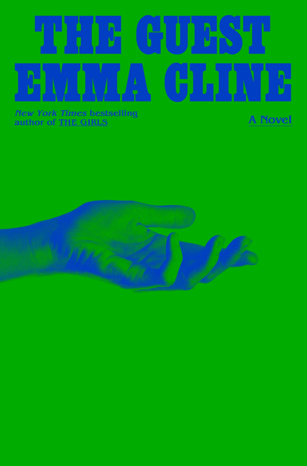
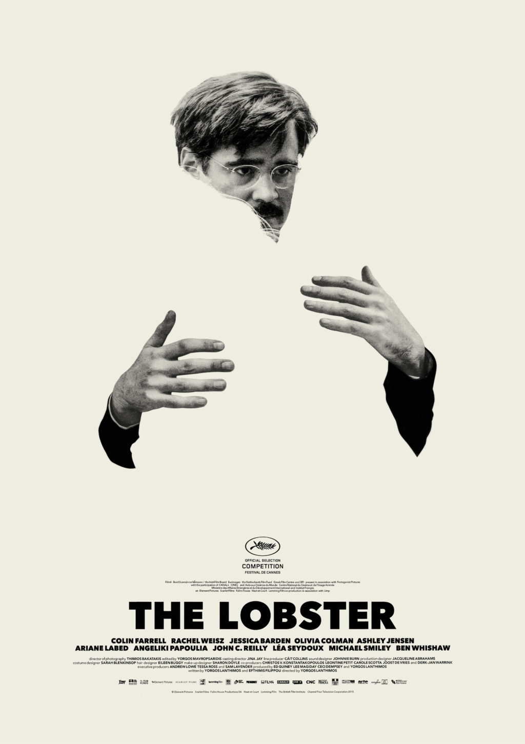
Disembodied hands are a bit of a thing this month (see The Guest), but this actually reminded me of Vasilis Marmatakis‘s lovely minimalist posters for The Lobster:
The cover for the UK and Australian edition of Blue Hunger, published by Scribe, was designed by Luke Bird (and thank you to Guy Ivison at Scribe for providing the design credit). It’s an interesting contrast I think:


