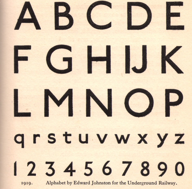
At Intelligent Life, Catherine Nixey tells the story of Edward Johnson, creator of the London Underground’s typeface:
The Underground didn’t commission a font to look different from commercial ones simply to sell it straight back to the commercial world. But that world wanted the font nevertheless. And so Johnston’s pupil Eric Gill obliged, creating Gill Sans, which would go on to be used on everything from the classic Penguin Books design to the BBC logo (since 1997)—and, later, many a Word document.
There is some suggestion that even Gill, not a man to be easily abashed, may have felt uneasy about this. He sent Johnston a letter that manages to turn, in a moment, from humility to boastful defiance. “I hope you realise”, he wrote, “that I take every opportunity of proclaiming the fact that what the Monotype people call ‘Gill’ Sans owes all its goodness to your Underground letter. It is not altogether my fault that the exaggerated publicity value of my name makes the advertising world keen to call it by the name of Gill.”
Did Johnston mind? We don’t know exactly. “I don’t think there was bitterness,” says his grandson. Though there was no money, either. “He was so lacking in business sense, he never charged a going rate for his work and so couldn’t make ends meet.” For the Underground font, Johnston was paid 50 guineas—about £4,000 in today’s money (he handed 10% of it on to Gill). By the time he died in 1944, “the finances were in a terrible state,” Andrew Johnston adds. “There had been a fund started by calligraphers in America to help this destitute master craftsman.”
(image via Mikey Ashworth on Flickr)