I posted about Wes Anderson’s Zweig-inspired film The Grand Budapest Hotel quite a lot in 2014. But as the film won four Oscars last month (including the award for production design) and I revisited the movie this past weekend, I don’t feel too bad about posting a few links about it again — it is so beautifully designed and constructed.
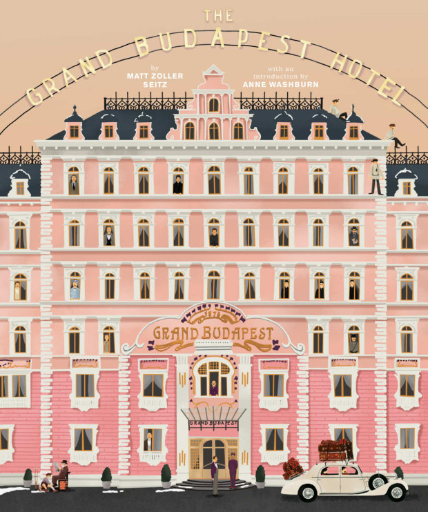
First of all, there is a new book about the movie, The Wes Anderson Collection: The Grand Budapest Hotel, by Matt Zoller Seitz, author of the original Wes Anderson Collection.
Back in January the New York Times spoke to Seitz:
“The Grand Budapest Hotel” is an incredibly rich film, one of his best, definitely the most logistically and maybe thematically complex. It’s kind of every Wes Anderson film stacked one on top of the other, like a wedding cake.
While RogerEbert.com produced this 16 minute video essay adapted from the book:
The book even has a nice animated trailer:
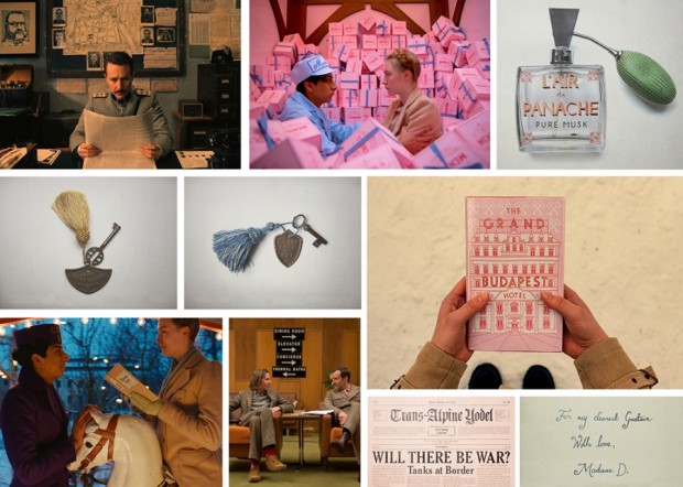
Elsewhere, Quartz interviewed the film’s lead graphic designer Annie Atkins:
“A fictitious country needs all kinds of graphics: flags, banknotes, passports, street signs,” she told Quartz. “It’s impossible to imagine graphics like these. You have to do your research and you’ll find treasures that you couldn’t even have begun to sit down and draw until you saw them in front of your eyes.”
Working closely with Anderson and the film’s production designers Adam Stockhausen and Anna Pinnock, Atkins meticulously hand-crafted almost every of piece of ephemera shown on camera. “Every piece I made began with showing Wes a collection of real examples from the period,” she explained. “We looked at hundreds of pieces of design from Eastern Europe at the beginning of the last century as reference.”
And Deadline talks to production designer Adam Stockhausen about the film and working with Anderson:
Wes knew that he wanted the hotel to be pink. That’s one of the fun things about working with him—he has such a strong sense of color and makes very bold, daring choices that, just left to my own devices I’m not sure I would have come up with. So, working with him is inspiring in that way. And then it’s a process—working with colors that go together, adding in tones that help balance things, figuring out what the right pinks are. The funny thing is, we started with all this pink, and I think this would be true of any color—if you use too much of it, you stop seeing it because it’s everywhere and you start taking it for granted. So, we found that we had to add in yellows and different colors to kind of cut it back so you could see it more. And it’s those kinds of things you learn as you’re going; in this case, we learned from taking a section of the walls in the hotel and painting them.
Stockhausen discusses the locations in the movie with National Geographic:
Most of the inspiration we had for the hotel came from our site visit to Karlovy Vary in the Czech Republic. But we also put tons of research into the setting before we visited Europe. We looked at archive photos from many different hotels, including several hotels in London, Scotland, Switzerland—all over the place. Personally, I think the design was most influenced by the Grandhotel Pupp, which sits on a hill overlooking the town of Karlovy Vary.
The town of Karlovy Vary is filled with pastel-colored buildings that line the riverfront, and it has several hotels that stand on hills that look over the town. The whole place had the right feeling we wanted to convey in the movie.
That National Geographic article also alerted me to this interesting featurette about the creating the film’s hotel in a department store in Görlitz, Germany:
And, with that, I think I’m done.
(For now.)