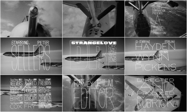
The wonderful Art of Title looks back at the title sequence for Stanley Kubrick’s Dr. Strangelove or: How I Learned to Stop Worrying and Love the Bomb designed by Pablo Ferro:
Pablo Ferro’s loose letterforms and slack compositions superimposed over aircraft footage represented a distinct departure from American title design of the time. Prior to 1966, the aesthetic of main titles was defined primarily by designers Binder, Brownjohn, and Frankfurt and their symbolic geometry, clean typography, and bold graphic forms. The stage was set for Ferro’s strain of ambitious artistry. His lettering, variously squat, long, and lean, allows the footage to peek through, unobtrusive but utterly individual. It was all done by hand, with grease pencil on glass.
In an interview with Pablo Ferro himself, the designer discusses that distinctive lettering:
I tried to do the lettering like it’s usually done in films, but he said, “Pablo, I don’t know whether to look at the lettering or look at the plane. We have to see both at the same time.” I said to myself, oh boy, how could you do that? I remembered that I do my own lettering, just doodling around, thin and tall and things like that, and I thought I’d try that.
We did a test and it worked! Stanley filled the screen with my lettering. It was perfect! You could see the plane and you could see the lettering at the same time.
Coincidently, Vienna-based foundry FaceType actually released a typeface inspired by Ferro’s lettering called Strangelove Next a few years ago. I’m sure I’ve seen it on a couple of book covers.