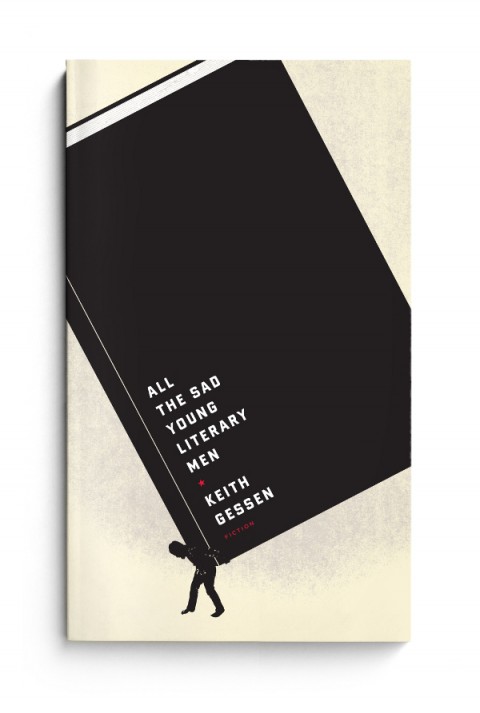
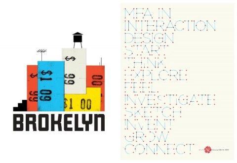
Jason Kernevich (left) and Dustin Summers (right), known together as award-winning design shop The Heads of State, met in the design program at Tyler School of Art, Philadelphia. Shortly after graduating, the duo began producing screen-print posters for the local independent music scene. The simple, bold graphic style of their work quickly garnered international attention and acclaim, and their clients now include the likes of R.E.M., Wilco, The National, The New York Times and The Guardian, as well as publishers Penguin, HarperCollins, and Random House.
If that wasn’t enough, the duo recently released a new letterpress print inspired by F. Scott Fitzgerald’s novel The Great Gatsby . The 4-colour, limited edition print (on 140 lb. French Poptone Sweet Tooth paper) shows the business cards and personal stationery of the Jazz Age VIPs that attend Gatsby’s parties in the summer of 1922. Complete with lovely touches such vintage typography and the characters’ professions and street addresses, the print is a beautiful tribute to a 2oth Century classic.
Jason, Dustin and I corresponded by Twitter and email about the Gatsby print and their unique design collaboration.
How did this project come about?
We’d been kicking around the idea of doing something with the novel for a long time. Chapter Four breaks from the plot for a moment and the narrator begins reminiscing about the folks who came to the parties that summer. The names by themselves are just incredible. There is some detail given about the characters’ background but not much. We had to make a lot of it up. But there were hints at a profession or an address here and there and that led to the idea to do business cards.
What’s the enduring appeal of The Great Gatsby for you?
Like most people, we first came across this book in high school and hated it. Rediscovering it later in life has been a joy. The time period holds endless allure. It was between the wars. The reputation of the roaring twenties and its decadence and flamboyance allows the reader to imagine so much more than what’s on the page. And there’s plenty on the page! It’s all the more poignant because of the crash that followed.
Do you think the story has particular contemporary relevance?
The lead-up to the Great Depression holds a contemporary economic relevance for sure. But it’s also a hell of a break-up story in a way with it’s jealousy, conspiracy, and doomed aspirations. That is certainly a side of the novel not fully grasped in the 9th grade.
 Your work often seems inspired by New Deal era WPA illustration and mid-century modern design. Are you also inspired by the Jazz Age?
We hadn’t really looked to it for much inspiration in the past, but through our research we found that a lot of the documents of that era were much more practical and less decorative than we anticipated, which connected more with our aesthetic.
How did you recreate the vintage type?
A lot of it came from books that we scanned as well as classic typefaces that predate the era or modern decorative faces that reference it. There was also some hand lettering done.
Did you research 1920’s typefaces? Were you trying to be totally accurate?
We weren’t trying to be 100% accurate. Capturing the spirit was the most important thing. We had a few historical references for inspiration. The credits and titles for the original King Kong conveyed a sense of glamour and of old New York that was appropriate for some cards despite the film being from 1933. We found a few business cards from the early twenties for doctors, furriers, jewelers, etc. They were surprisingly modest and utilitarian. Which makes sense due to printing and lettering limitations. So we aimed for somewhere in the middle.
Do you have a favourite ‘card’ on the poster?
It changes. The “Films Par Excellence” card is a favorite. But Jordan Baker’s gets our pick. She is the only main character we did a card for and we wanted to sneak it in as a payoff to fans of the book. We like to say that her card was inspired not just by her profession (golf champion) but by her eyelashes.
What’s the appeal of manual printing processes like letterpress and silkscreen?
It a tactile, sensual thing that you feel connected to as a viewer. It’s great to be able to interact with a piece of design in that way. It also added a disguise of authenticity and age to this project. Oh, the irony.
 Could you describe your creative process? How does your collaboration work?
Over the years we’ve developed quite a shorthand with one another. Our process is sometimes as simple as a conversation while sketching. We’ve hit on some of our best ideas in a matter of few minutes by just talking through the problem at hand. Sometimes it’s more labored over. In those instances we hit the books, research, sketch, and let the best and most clear idea win. We are both always in pursuit of the best idea and that helps move things along.
Who are your design heroes?
We have so many. Plenty of usual suspects from the 1950’s and 1960’s and from our early days of making silkscreen posters. We love the travel posters of David Klein. Book designers like John Gall and Paul Sahre. Leanne Shapton is a personal favorite. A lot of our artist friends never cease to amaze us with the work they churn out. Jessica Hische. Tim Gough. Matt Curtius and Gina Triplett. Martha Rich. Josh Cochran and Chris Neal and everybody else at the Pencil Factory in Brooklyn.
 What’s next for The Heads of State? Will we be seeing more book covers from you soon?
We’ve got some book covers in the works. We’re also working on more self-initiated projects and products as well as a few branding projects we’ll be unveiling in the next few months that we’re pretty psyched about.
Thanks!
How did this project come about?
We’d been kicking around the idea of doing something with the novel for a long time. Chapter Four breaks from the plot for a moment and the narrator begins reminiscing about the folks who came to the parties that summer. The names by themselves are just incredible. There is some detail given about the characters background but not much. We had to make a lot of it up. But there were hints at a profession or an address here and there and that led to the idea to do business cards.
What’s the enduring appeal of The Great Gatsby for you?
Like most people, we first came across this book in high school and hated it. Rediscovering it later in life has been a joy. The time period holds endless allure. It was between the wars. The reputation of the roaring twenties and its decadence and flamboyance allows the reader to imagine so much more than what’s on the page. And there’s plenty on the page! It’s all the more poignant because of the crash that followed.
Do you think the story has particular contemporary relevance?
The lead-up to the Great Depression holds a contemporary economic relevance for sure. But it’s also a hell of a break-up story in a way with it’s jealousy, conspiracy, and doomed aspirations. That is certainly a side of the novel not fully grasped in the 9th grade.
Your work often seems inspired by New Deal era WPA illustration and mid-century modern design. Are you also inspired by the Jazz Age?
We hadn’t really looked to it for much inspiration in the past, but through our research we found that a lot of the documents of that era were much more practical and less decorative than we anticipated, which connected more with our aesthetic.
How did you recreate the vintage type?
A lot of it came from books that we scanned as well as classic typefaces that predate the era or modern decorative faces that reference it. There was also some hand lettering done.
Did you research 1920’s typefaces? Were you trying to be totally accurate?
We weren’t trying to be 100% accurate. Capturing the spirit was the most important thing. We had a few historical references for inspiration. The credits and titles for the original King Kong conveyed a sense of glamour and of old New York that was appropriate for some cards despite the film being from 1933. We found a few business cards from the early twenties for doctors, furriers, jewelers, etc. They were surprisingly modest and utilitarian. Which makes sense due to printing and lettering limitations. So we aimed for somewhere in the middle.
Do you have a favourite ‘card’ on the poster?
It changes. The Films Par Excellence card is a favorite. But Jordan Baker’s gets our pick. She is the only main character we did a card for and we wanted to sneak it in as a payoff to fans of the book. We like to say that her card was inspired not just by her profession (golf champion) but by her eyelashes.
What’s the appeal of manual printing processes like letterpress and silkscreen?
It a tactile, sensual thing that you feel connected to as a viewer. It’s great to be able to interact with a piece of design in that way. It also added a disguise of authenticity and age to this project. Oh, the irony.
Could you describe your creative process? 10. How does your collaboration work?
Over the years we’ve developed quite a shorthand with one another. Our process is sometimes as simple as a conversation while sketching. We’ve hit on some of our best ideas in a matter of few minutes by just talking through the problem at hand. Sometimes it’s more labored over. In those instances we hit the books, research, sketch, and let the best and most clear idea win. We are both always in pursuit of the best idea and that helps move things along.
Who are your design heroes?
We have so many. Plenty of usual suspects from the 1950’s and 1960’s and from our early days of making silkscreen posters. We love the travel posters of David Klein. Book designers like John Gall and Paul Sahre. Leanne Shapton is a personal favorite. A lot of our artist friends never cease to amaze us with the work they churn out. Jessica Hische. Tim Gough. Matt Curtius and Gina Triplett. Martha Rich. Josh Cochran and Chris Neal and everybody else at the Pencil Factory in Brooklyn.
What’s next for The Heads of State? Will be seeing more book covers from you soon?
We’ve got some book covers in the works. We’re also working on more self-initiated projects and products as well as a few branding projects we’ll be unveiling in the next few months that we’re pretty psyched about.
Thanks! Dan


such amazing beautiful art. I think I might wonder over to their online shop… for that Gatsby print
Absolutely amazing work. I’ve always been huge a fan and was dying with anticipation for their new website and shop … and now the Gatsby print.
They just get better with age.
As ever, another great interview by Dan.
The website rocks. the work rocks. they rock. end of story.
[…] more back-story on the Gatsby […]
[…] their design process (here is an excellent one on The Great Discontent, and an older one on the Casual Optimist). You can read a half dozen of the same interviews, so we decided to focus a bit more on the […]