Hey. I hope you’re safe and well and caught up on your podcasts, shows, and TBR pile.
I thought this was going to be a short post this month, and then it turned into a long one — or longer than expected at least. I don’t have too much to add to the covers. I’m busy, you’re busy. It’s almost October, literally no one has time for this! But there are some lovely covers this month. There’s a bit autumnal orange and ennui, some nice type, and a couple of Canadian covers (for those keeping count), and a couple of appropriately off-beat ones from our friends at New Directions.*
American Gun by Cameron McWhirter and Zusha Elinson; design by Rodrigo Corral (Farrar, Straus & Giroux / September 2023)
Fear by Robert Peckham; design by Tom Etherington (Profile / September 2023)
Goth by Lol Tolhurst; design by Timothy O’Donnell (Quercus Publishing / September 2023)
This whole thing is ridiculously in my wheelhouse. The cover photo is by the author (of course!), and there’s a fun note about trying to source the type in Timothy’s Instagram post about the design.
Grand Tour by Elisa Gonzalez; design by Na Kim (Farrar, Straus & Giroux)
I’m not sure it was the intention, but I like the trippy film title / goth art project quality of this.
The Lights by Ben Lerner; design by David Pearson (Granta / September 2023)
Hopefully you’ve all had chance to listen to David on the Cover Meeting podcast by now. It’s really good!
The cover of the US edition published by FSG was designed by Thom Colligan. It’s interesting that they’re similar and yet different. I wonder if it was brief or just a creative coincidence?
I’m sure I’m not the only one to get Edward Hopper vibes from this cover.
The cover of the UK edition was designed by Suzanne Dean with a cover illustration by Anna Morrison.
*A bit of admin from last month: I finally managed to spend some time browsing a bookstore and I was able to ascertain that the cover of the US edition of Bridge by Lauren Beukes was designed by Kirin Diemont. Apologies to Kirin for not crediting her at the time in last month’s post. It’s updated now)
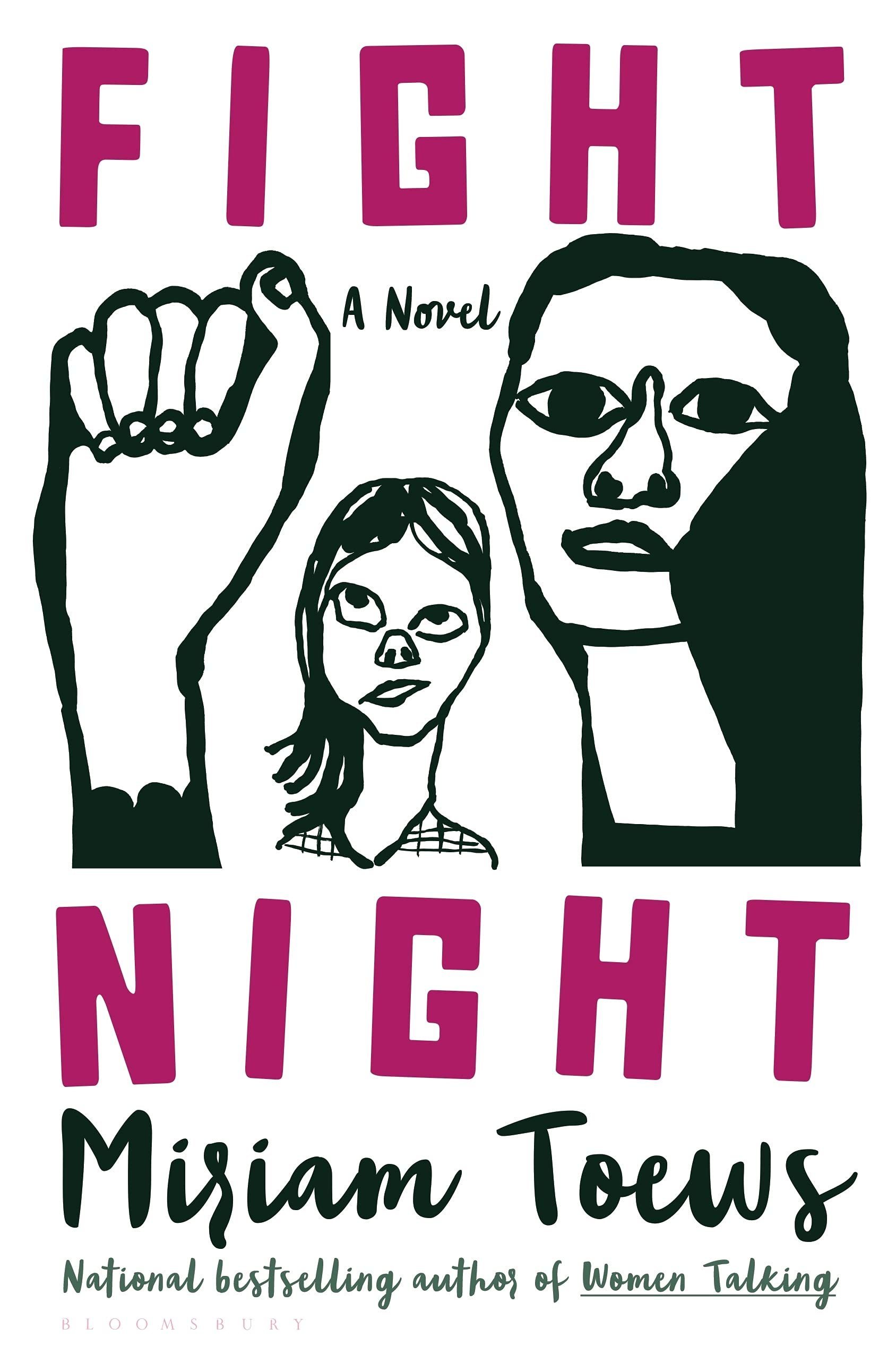
The black and white illustration and pink type reminded me of the US cover for Fight Night by Mirian Toews, designed by Patti Ratchford with an illustration by Christina Zimpel, from last year.
Boothby Karen Joy Fowler; design by Tal Goretsky (G.P. Putnam’s Sons / March 2022)
If you’d asked me to guess sight-unseen, I would’ve 100% said this was designed by someone else. It just goes to show that designers are talented, versatile people and I know nothing (NOTHING).
Earlier this year, a Canadian magazine asked me what the latest trends in book cover design were. I don’t think I had a very satisfactory answer. 2021 felt very much like a continuation of 2020, which itself felt like a year on hold.
The trends that came to mind were not exactly new. In no particular order: big faces (big sunglasses!); cropped faces; hands; mouths; postmodern typefaces;1 big skies; rainbows; gradients; the colour orange; psychedelia; collage; contemporary painting.
A lot was made of “blob” covers this year. I’m not sure that anything has really changed since Vulture published this article about “blocky” covers in 2019. They seemed like much the same thing.
Design is about the constraints and, as it turns out, the constraints around designing commercial literary fiction covers that have to work just as well online as in bookstores can lead to similar design solutions — large, legible type, and bright, abstract backgrounds. 2 The surprising thing is not that a few covers look the same when you squint; it’s that more of them don’t.
There were a lot of good covers (that didn’t look alike) in 2021. LitHub posted 101 of them. Still, it didn’t exactly feel like a vintage year.
Do I say that every December? Possibly.
A few years ago I worried that covers were moving in a more conservative direction, particularly at the big publishers. I’m not sure this has come to pass, at least not in the US. There are plenty of covers from the big, prestigious American literary imprints in this year’s list, as there were last year, and every year before that.
There are fewer covers from the UK in this year’s list than in previous years though, and I feel less confident about the situation there. From a distance, things seem a little sedate. I may be mistaken. It’s quite possible I haven’t see enough covers — or perhaps enough of the right ones — from British publishers to get a good sense of the overall picture.3
It would not be a surprise, however, if publishers were feeling a little risk-averse at the moment. We are two years into a global pandemic, experiencing a major supply chain issues, and living through a seemingly endless series of sociopolitical crises.
Nor would it be a surprise if designers were personally feeling the effects too — I’m not sure we are talking about this enough, and I’m not sure I know how to.
Thank you to everyone who has supported the blog in 2021. It means a lot. Here are this year’s book covers of note…
Na Kim talked to PRINT about her career and the designs for the Ditlevsen series in February. If, like me, you were wondering about typeface on the covers, it’s Prophet from Dinamo apparently.
If you’re wondering about the Super-Seventies Sally Rooney typeface, it is Ronda designed by Herb Lubalin and Tom Carnese (I only know because I asked).
Thank you to everyone who has supported the blog in 2021. It means a lot.
I am not convinced that the term “postmodern” quite captures what I mean here (and/or worse, implies something different in the context of typography), but it’s the best I’ve got. I’m not talking about the kind of experimental typography you might associate with the likes of Wim Crouwel or Emigre, or the aesthetic of someone like David Carson. What I am trying to get at is idiosyncratic type that purposely exaggerates or plays with letterforms, and doesn’t conform to function-first modernism. To my mind, this would include some typefaces from the 1960s and 70s, as well as some more contemporary type. In a sense what I am describing is display faces — and I think the eclectic, innovative use of type in Victorian advertising might be an inspiration to designers here — but I don’t think it is just about size. ↩
They look very different, but I was reminded of another sunset sky cover designed by Lauren from earlier this year. It’s interesting to see the (presumably) coincidental themes in a designers work.
I quite enjoy seeing contemporary painting being used on book covers. A couple of other recent examples that come to mind are Jennifer Carrow’s recent cover for Lorna Mott Comes Home with art by Barbara Hoogeweegen, and Stephen Brayda’s cover for last year’s The End of the Ocean by Maja Lunde with art by Scott Naismith (another sunset sky cover! I guess After the Sun could also be included in this trend broadly speaking. It is not quite the kind of painterly art I am thinking of though…).
I’m drawing lots of unnecessary comparisons today, but I was reminded of this Oliver Munday cover from a while back if only for the similar-ish colour combinations (I was going to say palette, but… ). It reminds me of something else too, I just can’t quite put my finger on it…
If I didn’t already know who the publisher was, I would not have been able to tell you if this was an American or British cover despite the subtitle and very American imagery. I don’t think it would like out of place on the Allen Lane list for example.
The don’t look that similar side by side, by I was reminded of Will Staehle‘s 2018 cover for Circe by Madeline Miller, and the UK cover of the more recent Sistersong by Lucy Holland, designed by Melissa Four (I’m fairly sure I’ve seen an orange/red version of the Sistersong cover. Perhaps it was an ARC?).
Circe by Madeline Miller; design by Will Staehle (Little Brown & Co / April 2018)
When I first saw this cover I immediately thought there was some kind of link to Josef Albers ‘Homage a Square’ series, but nobody else seems to have mentioned it, so perhaps it is coincidental? Is that possible? I should probably pick up the book!