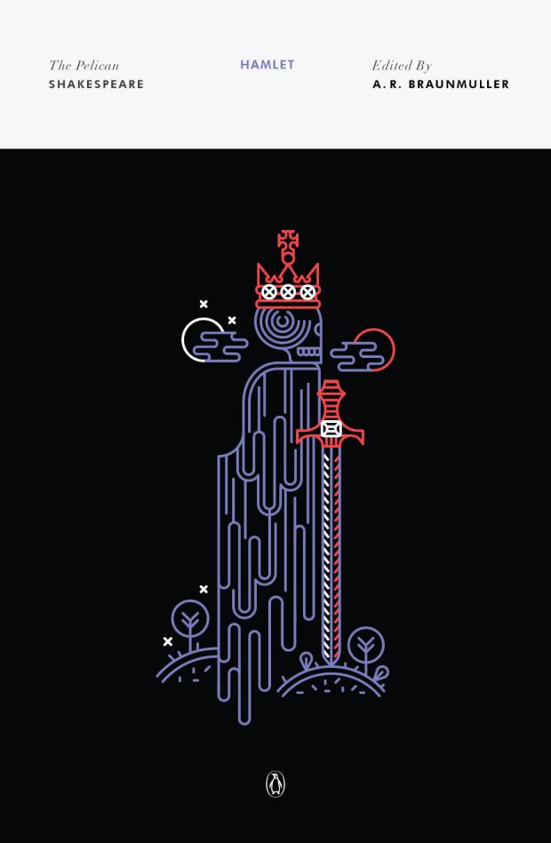
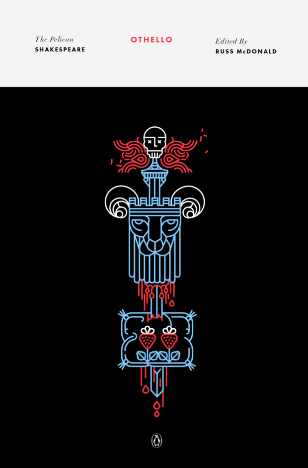
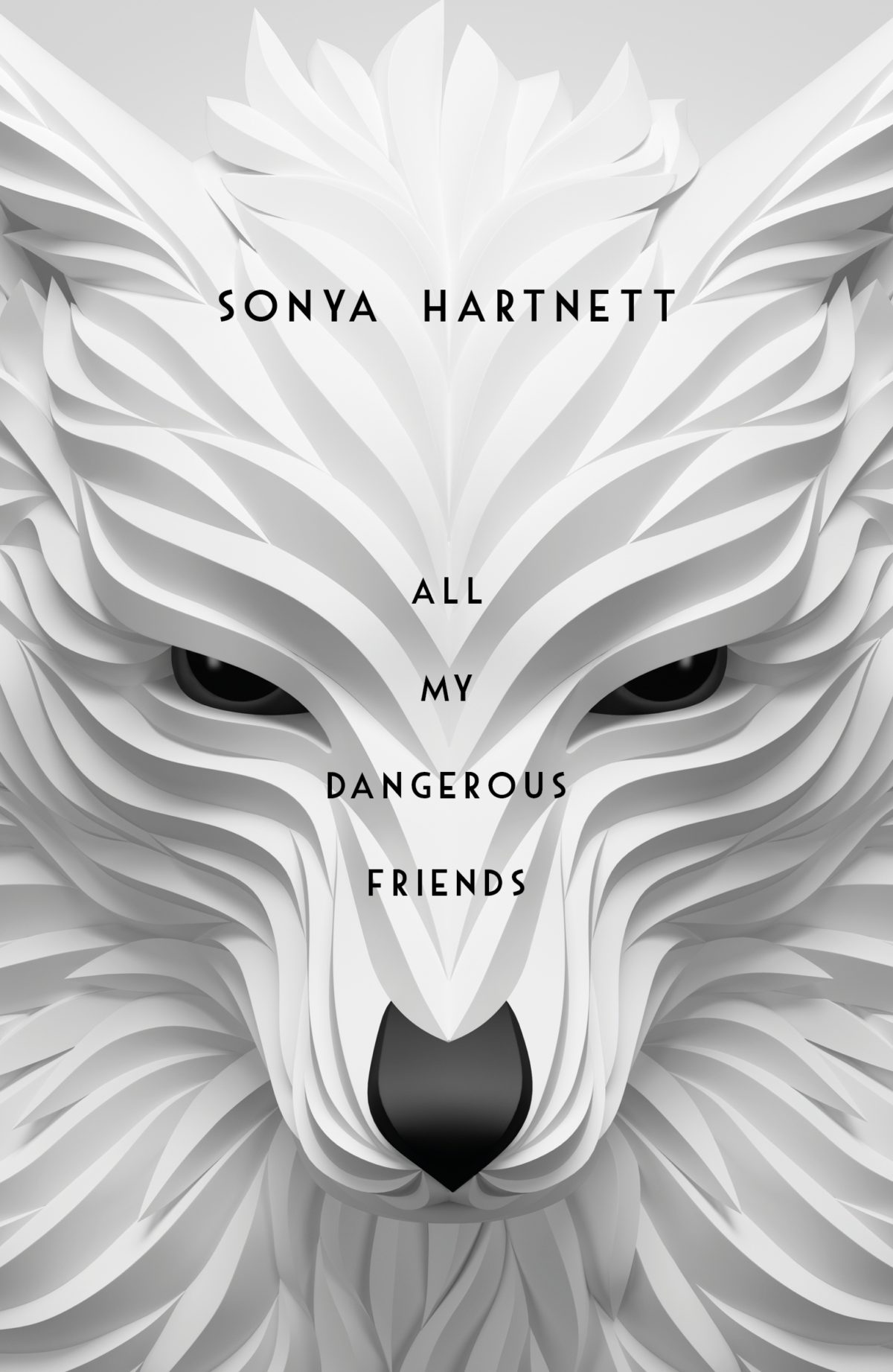
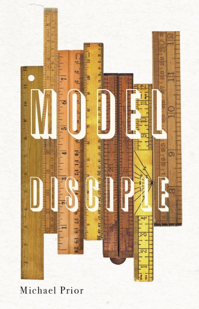
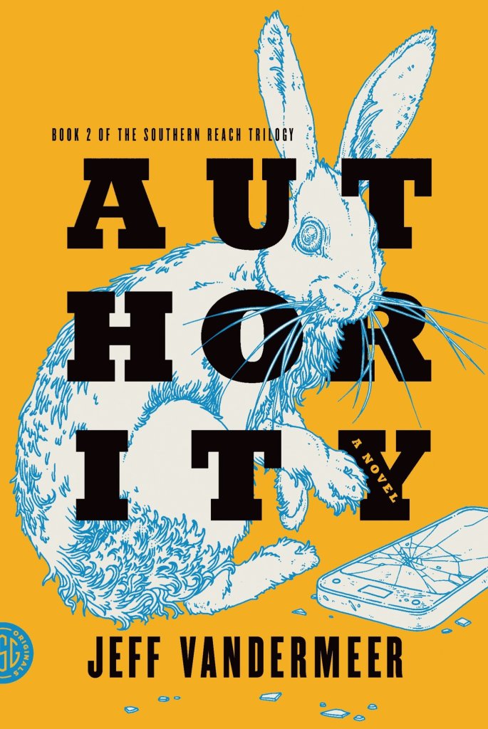
Continuing with the recent series design theme here on The Casual Optimist, creative director Paul Buckley let me know about new set of covers for the Pelican editions of Shakespeare. The covers were designed by newcomer Manuja Waldia, who studied Graphic Design at NIFT, New Delhi and the Milwaukee Institute of Art & Design. Waldia has been commissioned to design the entire series (which is a lot of book covers!), and as a Paul said, “she gives the last two male icon artists to do that (Milton Glaser and Riccardo Vecchio) a run for their money.”
Art directed by Ashley Prine at Sterling Publishing, and with additional typography by the immensely talented Chin-Yee Lai, both books have laser-cut covers, as well as five laser-cut interior illustrations per book, and more than 30 other illustrations.
The results are beautiful and the project sounded like fascinating undertaking, so I thought I would ask Kevin a little more about it.
We corresponded by email.
How did the project come about?
Two years ago, at the very beginning of my foray into freelancing and just a month after graduating from Pratt, I received an unsolicited email from Pamela Horn, a Editorial Director at Sterling Signature. It turns out that a higher-up in the company had seen my work at Pratt’s Annual Pratt Show and passed my portfolio on to her!
After we met a few times, she mentioned that she’d been looking to do a project with a paper artist, and that when the right one came along she would let me know. Initially this had meant a series of Classics book covers, but that fell through. Nine months after our first interview, I got the call — Pam wanted to do a series of Shakespeare plays, starting with Romeo and Juliet and Macbeth, each with a cover and fifteen plates! And that was a dream job right there! And after some discussion with my Art Director, Ashley Prine, it got even better, even more unreal: today it is a hardcover book with a laser-cut cover, five interior two-layer laser-cut illustrations, and almost forty printed spots, spreads, act openers and motifs. And my name on the cover to boot!
How did you approach such a big project?
The process was interesting to figure out. After hand-cutting a great deal of the book, we realized that scans of the pieces didn’t look good and there was no quick-fix for turning them into vectors. Enter my friend and assistant, Victoriya Baskin. Since my sketches before I cut are like maps of everything (I don’t freehand anything), she was able to vector it all together so that we had a product that could be printed on the pages and sent to the laser-cutter with clean, expert lines! And the work can be edited, which was our primary concern with paper.
How you feel about the final results?
It’s been an absolute dream. As a young illustrator, and one that works in paper, I couldn’t have hoped for a better display of my work than these books. I am so happy with them, although seeing them on the shelves in a book store is the most surreal experience for me. It’s a privilege to work with my entire team, and an honor to have been a part of such a phenomenal production! Much Ado about Nothing and Hamlet are next in line to be published in November!
Thanks Kevin!
You can see more of Kevin’s work on these books on his blog.
Hey. Here are the book covers that have caught my eye online this month. I hope that they bring a little joy in this very grim time.
If you have the means to buy books at the moment (and I appreciate that is not going to be the case for everyone), please consider supporting your local bookstore. I know a lot of stores are taking orders by email even if they are not answering the phone, and many are offering local delivery if curbside pick-up is not currently an option. The situation seems to be changing daily, so if a store wasn’t accepting orders yesterday, they might be today. We are all figuring this out on the fly.
If you are in the US and don’t have access to a local bookstore, there is Bookshop.org who are trying to provide some financial support to independents. If there are similar initiatives elsewhere, let me know — I’m happy to share the link.
Afterlife by Julia Alvarez; design by Jaya Miceli (Algonquin Books / April 2020)
I wonder where the eye — particularly the combination of the colour red and the eye — as a symbol of Orwell and Nineteen Eighty-Four originated? Does it go back to the 1960s and the Penguin paperback designed by Germano Facetti?
I understand that the eye is a short-hand for the surveillance state. But it is almost as if that is now considered the only element of the book worth visualizing (David Pearson’s cover is in an interesting exception in that it cleverly focuses on censorship rather than surveillance).
I haven’t read Nineteen Eighty-Four in years, but my memory is that the infamous “Big Brother is Watching You” poster is a face whose eyes seem to follow you when you move — something I think Matt’s cover above captures quite nicely — not an all-seeing, omniscient eye. The first time I read the novel, I imagined Big Brother looked something like Lord Kitchener / Uncle Sam in the recruitment posters. I was more traumatized by Room 101 to be honest… Has anyone put rats on the cover of Nineteen Eighty-Four?
I actually read Godshot in manuscript form last year and liked it a lot. It is set in drought-stricken California, but I had Ry Cooder’s soundtrack to Paris, Texas playing in my head the whole time I was reading it.
I also wanted to give a quick shout-out to Nicole who was diagnosed with breast cancer at the end of last year and bravely shared her story on social media recently. Stay safe, and get well soon, Nicole. :-)
Griefby Svend Brinkmann; design by David A. Gee (Polity Press / April 2020)
David has designed the covers for a number of books by Svend Brinkmann, including Standpoints, which featured on the blog back in March 2018.
The cover of the UK edition of A Luminous Republic, which Granta is publishing in a couple of months, was designed by Luke Bird. It’s a really interesting contrast!
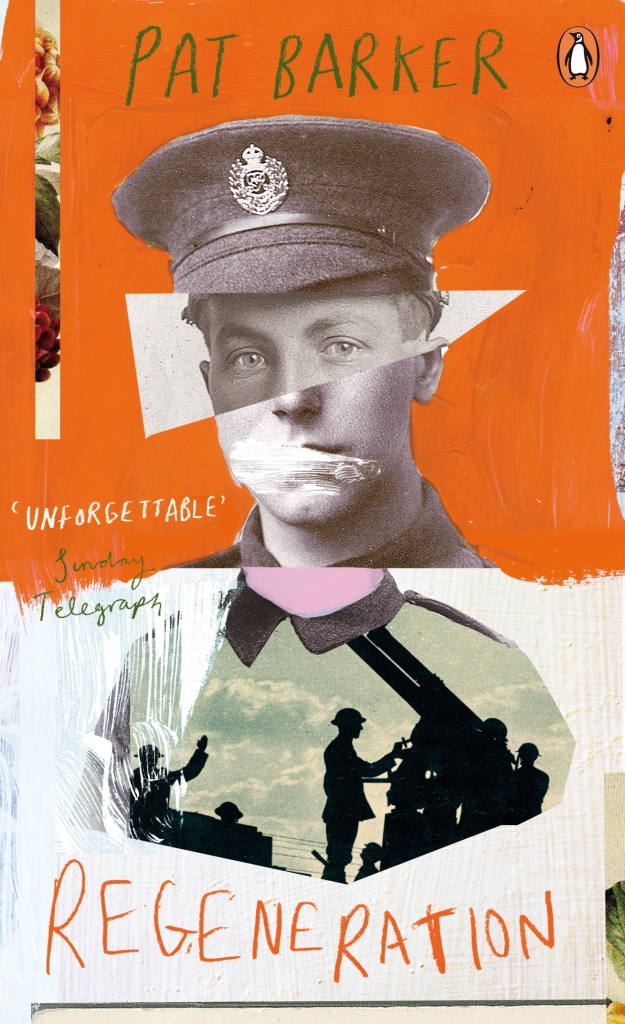
Some of the most interesting and innovative book covers in the last few years have been designed as part of a series — designers and art directors seem to have more leeway with backlist titles (especially so if the author is no longer in the picture!) — and 2016 was no exception. Here are some of my favourite series designs from past year…
The Angelus Trilogy by John Steele; designed by Jason Booher (Blue Rider Press / 2016)
Inspector Littlejohn Mysteries by George Bellairs; design Stuart Bache (IPSO Books / 2016)
The Birds and the Bees; cover art by Timorous Beasties (Vintage / 2016)
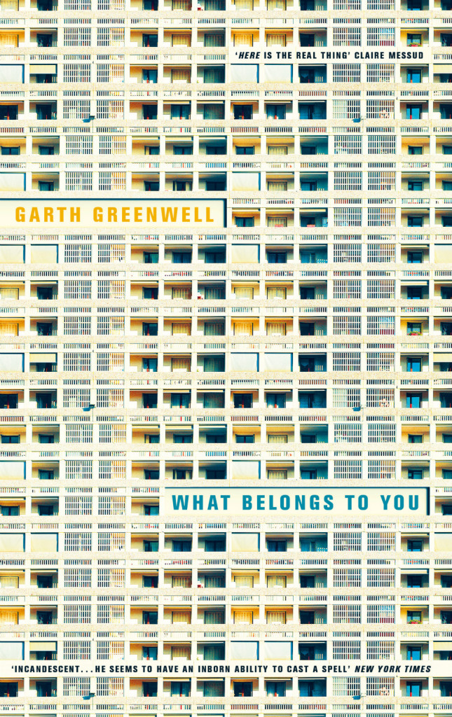
What Belongs to You by Garth Greenwell; design by Justine Anweiler (Picador / April 2016)
This is a variant on the cover of the US edition from FSG designed by Jennifer Carrow, which is also very nice (especially the zig-zag of the type), but I especially like the Andreas Gursky-like edge-to-edge grid and hyper-real colour of the UK edition.
What Belongs to You by Garth Greenwell; design by Justine Anweiler (Picador / April 2016)
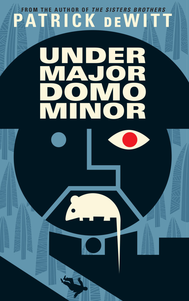
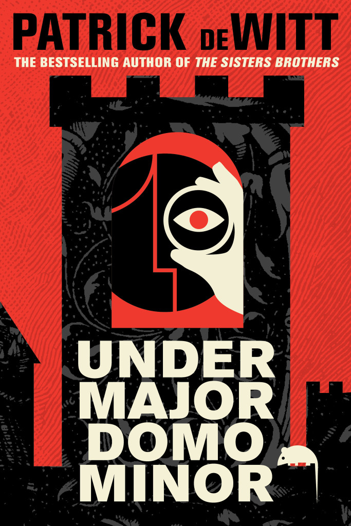
Next month sees the publication ofUndermajordomo Minor, the new novel by award-winning Canadian author Patrick deWitt.
An “ink-black comedy of manners”, itapparently involves an Alpine castle, a mysterious Baron Von Aux, and a lot of bad behaviour — including, if the Quill and Quire‘s Steven W. Beattie is to be believed, “an extravagant act of Hieronymus Bosch-like grotesqueness… perpetrated upon a large rat.”
It sounds a little like a horror movie directed by Wes Anderson. Or Terence Fisher doing something nasty to Gilbert and Sullivan.
While the cover for the US edition (published by Ecco) was designed by the talented Sara Wood, the UK and Canadian editions of Undermajordomo Minor feature the distinctive artwork of Dan Stiles, the American illustrator and designer who designed the covers of deWitt’s previous novels The Sisters Brothers and (the reissued) Ablutions.
Granta (UK)
House of Anansi (Canada)
Although Stiles has created different designs for Granta, and House of Anansi, the UK and Canadian covers (both featuring that unfortunate rat) have strong echoes of those previous books. According to the Canadian art director Alysia Shewchuk, this was a deliberate decision. “Dan Stiles created a very a distinctive look for The Sisters Brothers — highly stylized, dark yet playful — and we wanted to pick up these threads in our cover for Undermajordomo Minor.”
This is most apparent in the Anansi cover. Its bold geometric design is similar to Stiles’s theatrical cover for Granta, but its colour palette and texture bring it back to the The Sisters Brothers.
Interestingly, the focus of the Canadian cover is different too. “We’d seen early versions of the covers for both the US and the UK editions, and while we liked the different directions they’d each gone in, for our edition we thought it was important to feature the main character (Lucy Minor) and the castle where he lives and works,” says Shewchuk. “Dan understood exactly what we were looking for and he nailed it on the first go-around.”
Undermajordomo Minor will be published on September 3rd in the UK, September 5th in Canada, and September 15th in the US.
In the meantime, watch the slightly Monty Python-esque trailer made by artist Joanna Neborsky, with music by deWitt’s brother Nick deWitt, released today:
Correction: When first posted, I stated incorrectly that the US cover was also designed by Dan Stiles. The final design and illustration for the Ecco edition of Undermajordomo Minor is by Sara Wood. The post has been amended and updated to credit Sara for her work.
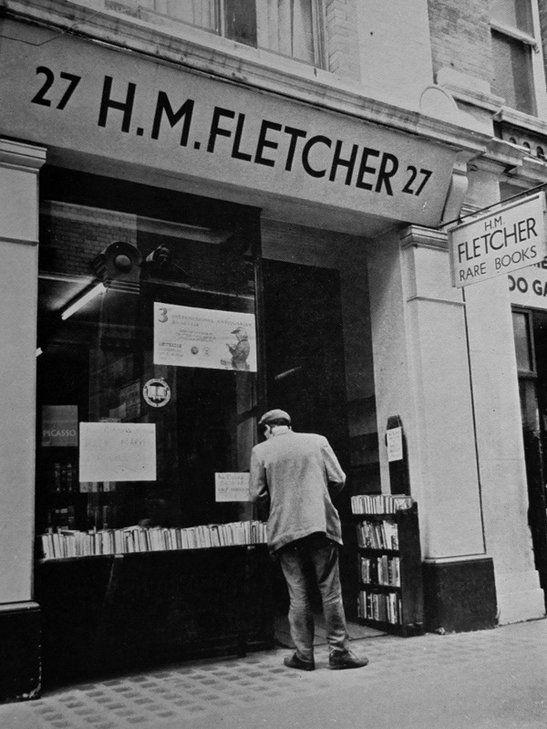
At the lovely Spitalfields Life blog, the Gentle Author reminisces about buying and selling used books in London, and shares some wondeful black and white photographs of the city’s secondhand bookshops taken in 1971 by Richard Brown:
Frustrated by my pitiful lack of income, it was not long before I began carrying boxes of my textbooks to bookshops in the Charing Cross Rd and swapping them for a few banknotes that would give me a night at the theatre or some other treat. I recall the wrench of guilt when I first sold books off my shelves but I found I was more than compensated by the joy of the experiences that were granted to me in exchange.
Inevitably, I soon began acquiring more books that I discovered in these shops and, on occasion, making deals that gave me a little cash and a single volume from the shelves in return for a box of my own books. In this way, I obtained some early Hogarth Press titles and a first edition of To The Lighthouse with a sticker in the back revealing that it had been bought new at Shakespeare & Co in Paris. How I would like to have been there in 1927 to make that purchase myself.
In the past, I’ve often included a few series designs in with my favourite covers of the year. This year, I saw so many great covers that were part of a series, I thought a they deserved a post of their own…
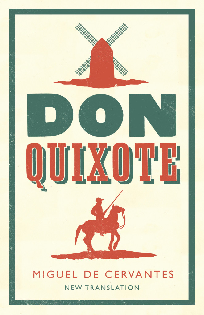
Don Quixote by Miguel de Cervantes; design by Nathan Burton (Alma / 2014)
The Gambler by Fydor Dostoevsky; design by Nathan Burton (Alma / 2014)
Notes from the Underground by Fydor Dostoevsky; design by Nathan Burton (Alma / 2014)
Alma Classics; design by Nathan Burton (Alma / 2014)
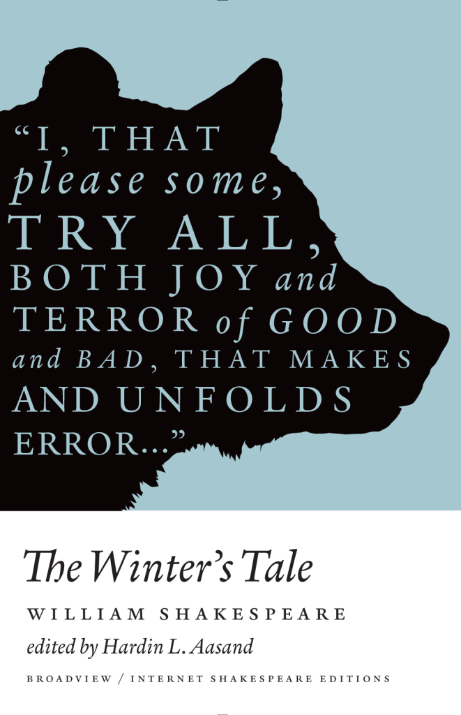
A Winter’s Tale by William Shakespeare; design by Michel Vrana (Broadview / 2014)
As You Like It by William Shakespeare; design by Michel Vrana (Broadview / 2014)
Henry V by William Shakespeare; design by Michel Vrana (Broadview / 2014)
Broadview Shakespeare; design by Michel Vrana (Broadview / 2014)
Nova Express by William Burroughs; cover art by Julian House (Penguin Classics 2014)
The Son Machine by William Burroughs; cover art by Julian House (Penguin Classics 2014)
The Ticket That Exploded by William Burroughs; cover art by Julian House (Penguin Classics 2014)
The Cut-Up Trilogy by William Burroughs; cover art by Julian House (Penguin Classics 2014)
Snapshots–Nouvelles voix du Caine Prize; design by David Pearson (Éditions Zulma / 2014)
Le Complex d’Eden Bellweather by Benjamin Wood; design by David Pearson (Éditions Zulma / 2014)
L’Exception by Auður Ava Ólafsdóttir ; design by David Pearson (Éditions Zulma / 2014)
Éditions Zulma; design by David Pearson (Éditions Zulma / 2014)
Come, Sweet Death by Wolf Haas; design by Christopher Brian King (Melville House / 2014)
Resurrection by Wolf Haas; design by Christopher Brian King (Melville House / 2014)
In November’s Vanity Fair, Bruce Handy profiles George Whitman, the late owner of Shakespeare & Company — “the most famous independent bookstore in the world” — and his daughter Sylvia, the current owner of the shop:
It is not true, as the store’s workers have sometimes overheard passing tour guides proclaim, that James Joyce lies buried in the cellar. (If only. He was laid to rest at a conventional, non-bookselling cemetery in Zurich.) But the store’s roots do indeed reach back to the Shakespeare and Company that Sylvia Beach, an American expatriate, owned in Paris in the 1920s and 30s. As every English major knows, her bookshop and lending library became a hangout for Lost Generation writers such as Ernest Hemingway, F. Scott Fitzgerald, Ezra Pound, and Joyce, whose Ulysses was first published in its complete form by Beach because authorities in Britain and America deemed it obscene. She closed up shop during the Nazi occupation and never reopened. But her mantle was taken up by another American, George Whitman, who opened the present-day store in 1951, just as Beat Generation writers were finding their way to the Left Bank. (The so-called Beat Hotel, which would become a Parisian equivalent to New York’s Chelsea Hotel as a flophouse for writers, artists, and musicians, was only a few blocks away.) Writers who logged time at the current Shakespeare and Company, sometimes even sleeping there—Whitman was possibly keener on extending hospitality to authors, lauded or not, than on selling their books—include Allen Ginsberg, Henry Miller, Richard Wright, Langston Hughes, Lawrence Durrell, Anaïs Nin, James Jones, William Styron, Ray Bradbury, Julio Cortázar, James Baldwin, and Gregory Corso. Another early visitor, Lawrence Ferlinghetti, co-founded his City Lights Bookstore, in San Francisco, as a sister institution two years after Shakespeare’s opened. William S. Burroughs pored over Whitman’s collection of medical textbooks to research portions of Naked Lunch; he also gave what may have been the first public reading from his novel-in-progress at the store. (“Nobody was quite sure what to make of it, whether to laugh or be sick,” Whitman later said.)
Chasing the White Rabbit — Francine Prose on dreams and literature, at the New York Review of Books blog:
Literature is full of dreams that we remember more clearly than our own. Jacob’s ladder of angels. Joseph saving Egypt and himself by interpreting the Pharoah’s vision of the seven fat and lean cows. The dreams in Shakespeare’s plays range as widely as our own, and the evil are often punished in their sleep before they pay for their crimes in life. Kafka never tells us what Gregor Samsa was dreaming when he awakens as a giant insect, except that the dreams were “uneasy.” Likely they were not as uneasy as the morning he wakes into. By the end of the first paragraph of “The Metamorphosis,” Gregor has noticed his arched, dome-like brown belly, his numerous waving legs. “What has happened to me? he thought. It was no dream.”
“Krautrock” was the convenient collective name given in a slightly jokey, slightly wary and affectionately patronising way to an eclectic collection of radicalised German groups from very different parts of the country that contained musicians who were born in the few years before, during or just after the Second World War. Another collective name for these groups, still frivolous but more descriptive of their mission to create sound never heard before on our planet and invent music that could make you feel you were leaving the earth behind, was “kosmische”. As well as Can, these groups included Kraftwerk, Tangerine Dream, Amon Düül II, Cluster, Popol Vuh, Harmonia, Neu! and Faust, and they were looking for ways to repair their traumatic recent history, remove the crippling infection of fascism, break free of totalitarian artistic repression, negotiate turbulent social and emotional currents, and radically, romantically reinstate the positive, progressive elements of their mortified national psyche.
See also: Jonathan Gibbs looks at the design of the Penguin Lines series at The Independent.
When the new, remade The New Yorker of the last decade was gearing up and we started getting all these late-breaking stories, issues such as logic and fairness and balance—which previously had been the responsibility of the editors—began to fall on the checkers. This wasn’t by anybody’s design. It was because the editors were really busy putting these stories together and they wanted us to look at things from the outside and see how they were framed, and look at them from the inside and look at the logic and the way they were reported and the way quotes were used and many other such things.
That responsibility came to us not in the way of anybody saying suddenly, “You’re doing that.” It just became that when a problem arose, they would come to us and say, “Why didn’t you warn us?” And so it just became clear that there was this gap between editing and checking that had opened up under the pressure of later-breaking stories, and it just seemed logical that we should fill it. It made our job more challenging, and more fun.
I was the first person to take unserious television seriously. There were plenty of people who were writing profoundly about profound stuff. I was first to spot the importance of stuff that was unimportant: the stuff in between the shows, the link material, the sports commentators, the trivia. I started writing about that. It was illustrative, and you could be funny about it. You start describing a culture by taking that approach. That was my contribution.
Savage Satire — Samuel Carlisle considers whether American Psycho would be better without the violence, at The Believer:
Ellis… had trouble with American Psycho’s violence while writing it: the murder scenes remained unwritten until the rest of the book was completed, at which point Ellis read FBI criminology textbooks detailing actual serial killings and returned to insert the scenes that would be most unsettling to author, reader, and public alike. “I didn’t really want to write them,” he told an interviewer later, “but I knew they had to be there.”
What this leaves us with is violence that is mostly self-contained in a handful of brief chapters. To remove that violence would more or less be a clean excision, leaving the rest of the savagely insouciant satire intact.
What is the line between acceptable and unacceptable violence in art? If gruesomeness is the criterion, much of Jacobean drama would have to be banned, including Shakespeare’s “King Lear,” with its graphic scene of Gloucester’s eyes being mercilessly plucked out. Some may believe they can identify pornography at a glance, but violence places keener demands on our sensibilities. Its artistic validity isn’t a function of how many liters of blood are spilled or how many limbs are dismembered. The question is one of gratuitousness. Or to put it another way: How does the brutality fit into a work’s larger vision?
And finally…
Ahab — New research suggests that Fredric Wertham misrepresented his research and falsified his results for his controversial book on the corrupting influence of comic books The Seduction of the Innocent, published in 1954:
Michael Chabon, who researched the early history of comics for his Pulitzer Prize-winning novel, “The Amazing Adventures of Kavalier & Clay,” said that while Wertham had been viewed as “this almost McCarthyite witch hunter,” he was actually “an extremely well-intentioned liberal, progressive man in many ways,” providing mental health services to minorities and the poor.
But of “Seduction of the Innocent,” Mr. Chabon said: “You read the book, it just smells wrong. It’s clear he got completely carried away with his obsession, in an almost Ahab-like way.”
(pictured above: The Phantom Lady drawn by Matt Baker was one the comics cited in Seduction of the Innocent. A reappraisal of Baker, one of the earliest African American comic book artists, has just been published by TwoMorrows Publishing.)