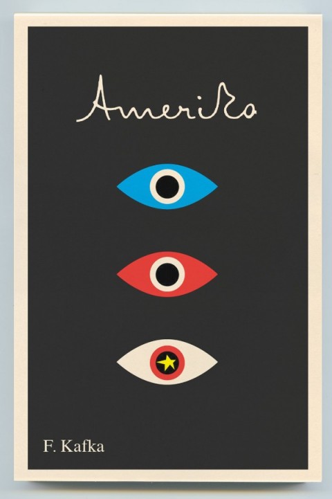
Peter Mendelsund on his remarkable (and unexpectedly Paul Rand-like) Kafka redesigns for Knopf imprint Schocken:
After all, what is it that makes Kafka, Kafka? The economy; the dark humor; the teasing inscrutability; the brilliance of the thought-experiments; the hieratic and esoteric flavor of the constructions; the disorienting cadence of the prose; the impeccable, internal, magical logic that drives the mechanical toy theaters of his work; the much discussed Jewishness (as if this was easy to parse); the “concrete abstractions” (in the words of Zadie Smith)…. I suppose what some find most relevant and compelling in Kafka is his ability to inspire in them that paradoxical feeling that great literature always aspires to arouse in readers—the feeling of the universality of their own alienation. Kafka is the ne plus ultra of alienation– alienation being arguably the defining emotional condition of the 20th century.
There is more at Peter’s blog JACKET MECHANICAL.


Superb: looks like Kafka revisited by colour and… optimism!
Funny enough just before getting here, I’ve just posted a similar Rand’s appreciation on PM’s blog. It’s looks very much inspired by Rand’s design for IBM i.e.
Love these. Need to own. It’s for the kids.
I agree they have that rand/lustig quality/dorffman quality. I think that is partly why I love them so much—they don’t feel like anything you would expect to see at your local bookstore these days. A nice nod to the past masters of design is always in order when designing a cover for a literary master. I really do hope they clam shell this or package it as a unit… I may hold off and wait for that.
Hey Ruxandra, Gould, Ian… Thanks for your comments. I’m sketching out some additional thoughts on Mendelsund and his interpretations of Kafka. I’m not sure they will develop into a full post, but which this space… :-)